Reading: A Note About Digital Manhwa

I know I write often of comics, manga, and manhwa, but I wanted to make a fuss about how digital illustration has really changed how comics look now, and has made manhwa (comics from South Korea) in particular so attractive to me as a person who used to work in architecture.

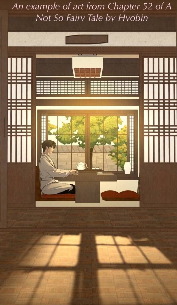
I previously wrote about A Not So Fairy Tale by Hyobin on Webtoon. Look at this scene:

Just a scene of one character waiting in a restaurant for another character to show up. (She won’t.)

Look at the details. The textures. The shadows that the evening sun makes on the floor (which has a sort of wood parquet treatment). This level of effort in webtoons is VERY appealing to me. And is spoiling me a bit.

Even if/when the characters are highly stylized in unnatural ways, the rendering of the world they live in – backgrounds, the interior design, the furniture, the foliage – these have some remarkable details. Some appear to be produced by specialists who just create castles, modern cities, European rococo ballrooms, etc. Others appear to be photo-to-illustration conversions of some sort (but that works only for places based on real settings).

Drawings produced at this level when I was still in architecture would have been award-winning marvels of the profession: now they are the routine product of manhwa studio artists!

I admire the effort (and artifice) that goes into producing these scenes.

I have other favorite scenes to express my admiration for, but I haven’t reviewed those particular manga yet, so they’ll likely turn up in a few weeks.

Life: Managing Fear of (Watercolor) Failure

I sat down on the national holiday and made a little sketch to paint, and while it was harder than it should have been, it also wasn’t the end of the world. It isn’t finished – I need it to dry to glaze some sections that aren’t well defined – but it is recognizably the right general [vague hand-waving gesture] shape.

I could say this reminds me of going from being a swimming instructor with superb form to feeling like a brick dragging itself through the water with weak arms after many years of not swimming laps regularly. (A thing that happened to me.) But the difference is: I was actually good at swimming. (I practiced for years every summer weekday as a student, and kept practicing as a swimming teacher, so there was a least a decade of intensive swimming there, including recreational racing with others.). When I lost that ease in the water, I felt… wrong. Like I’d forgotten something important, and had ‘let myself go’ in a way that made me sad.

However, I was always a beginner-level painter, so I can’t pretend to be crushed at still being one now. I took up watercolor with enthusiasm back in college, but took too many classes, and had no time to play. Painting lost out in favor of manual drafting (a skill I was rewarded for as both a student and professional). (OMG, I am so old!) Watercolor back then was something great for “renderings,” which were hand-painted, intentionally pretty illustrations of what a building would look like in the future, to help clients visualize their project in flattering ways. Being a renderer was a professional speciality people paid extra for. Now that’s all done digitally, which means design projects by others made during my youth are going to wind up in museums, and people will be so impressed that people could once make such images without computers…

Ah, well. There are some watercolor projects I’d like to try, and yesterday’s sketch suggests I can chip away at my fears and work on them.

Some of my watercolor project ideas are mere fantasies: much like cafes with big windows and views of gardens, the IDEA of painting is a fantasy of leisure. Imagine, having time to paint! Imagine, painting often enough to be good at it! Imagine having time to drink good coffee and practice! I know what I’m like: I work too much, I see what these ideas of quiet painting time offer, and I understand why these projects are such a draw, even if my actual results are so basic.

Once I overcome my dread of being bad, painting allows me to enjoy the process of painting. The results are less important than the experience, in some ways. If the experience is pleasant, I will try again. Even if the results aren’t great, I am still able to sit still for a while and put paint on paper for a few hours, which is a joy.

Art: Indigo Cotton Handmade Book – progress

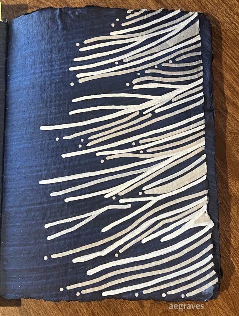
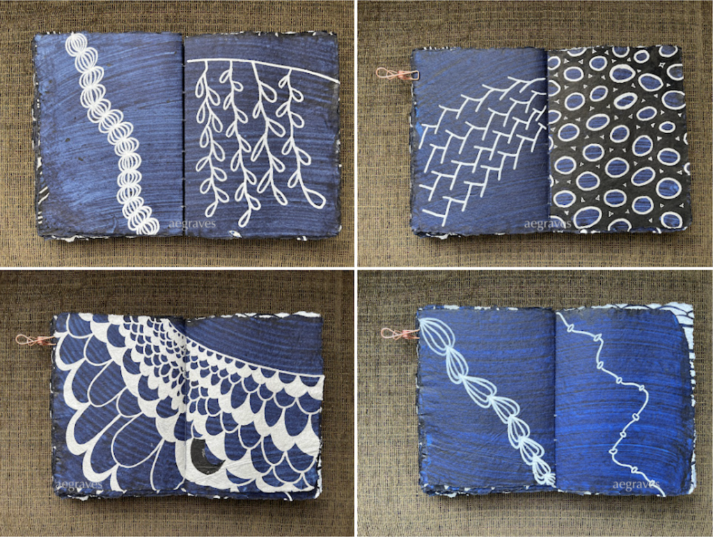
four image spreads of an open, oversized indigo-painted book, featuring freehand illustrations in black and white acrylic ink by A.E. Graves

I addition to reading and writing books, I also DRAW in blank books.

The Topdrawer shop (topdrawershop.com), a subsidiary of Japan’s delightful Itoya brand, has been carrying these handmade, 100% cotton rag paper notebooks from Lamali for a while. They are deckle-edged (meaning you can see how the fibers filled out the frame, untrimmed) and have a nearly crispy texture. The indigo version of the book has indigo-painted pages, and there is something appealing about being able to see the brushmarks, which have a lot of character and variation.

I finally purchased an oversized notebook, and have been filling its pages with abstract acrylic ink drawings. The paper appears to be heavily sized, so my acrylic ink sits on the surface nicely without bleeding or feathering. the contrast is good. The textured surface is hard on the pen tips, but this is why I have replacement pen tips!

Any day I sit and enjoy drawing in this notebook with my markers is a good day.

Book: Uncollected Works 2010 – 2021 by Mateusz Urbanowicz

Book: Uncollected Works 2010 – 2021
by Mateusz Urbanowicz
published by MdN corporation
2022

I’ve written enthusiastically about Urbanowicz’ Tokyo at Night book, and now I’m back for his book of drawings and paintings of Japanese scenes in different seasons and times of day.

These paintings show many types of structures, both traditional and modern, and have the same charm and attention to scale and detail that make Urbanowicz’ art so interesting. Unlike the store fronts, these are broader scenes and wider perspectives. (Yes, he works in anime also, and you can see how some of these could function as studies for both ordinary and extraordinary backgrounds for anime dramas.)

You can see scenes from the book at the artist’s website for this book:

I was happy to purchase this book at Kinokuniya (I can’t believe my SF store has already had a 50 year anniversary!), and appreciate Urbanowicz’ drawing styles, comments on watercolor pencils (I use them, so I laughed out loud), and the skill, sensitivity, and affection this artist has for his subjections.

If you loved Tokyo at Night, you might love this, too!

Art: Drawing practice (for paint cravings)

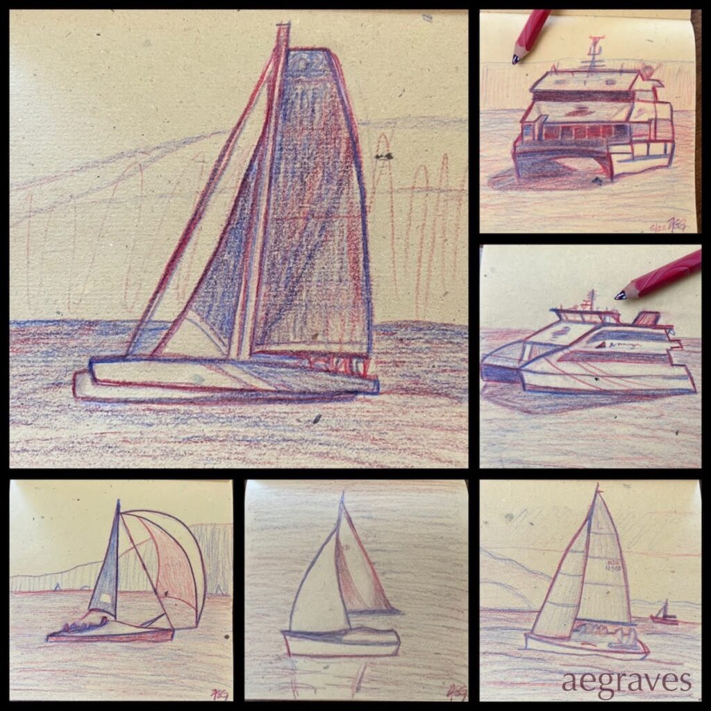
A collage of recent sketches of boats I’ve seen in recent months, after a long break from drawing

I AM DRAWING – BY HAND! ON PAPER! It has been a while since I’ve done this… I drew often in childhood, and regularly sketched for architecture school in my late teens and early 20s, but after leaving architecture professionally, I stopped drawing regularly. Drawing is slow and thoughtful, and I have too often struggled with long hours and demanding work – drawing felt like something I didn’t have time for. Photography, especially once I started carrying a small camera in my purse, was more accessible – and FASTER. Drawing fell by the wayside, a cost of my non-creative profession.

I never gave up drawing entirely: I still enjoy drawing in flurries, especially when I want to really take my time to enjoy studying things. I’ll take a new sketchbook to a museum, sketch sculptures for a day or two, and then set it aside until the mood strikes again.

I’m drawing again this month, because I’ve been suffering from paint lust. In my fantasies, I’m about to make a series of really great gouache representational paintings, and I’ll need to lay out some great drawings and buy some gouache to make this happen. This is an outrageous fantasy: I have been making primarily abstract (non-representational) drawings and paintings since 2012, so I am out of practice in representational (representing the shape of real world things) drawing. Plus, I have never been IN practice with gouache: I have just one, small notebook with abstract or patterned gouache multimedia sketches.

This fantasy is grandiose, and so I’m putting conditions on it, such as: I can’t buy gouache until I make a representational gouache painting with my existing little set of 5 colors FIRST.

And I can’t make a representational painting without a drawing to guide me, and so this is why the sketches at the top of the page exist. I need the practice. Badly. This is a fun prerequisite, even if I am clumsy and using a museum-gift-shop pencil with multiple leads.

*

There is more to this plan: I can’t just buy any paint, because gouache paintings are delicate (there is no natural seal against moisture, abrasion, or UV light, like traditionally varnished oils or acrylics have), and I insist on using permanent, artist-grade paints. Gouache has often been used for commercial art with a short lifespan, and so many colorful gouaches aren’t made with stable, long-lasting pigments.

I’ve done my research, ruled out familiar brands with unstable pigments, and have a surprise choice in mind (German!?!), but… I don’t want to write about that until I’m actually painting with that product. So, hopefully I’ll get some more drawings in, and knock out at least one cheerful little painting before money flies out of my wallet for this.

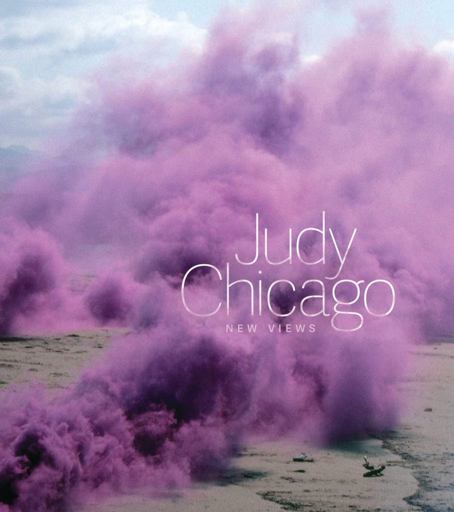
Book: Judy Chicago: New Views by the National Museum of Women in the Arts

This is a gorgeous cover, with the intrusive colored smoke encroaching on the title text. Just fantastic!

Judy Chicago: New Views
by the National Museum of Women in the Arts (U.S.)
published by Scala Arts Publishers, Inc., New York
2019

Judy Chicago’s works, especially her drawings and paintings, always appeal to me. She has a sense shading and gradation that is consistent across her materials, and her drawing compositions are just stunning. She is an artist I have always believed should be more famous, and the folks at the National Museum of Women in the Arts agree! They’ve created and published this excellent book.

There is a lot to appreciate about this volume. It includes works that are held privately, and so you are unlikely to have seen them; it includes details of works you may not have appreciated from a polite viewing distance in a museum, especially for her textile works; and the essays and interview are of exceptionally high quality – and are somehow at just the right length to leave you stimulated and wanting more.

I am personally thrilled to see images of her smoke and firework pieces, which had escaped me previously, but which I should see in larger form at the upcoming Judy Chicago retrospective at the San Francisco deYoung Museum, which opens later this month (August 2021).

I appreciate so much about her body of work. I especially appreciate: the consistency of her compositions across materials (from Prismacolor pencil to sprayed paints on different bases); her elegant use of ranges of color; her direct embrace of female imagery and feminist ideas; her compassion for the suffering of others (including animals), which she renders so skillfully across different media; her in depth, multi-year studies of materials (she enrolled in auto body shop classes, boatbuilding classes, and china painting classes) so she could execute her work at a high technical level; and her utilization and embrace of skilled collaborators to help her achieve some of her monumentally sized works.

While her work evolved in clear directions, I was surprised to be so delighted by some of her early paintings on car hoods, which I wouldn’t recognize has hers (based on later work), but which is charming and bold. The shapes she uses are nearly iconic.

This is an excellent book of very high quality by every measure, with a great selection of Chicago’s work, beautifully reproduced, presented in a well-organized fashion alongside thoughtful writing about her direction and commitment to her themes. I’m so glad I bought it, and feel more prepared to enjoy her forthcoming show!

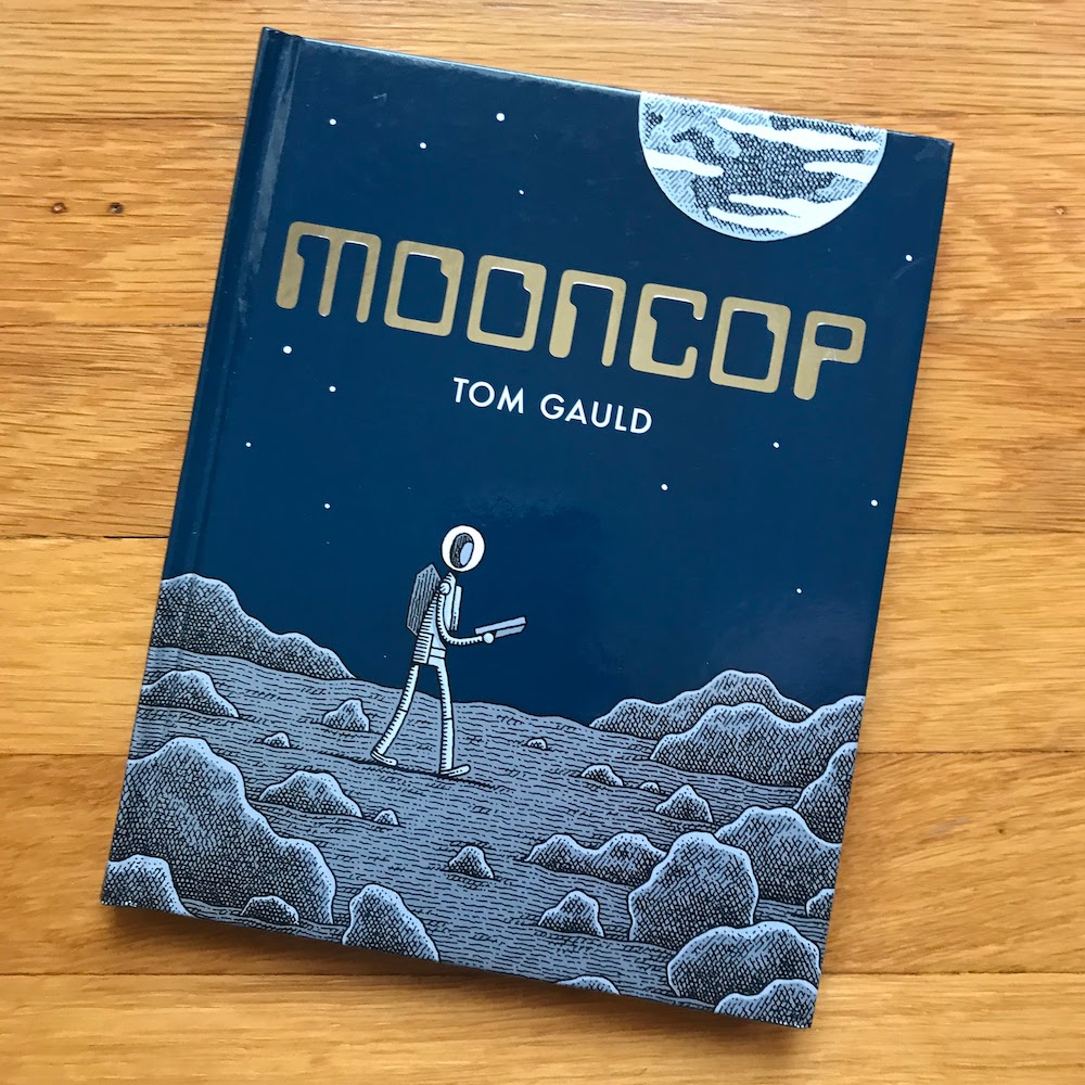
Book: Mooncop by Tom Gauld

Yes, it looks like this.

Mooncop
by Tom Gauld
published by Drawn & Quarterly, Montreal
2016

Science-loving cartoonist/illustrator Tom Gauld’s adorable style is evident again in Mooncop, an accurately-titled, single story about… wait for it… a police officer who works on the moon.

The story is a bit melancholy, as our protagonist is living his dream, while other humans have largely lost interest in the place.

It’s charming. It’s spare. The small gestures in Gauld’s style are very expressive. I really like Gauld’s practical-looking, modular architecture, periodically interrupted by transparent bubble domes. I like the boxiness of the robots. And the cover even has the title in fancy silver foil! It’s a nice little book.

Life: I used to draw!

A sketch from one of my early 1990s sketchbooks

Once upon a time, I would sit down and DRAW. Lots of us love to draw when we are kids, and I kept at it, and could draw for enjoyment into adulthood. This came in handy when I chose to study architecture (though you could get by with drafting for anything that required straight lines; note that I went to school before CADD was a thing, so I mean drafting by hand.)

I enjoyed sketching, not impress other people (as it feels is common in this new, social media age), but to REALLY LOOK AT THINGS CLOSELY and learn about them through that deep study and transforming them into two dimensions on paper. Few of my drawings are good (in the showing-off meaning), but I learned something from the process of creating each of them.

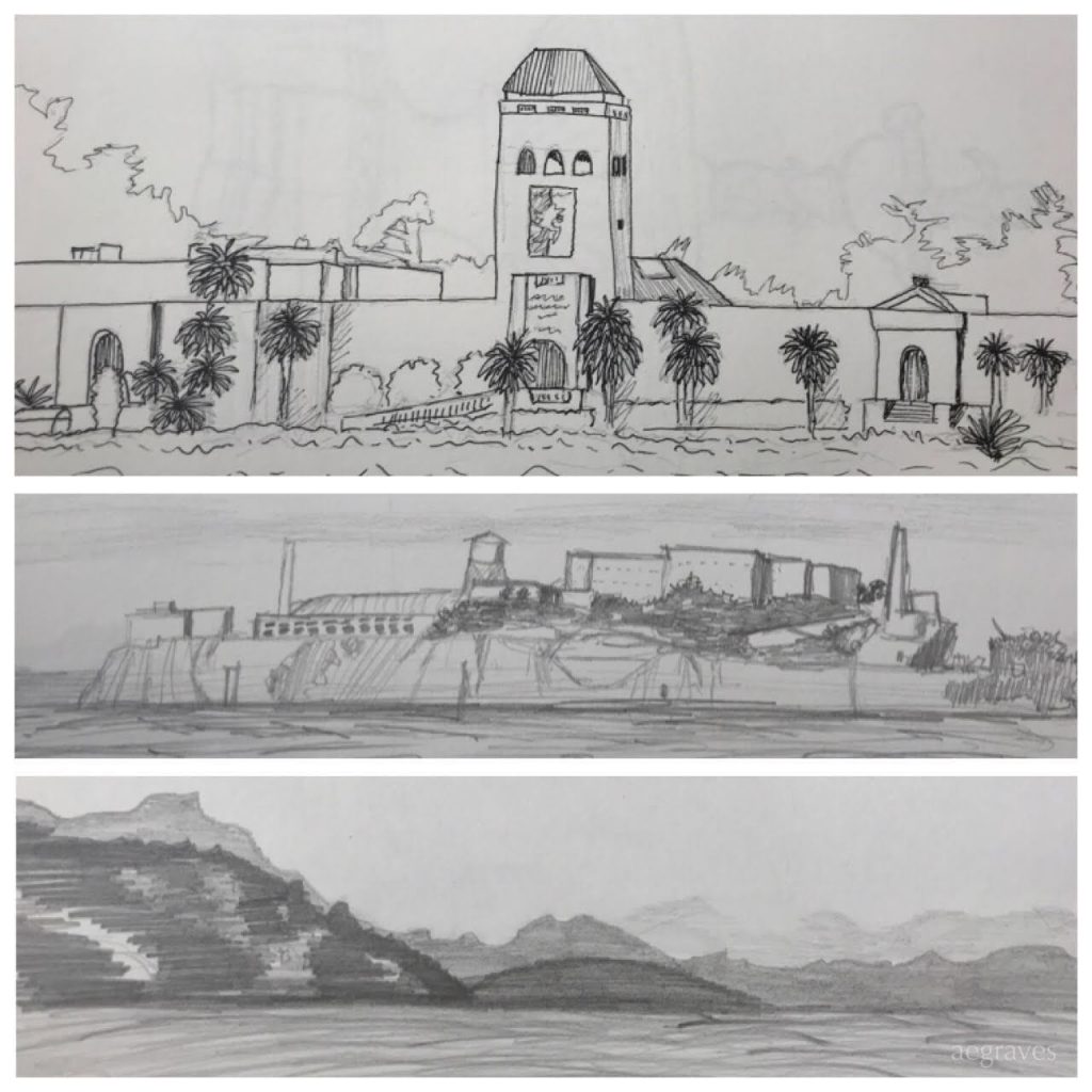
I don’t have any photos of my city’s old deYoung Museum, but I do have sketches of it! And of other things.

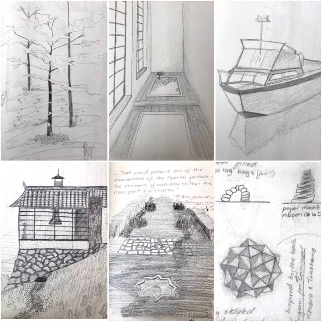
Some early 1990s sketches of the old deYoung in Golden Gate Park (in pencil and fine pen), Alcatraz, and a general northerly view over the San Francisco Bay (in soft pencil), all by me.

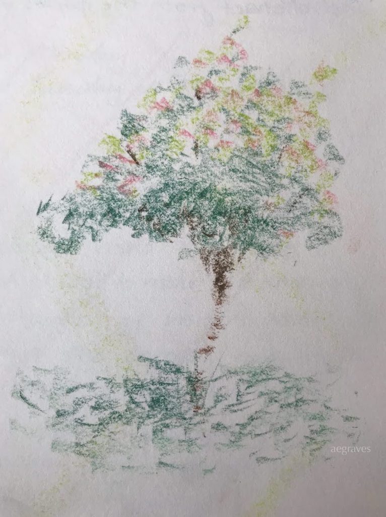
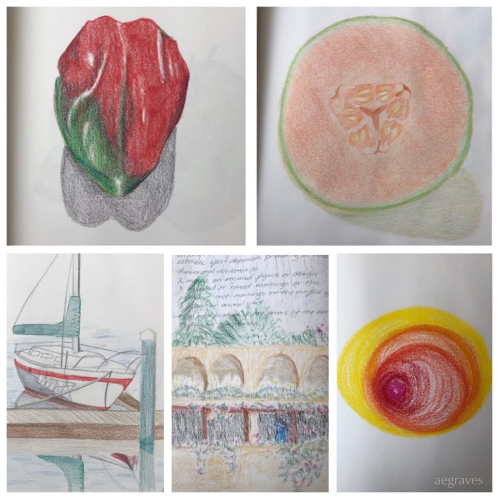
Some of the color drawings, despite the fact that I don’t much like the texture of colored pencils, showed I WAS learning how to use them!

Selections of colored pencil sketches in the same notebook as the other images in this entry; the lower right one is pastel.

I love that I took the time to MAKE these. I love that I gave myself that opportunity, even while taking a risk that nothing would really come of it, that I could enjoy both looking and drawing. It’s a rich experience, having that kind of focused attention and doing something with it. I had never really LOOKED at a cantaloupe closely, but one day I cut one open and knew I had to draw it and its lovely seeds.

I drew from life (from a place I really was, like the marina where I drew that boat, or the geometric shapes that were based on an origami project I had made with friends), and photos (the garden in the lower center was surely from a magazine), or that I invented (the house on the hill with Japanese-castle-like details and modern windows, if I remember correctly).

It’s fun for me to look back through this old sketchbook (which I came across while cleaning out a box in the garage), and think about how good it was that I took the time to study and enjoy the time I spent drawing these things. My life was challenging during that time period (tuition was becoming a serious hardship, etc.) , but this was something I did for myself, and I’m glad I did.

I have lots of interests, and my career has limited the time I can spend on my own projects, so I’ve given up drawing and painting to make room for work, sleep, and loved ones.

I felt I could only choose one creative pursuit, and I chose photography (and writing for my own websites, if you haven’t noticed). I have no regrets about that choice, but would love to “have it all” – including more time to study, draw, and paint.

Book: Vija Celmins: To Fix The Image In Memory, edited by Gary Garrels

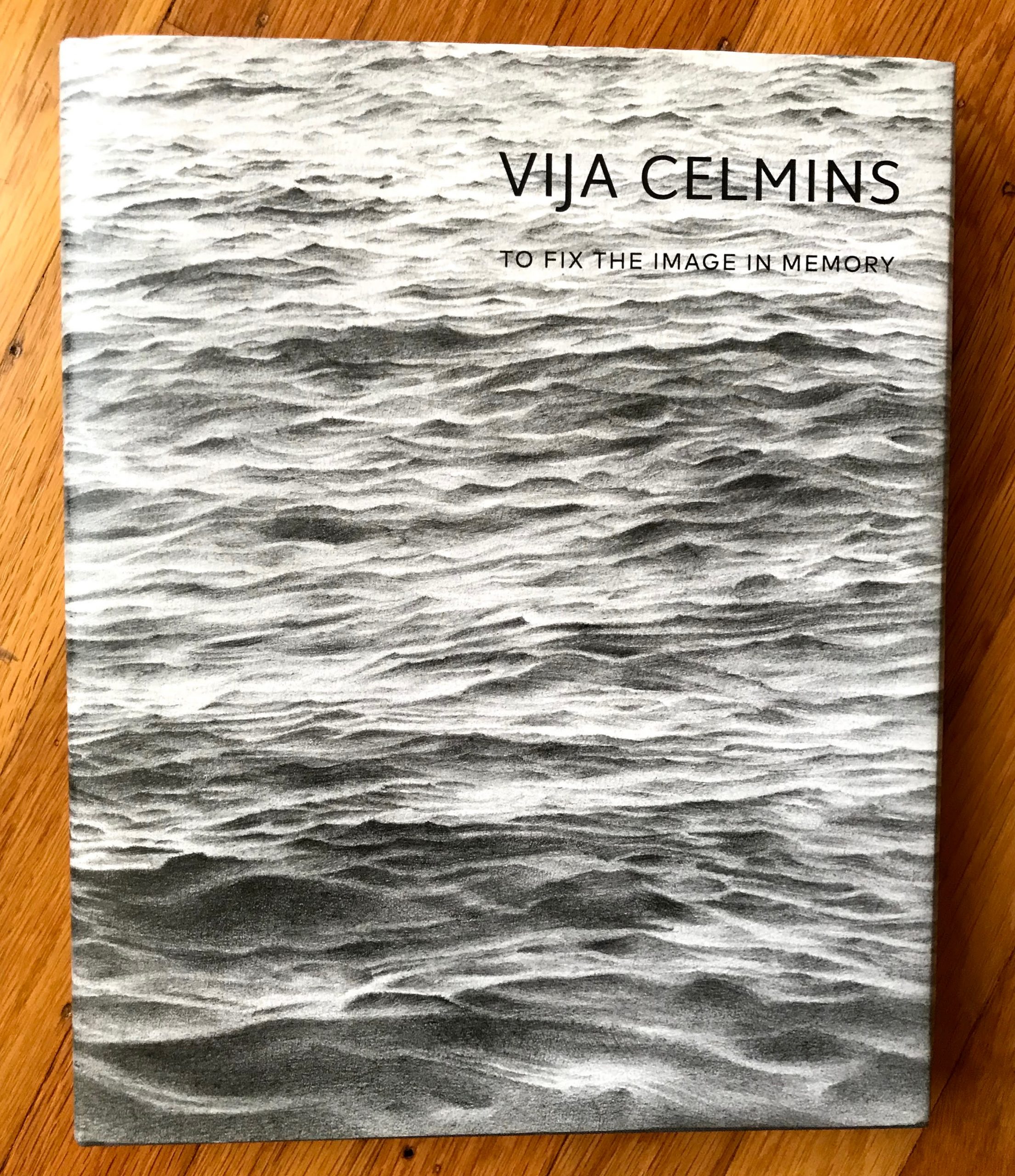
Cover of Vija Celmins: to Fix the Image in Memory

Vija Celmins: To Fix The Image In Memory
edited by Gary Garrels
published by San Francisco Museum of Modern Art, in association with Yale University Press
2018

In late 2018 & early 2019, SFMoMA had a fantastic exhibit of the art of Vija Celmins, and that show led to the publication of this enormous, substantive catalog of her work. It contains essays with a broad range of interpretations of her catalog, high quality reproductions, a collection of insightful interview excerpts, AND a biographical timeline that is unusually well written. It is one of the better catalogs I’ve purchased, and after enjoying it in small servings since the viewing the exhibit in person TWICE (it was that good), I read it from end to end today.

There is something remarkable about Celmins’ artistic focus. She has created a range of work to show off her skills, but her long term commitment to drawing and painting certain subjects, such as the surface of the ocean or the depth of the sky, in a very particular method, has led to a profound body of work. It is remarkable to have such a range of skills, to have shown them off through solid early representational work in oil paints and remarkable sculptures (though she considered those drawings or paintings of a sort), and also to perform time-consuming, in-depth studies of a few subjects in graphite with such SATISFYING results, all while bucking other artistic trends, and maintaining a unique “voice.”

I’m old enough to have trained in architecture back when we actually drew (no, really), and so seeing such amazing work in graphite means something to me – it’s a medium I worked in for so many years… and she does wonders with it.

The graphite drawings in particular are inspiring and gorgeous in person. From afar, they are the sea; from up close, they are the texture of graphite on paper; and you can feel yourself slipping between the two understandings, especially around the edges, and being pleased with that experience.

Her pictures of the surface of another planet are also remarkable, and you realize after viewing several that you recognize specific rocks appearing in the drawings, because the rocky landscape is NOT a random drawing of high precision, but a high precision interpretation of a specific NASA image, methodically mapped out and reinterpreted in different weights of pencil, or from a closer point of view.

The reproductions would have been satisfying enough for me, but the texts, including the interview snippets on her NEED to do this work, and on the way drawing and painting on these projects became part of her way of living in awareness… it’s all quite informative.

I love her consistency; the way she challenged herself by changing media when the time felt right; the depths of the blacks in her drawn skies; the inverse skies she created recently… there is a lot to enjoy.

Great artist; great show; unusually satisfying catalog.