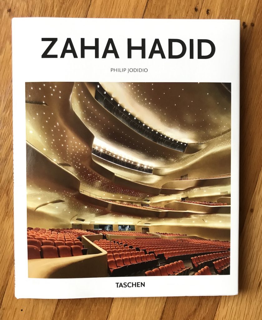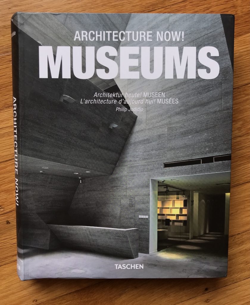
Architecture Now! Museums
by Philip Jodidio
published by Taschen, Cologne (Köln), Germany
2010
This oversized softcover showcases architecture firms working on public and private museums, with an emphasis on projects Europe, the Middle East, Asia, and North America. Each firm has a brief profile, followed by one or more projects which are showcased through very precise, clear photographs and blue architectural drawings (usually plans, sometimes sections, in miniature) for orientation. Profiles and project texts are provided in English, German, and French in caption style, as the photos and drawings do most of the work in showcasing the projects.
The author emphasized built projects over conceptual ones, though he included some already under construction and a few very likely to be built, to keep the book feeling up-to-the-moment as of its publication. He succeeded!
Museums, especially large public ones, are something of an architect’s dream: the program requirements for the building tend toward grandness (with grand budgets to match), and the owners are often trying to embody their status and create a landmark. (Several of my own city’s museums are featured here, and yes, we were definitely collecting star firms for bold looks that will please visitors and be recognized as proof of our cultural sophistication.) As a result, many of the projects included here were the result of high profile, international competitions.
The projects are quite diverse in materials and appearance, and this impressive variety is due to the hard work of the author, the skill and diverse approaches of the architects, and (I am certain) the programmatic requirement to make unique statements that will serve the owner’s image.
As in other architecture books, I especially appreciate images that show the building being used for its intended purpose. Some promising projects are included here that were built around special collections, but those collections aren’t shown in the uninhabited spaces, and so it is difficult to know if the building truly succeeded in its program. (I don’t know if this is the usual concern about the purity of the architect’s work (which I don’t find useful), or concerns that any art shown would require additional legal reproduction rights.) Those projects that show people moving through the spaces and art on display with appropriate lighting suggest they firmly meet the criteria of success. I wish such images were included for all the projects.
In fact, now that this particular book is ten years old, it would be great to have a standard analysis performed of each rating them on how well the execution of the programs held up during use. I would like to see the best designs/designers given some retroactive credit for not only winning their competitions successfully, but for their programmatic success, and for the satisfaction of their customers.
This is an attractive book of a wide range of solutions to the display requirements of museums, and it is fun to spend time with. I’m happy I purchased it (long ago) and revisited it (today!).