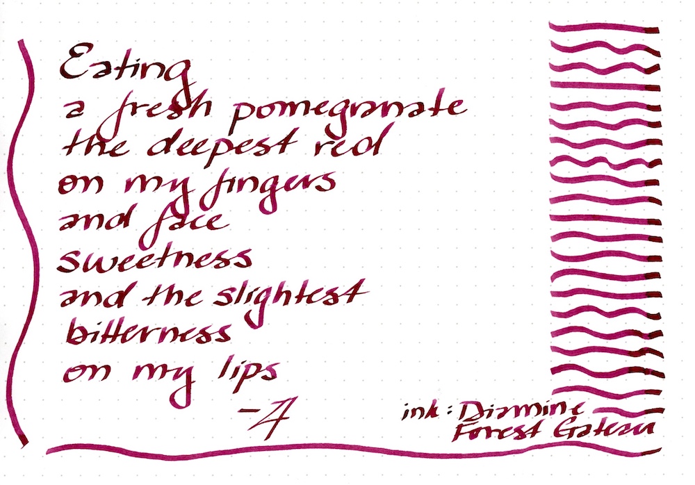
Such a pleasant shade of red… This is Diamine Inkvent 2024 Black Edition “Forest Gateau” (4/25) a sweetly scented ink.
I bought the Diamine Inkvent Black Edition for 2024, an advent calendar in which each little window contains a bottle of ink. Each year Diamine invents new colors, releases them this way, and then produces full-sized glass bottles later. This is my second year of purchasing the set. Prior years were impressive and produced two of my favorite sheening inks (Polar Glow and Holly), and so the series has high expectations to live up to.
This year’s set is influenced by the popularity of very muted colors (mostly coming from Asia – muted pastel grays and browns especially), colorful particulate glittering inks, plus a few sheening inks.
Other Diamine fans posted ink swatches and art daily to show off the inks, but long working hours and my desire not to just be another form of advertiser meant I took time to write letters and journal entries with the inks and get accustomed to my favorites. I also finally accepted that my phone mutes the colors too much, and scanning is really the only reliable way to go. I’ll post small writing samples of these inks, and others of many brands in my ink collection, over time.
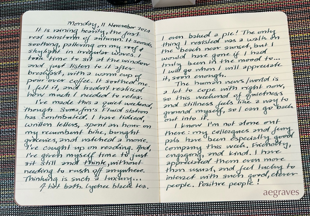
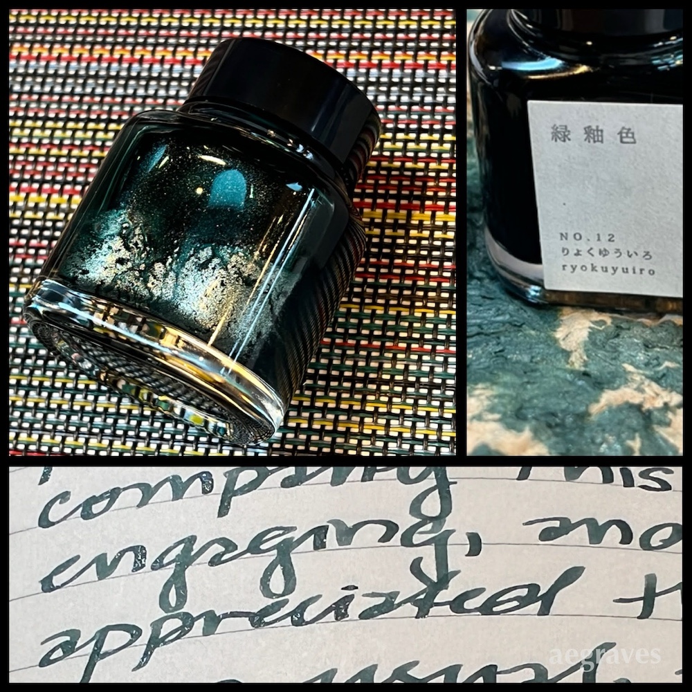
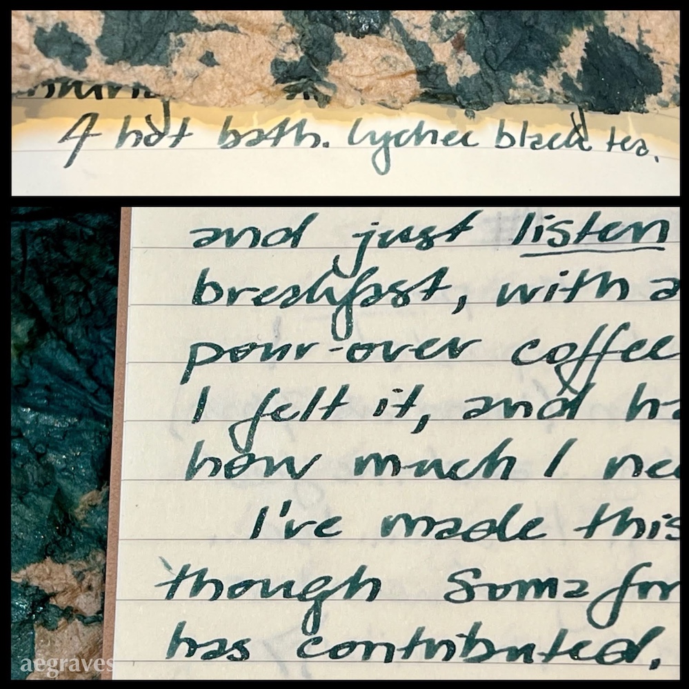
I spent time this morning listening to the rain, and then opened up a souvenir of my trip to Japan to write with it. It is Takeda Jimuki Kyo No Oto ink in Ryokuyuoiro, which is a deep, grayish green with silver sparkle. The sparkle component clogged the first pen I tried, but I went with one with a wider feed, and enjoyed its beauty as I wrote.
My phone camera likes to increase the contrast when I photograph text (it wants it to stand out from its bright paper background), but hopefully you can see the silver glitter in the text, and the depth of the green.
It was pleasant to take the time to write with such lovely ink, and spill my thoughts after some time listening to rain. I needed it.
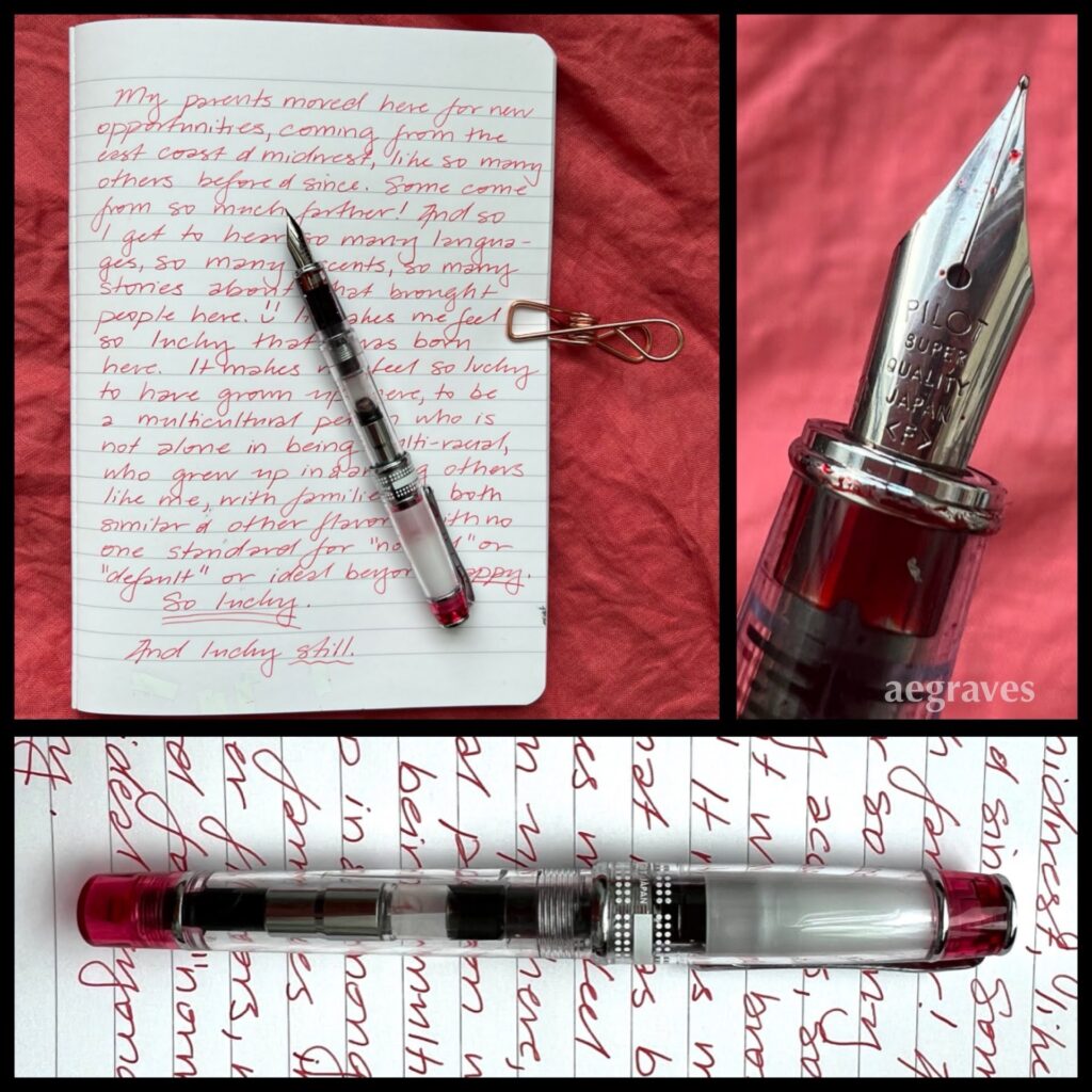
Finally out of the box: my first TWSBI fountain pen; its stub nib; a writing sample in Diamine’s Glacier ink. (It is too full of sparkles – I had to clean out the pen afterward, when it started to clog.)
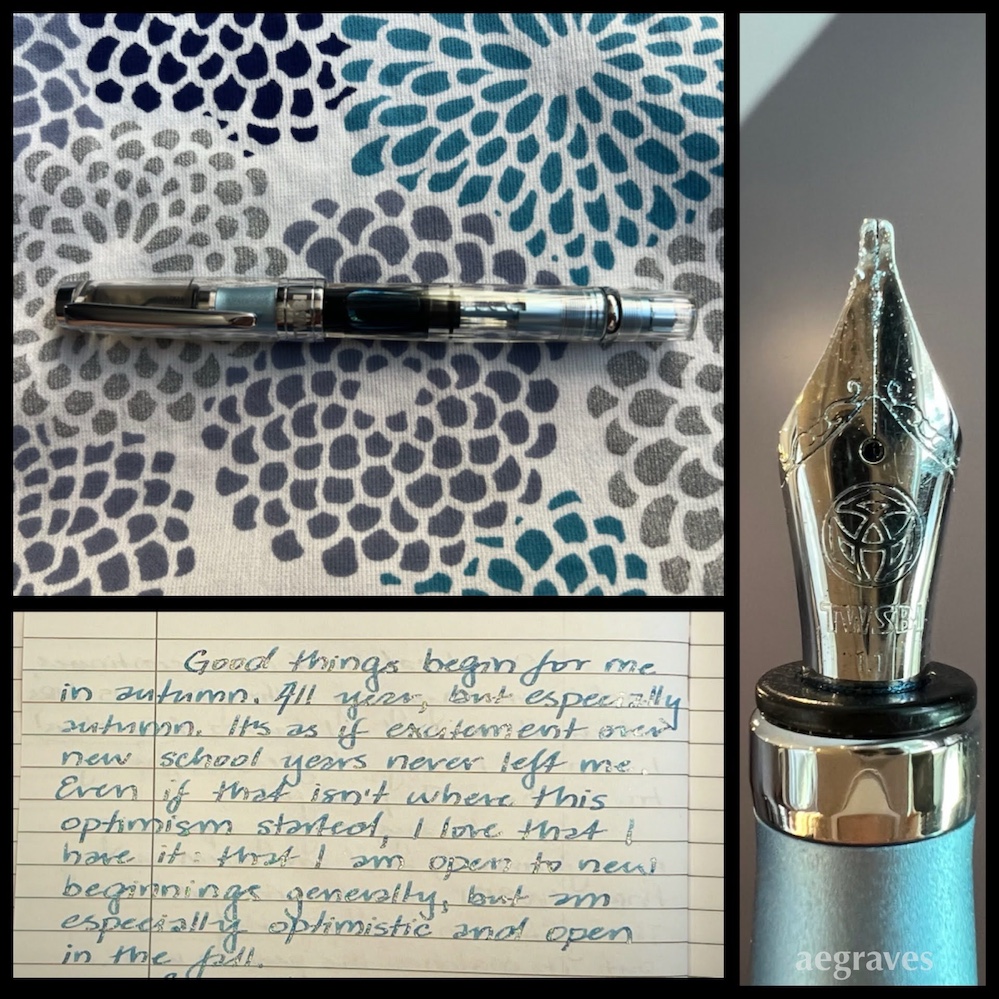
My writing hand is in a mood to write, so I unpacked my TWSBI Diamond 580AL Fountain Pen in Iceberg Blue to start a new volume of my journals.
It’s lovely! It feels well made, is comfortable to hold, and the angle makes sense. I am switching to another Diamine ink (with fewer sparkles, so it will flow more evenly) for the rest of today’s writing.
Yes, every autumn I do gush about autumn. Yes, there are pages listing all the foods I love to eat. No, I don’t have to hold back – I’m writing for my own satisfaction, and there’s no such thing as too much gushy enthusiasm in a private journal.
I anticipate this pen will go into heavy rotation for letter writing, when I need a large pen I can hold comfortably for long letters.
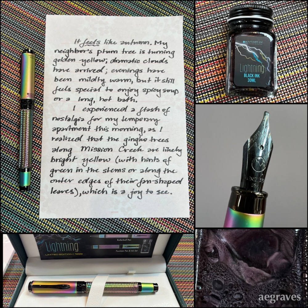
A slightly shaky page from a letter to a pen pal about my fondness for San Francisco’s local version of autumn, and fondly remembering the gingko trees near my temporary apartment on Mission Creek; the pearly metallic black ink that came with the pen; the stub nib I chose; the ink in the bottle; the pen in its box.
I’ve been waiting to enjoy this special pen for a day when my writing arm isn’t sore. That day hasn’t come, so I decided to stop waiting and write anyway, with soothing ice pack breaks relieving my arm of its internal swelling.
My writing sample isn’t the best here – I’ve waited weeks to hold a real pen again – but this Monteverde “Innova Formula M Fountain Pen – Lightning (Limited Edition)” pen provides a smooth, pleasant writing experience. The ink’s silvery sheen is pleasant. It has some special wetting agents that made it feather on my usual papers (and I thought nothing could feather on Tomoe River!), but works well on ordinary paper. I like the softness of this black. It makes me think of my well-washed, favorite black denim jeans, but more metallic. (This gives me ideas of special effects I might like in my denim if this didn’t make them less soft...)
As the writing sample notes, I LOVE LOVE LOVE this time of year, especially for food reasons, but also because of the delivery of dramatic skies. Oh, how I love them – they make mornings so moody, and sunsets so colorful…
I look forward to using this pen-ink combination on other papers for long writing sessions.
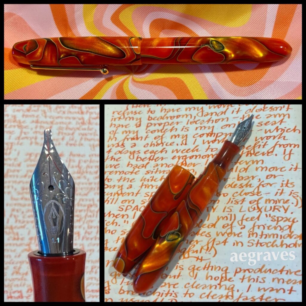
This is an Edison Collier fountain pen (made in Ohio!) in the color Persimmon Swirl; a Goulet 1.1mm stub nib assembly; a writing sample in Pelikan Edelstein ink in “Mandarin” orange on Rhodia cream paper.
I was writing yesterday about how wonderful it is to have a desk to write at (I have space!), was enjoying the orange theme a bit too much, and decided to post about it. (Materialism happens to me, too! I use a lot of tools and art supplies, and have been choosing prettier ones recently.)
This pen isn’t very “like” me – I own almost nothing that is orange – but it is so attractive looking, and so vivid, that I couldn’t resist. It is a lovely size and shape to hold, large, gently rounded, and easy to write with. It came with a medium nib, but I’m on a broad nib bender, so I ordered a replacement nib-and-feed assembly from Goulet, and am happier with it. I have ink feeding issues from time to time with the converter (it withholds ink after I’ve written a few pages, and I have to dial the converter to be more generous (postscript: this appears to be specific to certain inks, Herbin is flowing beautifully)), but standard international cartridges flow just fine.
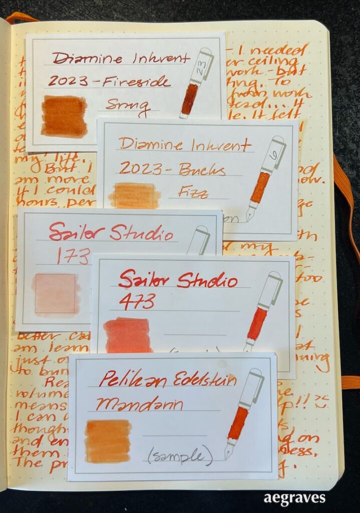
Orange inks can be limited in legibility, but I’ve been testing some good ones. By coincidence, the 2023 Diamine Inkvent calendar (an advent calendar with a 12ml bottle of ink behind 24 doors, and a bigger bottle behind door 25 for Christmas), happens to have added two new oranges to my little collection, including one that was behind Saturday’s tiny door.
Sample cards displaying the five (!) orange inks currently in my collection. Diamine Fireside Snug, Diamine Bucks Fizz, Sailor Studio 173 & 473, and Pelikan Edelstein Mandarin.
My employer’s theme color is orange, and I’ve grown accustomed to using a sanctioned shade of burnt orange in my presentations, so I may be more open to using this color than I’ve historically been. Goodness knows there have been many shades of orange in the gorgeous sunsets recently! So, we’ll see if these tiny bottles lead to a bigger commitment for my writing. There are some famous American and Japanese orange inks I haven’t sampled yet, so it’s possible…
This is my first Pilot Prera, with a fine nib – my least favorite nib size! It was scratchy when I bought it, yet the right ink and smooth paper make it pleasant. The ink is likely Herbin’s Corail des Tropiques.
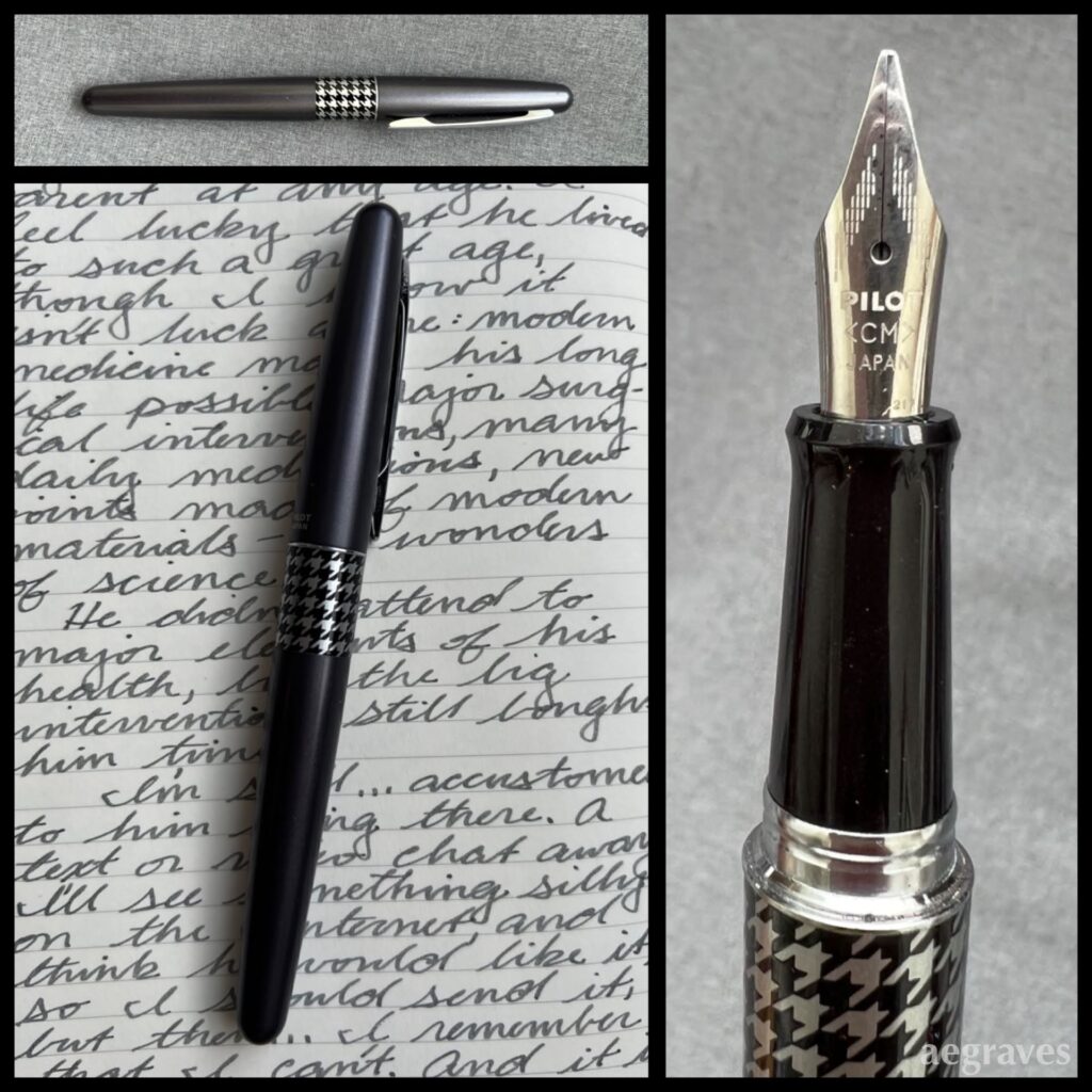
This is another Pilot Metropolitan fountain pen with a calligraphy medium (CM) nib. The writing sample is made with Private Reserve Gray Flannel ink.
Here’s another modest-but-fun pen in my collection, with matching velvety ink. I’ve been surprised at how many shades of gray ink are available, especially since some are so subtle and pale that I’m unsure how they can be used…
My handwriting with this style of pen is nicer when it is not hurried, but all of this year I’ve felt like I have so much to write and so little time that I can’t slow down…
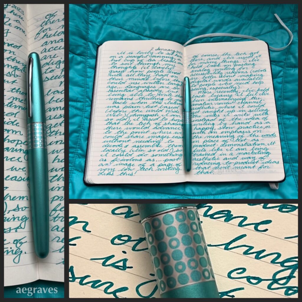
A journal spread – collage of pages I wrote in January 2023. The ink color is Diamine Steel Blue; the pen is a Pilot Metropolitan.
My elementary school encouraged and required all of us Kindergartners to keep a journal. We needed to practice writing, and having a black and white, speckled-cover composition notebook of our own was DELIGHTFUL. I filled mine with colorful-but-poorly-formed words! I wrote and illustrated stories about red-haired girls having adventures! IT WAS GREAT!
And, the habit stuck with me. By the time I was finishing college on weekends while working full time at a law firm (note: do not do this, it is exhausting), and the college offered a few units each semester for maintaining a journal, I jumped at the chance… and then startled my college advisor by filling it in the very first semester, and starting another…
I still write by hand, especially for letters to pen pals and journals. My hands get sore easily, so I can’t write with dry ball point pens for long: they involve too much pressing. It turns out that very wet gel pens are better (HELLO, Uni-ball SIGNO!), but I fly through them, and feel terrible throwing out handfuls of disposable pens each month. Refillable gel pens come and go, and are very portable, but still involve tossing significantly smaller bits of plastic and metal out almost daily. The lowest waste and lightest-ergonomic-touch pens I can use are fountain pens with “converters” that can be filled with ink directly from a bottle.
It turns out I LOVE writing with fountain pens.
I have friends who collect these, but when they spoke of it, I didn’t really grasp the point: they showed me the pens themselves, not what they were capable of, how they performed as pens. Also, they didn’t mention to me, an overzealous color fan, how many ink colors are available.
Now I know. Oh, do I ever know.
I’ve been reluctant to show off either my ink or pen collections, even though both are very modest. Despite their modesty, writing with these tools brings me disproportionately large joy. My reluctance comes from the popular ways of writing about products by presenting oneself as a semi-professional expert reviewer, who talks up the qualities of the product yet never really MAKES anything with them.
There are countless video tutorials on how to SWATCH EVERYTHING – how to provide samples of a display quality that would please a salesperson. But… why?
While this swatching approach may help me better document my watercolor paint tube collection and so prevent me from buying the same shades of celadon green accidentally, it’s awkward as one’s only shared output. (Also: one can never have too many shades of celadon.) I don’t really trust someone who has only swatched a paint to tell me whether or not it belongs in their paintbox for their actual painting practice (if they have one)… I have some credible enthusiast reviewer sources of fountain pen ink who have recommended against using inks they received for free AND who freely remark on beautiful inks that aren’t LEGIBLE for actual writing, and that is feedback I can use. But there is a lot of reviewing-popular-products-for-clicks content, and I don’t want to participate in that.
So, how will I be different? I’m going to show what I wrote with the pen and the ink for my own enjoyment. Maybe you’ll like it. Maybe you won’t. Perhaps styling of these images by coordinating pens, inks, and backdrops will prevent me from staring deeply into my favorite pen shop’s Instagram feed and purchasing pens I don’t need. I expect it to make my blog more visibly interesting.
Either way, now is a GREAT time to create these posts. Everyone in my mother’s family has terrible arthritis: my ability to write legibly with fancy pens won’t always be available! I’ll seize the (quiet, quaint, pen-geeky) moment.
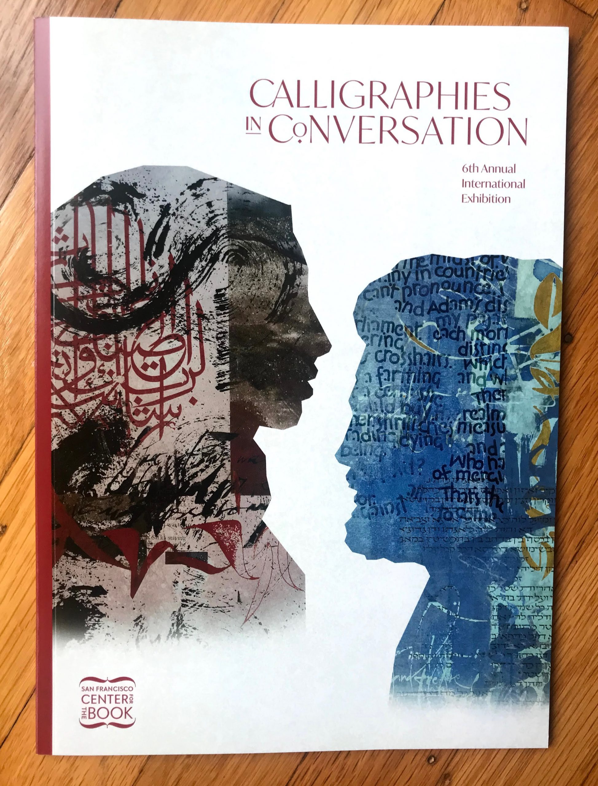
Calligraphies In Conversation, 6th Annual Exhibition curated by Arash Shirinbab published by San Francisco Center for the Book and Ziya Art Center 2019
This is a beautiful, fully illustrated catalog of an exhibit of calligraphic writing from multiple traditions, and it is really gorgeous. Work from fourteen artists shows a lovely stylistic and creative range. I had been expecting Chinese calligraphy for its local (SF Bay Area) popularity and long tradition, plus some western-language calligraphy, and was delighted to see those PLUS work in Urdu, Hebrew, Arabic, and more. My favorite piece is in a Devanagari / Sanskrit script over gorgeous shades of blue – the composition and color are WONDERFUL.