News: COVID-19 Mortality (and of choosing our role models more carefully)

We are at a point in the global coronavirus pandemic where the US leads the world in cases and deaths, yet also wants to resume business as usual because other countries have. (My country is like a small child that hasn’t done its homework, but wants to go out to play, like other children who actually DID their homework and chores can! If we want to be like countries that do testing, WE SHOULD DO TESTING!) COVID-19 prevention measures were intended to “buy time” for our governments, institutions, and business leaders to develop tests and contact tracing plans, but that time was largely squandered…

Despite polls showing that most Americans would prefer not to risk it, there is lots of promotion of other countries that implemented business-as-usual approaches.

The promotion of Sweden as a role model is especially alarming if you look at this data from John Hopkins Medicine & University’s Coronavirus Resource Center’s Mortality Page:

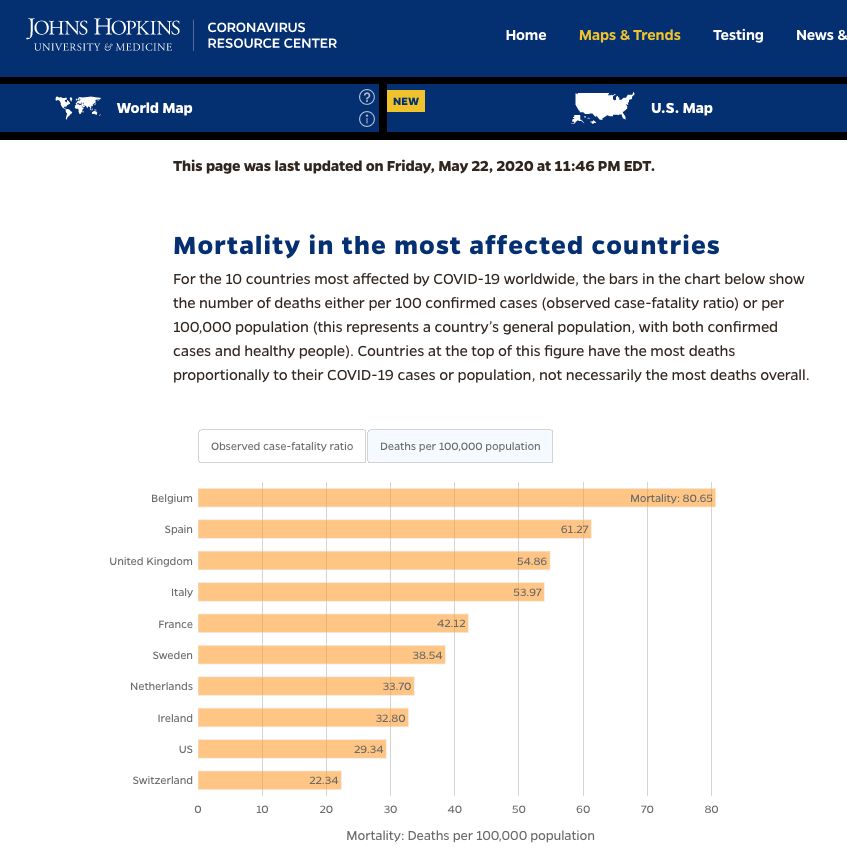
I have friend in both Sweden and the Netherlands, and seeing their countries, that have moderately sane governments and actual health systems do EVEN WORSE than we are doing as a percentage of the population, inspires pity, NOT an urge to be more like them.

NO. Just… NO.

I want us to be like South Korea (0.52 per 100k), or Taiwan (0.03 per 100k), or Japan (0.63 per 100k), or if you really need European examples, Denmark (9.68 per 100k) or Germany (9.92 per 100k). While both of those European examples are vastly higher than my preferred potential role models, they are still waaaaaay better than our rate, and may be more “achievable” as goals in the short term, if we think of ourselves as being in the ‘slower to figure things out’ group of nations that needs just to figure out how to get out of the double-digits.

We can learn from their COVID-19 management on the economic front, too!!

This item about Denmark from this New York Times opinion piece notes that Sweden seems to be held up as a model, but Denmark has 1/3 of their deaths AND a better economy. Plus, they are poised to bounce back, because they devoted their relief funds to keeping workers in place:

As a share of G.D.P., Denmark’s coronavirus relief spending is a bit less than America’s, but it seems more effective at protecting the population.

The upshot is that Denmark staggered through the pandemic with employees still on the payroll and still paying rent. As the economy sputters back to life, Danish companies are in a position to bounce back quickly without the cost of having to rehire workers.

“We can be up and running in a week, back where we were,” explained Peter Lykke Nielsen, a negotiator for unionized workers at hamburger chains.

– McDonald’s Workers in Denmark Pity Us, by Nicholas Kristof

There are objections within Sweden to the Swedish approach as well (see any number of articles, including Swedish scientists call for evidence-based policy on COVID-19 from way back in early April).

I didn’t need to be reminded to be skeptical of recommendations in the news, after our wave of ‘die for the economy’ messages, but thanks to the data, I am reminded.

Science: Research Rabbit Hole: Geology of Bermuda

I can’t even remember how it happened (perhaps it was triggered by sending a postcard to the French Overseas Department Réunion, which is an island off the coast of Madagascar, two days ago?), but I suddenly, very much needed to know how Bermuda, which lies in very isolated waters off the eastern coast of the United States, came to exist.

Answer: it is volcanic.

Bermuda Pedestal

The Bermuda Pedestal is an oval geological feature in the northern Atlantic Ocean containing the topographic highs of the Bermuda Platform, the Plantagenet (Argus) Bank, and the Challenger Bank. The pedestal is 50 km (31 mi) long and 25 km (16 mi) wide at the 100 fathom line (-185 m), while the base measures 130 km by 80 km at -4200 m.

I don’t think of the east coast of the US as volcanic generally, and while it is quite a distance from shore, it still feels like a surprise. A theory of a Bermuda Hotspot is uncertain.

I know our Pacific Ring of Fire isn’t the only site of tectonic plate volcanism, but outside of Iceland (which is quite wildly and unmistakably and actively volcanic), “Atlantic” and “volcanic” aren’t ideas that go together for me.

If Réunion did plant the conceptual seed of this need to know, it is likely because (yes) it is also volcanic, and the island has not one but TWO volcanoes: one dormant and the other quite active.

Piton de la Fournaise

Piton de la Fournaise ( French for “Peak of the Furnace”) is a shield volcano on the eastern side of Réunion island (a French department) in the Indian Ocean. It is currently one of the most active volcanoes in the world, along with Kīlauea in the Hawaiian Islands, Stromboli and Etna in Italy and Mount Erebus in Antarctica.

(Until sending this Réunion bound mail off, my prior association with Réunion was that a confirmed piece of missing flight plane MH-370 washed up there. )

Fonts: Tangly by Emigre Fonts

You likely know that I think  Zuzana Licko is BRILLIANT, and that Emigre Fonts is remarkably cool. But this new set of patterns called Tangly is blowing my mind.

I like to make patterns by hand, and am studying repeats, and… THIS IS SO AMAZING. The lines. The splines. The everything.

It’s really clever: go look.

Books: Olafur Eliasson In Real Life edited by Mark Godfrey

Olafur Eliasson In Real Life
edited by Mark Godfrey
published by Tate Enterprises, Ltd.
2019

Olafur Eliasson In Real Life isn’t a conventional art show catalog, if you can’t already tell that from my other two or three notes about this book here. Yes, it does include photographs from the remarkable exhibition of the same name at the Tate Modern, which had adults saying “WOAH!” out loud while walking blindly through bright rooms, staring at mirrors and lenses and wave machines, and playing in colored lights like happy children. A conventional catalog would describe what we would have seen and experienced if we’d visited the exhibit in person, with some essays to understand the work better in retrospect. This book is instead is a supplement (and according to the artist, part of the exhibit itself) that pulls together interviews with scientists, artists, chefs, musicians, designers, and others to discuss a broad range of approaches to human engagement with the world.

Yes, the pictures are PRETTY, but that’s just to lure you in to thinking about the world more broadly. 🙂

Studio Olafur Eliasson isn’t just one person or particular pieces of art: it’s a large team of people with a range of specialties who are exploring all sorts of ways to engage with the world, from eating (yes, the studio has a vegetarian restaurant to feed the team; they’ve published a cookbook AND ran a cafe at the Tate Modern during the exhibit), to coloring rivers to raise your awareness of them (and what they should look like when they aren’t harmlessly-but-vividly-colored), to being aware of light (those yellow rooms are really more interesting in altering perception than you would guess), to producing solar products, to displaying remarkable rooms of geometric models that form the various presentations of the Model Room (which remind me of something one would make at SF’s own interactive science museum The Exploratorium), and include many great works by the late Einar Thorsteinn

This book packs in a lot of concepts, extensive discussions about the role of culture, the false split between culture and nature, some disturbing descriptions from a chef about duck brains (Scandinavian food has never sounded more alarming), that amazing Fab 5 Freddy interview that delighted and amused me (and inspired me to watch some of F5F’s film, Wild Style, on YouTube), ideas that sent me off to order books and read up on random topics…

This book is an engaging work/collection in its own right even when separated from the exhibit, and supplements the gorgeous visuals and experiences of the show with lots of in-depth research. I feel my mind has been enriched by having spent time with it.

Book: Anni Albers edited by Ann Coxon, Briony Fer, and Maria Müller-Schareck

Anni Albers
edited by Ann Coxon, Briony Fer, and Maria Müller-Schareck
published by Yale University Press
2018

Anni Albers, a gorgeously printed exhibition catalog and book of essays, shows off the work of phenomenal modernist Anni Albers, and her work in design, weaving, painting, and printmaking.

Those of us who have been fans of the pre-war Bauhaus school in Germany may know her work from compilations of the school’s many famous graduates and teachers; we may also know that women were sent off into the weaving department regardless of their design interests to an extent that raises questions about the motivations of the male staff. Albers really took to it, produced some fantastic, ultra-modernist work, and raised the profile of textile design at a time when it was profoundly under-appreciated.

The hair on the back of your neck may rise up a bit when you read about the punch cards that were used to set the patterns for jacquard looms… The Bauhaus operated in a time where mass production seemed like an opportunity to democratize access to basic goods, like shoes and housewares, and that good design could directly improve day-to-day life. (Yes, of course the Nazis shut them down.)

The details of Alber’s work are beautifully reproduced in remarkably color plates, often showing both the entire work (ranging widely in scale) plus details that allow you to appreciate the craft.

And there is more to her work! As an aspiring pattern designer, I love seeing how she worked out some of her designs on grid paper. As a textile lover, the reproductions thrill me. And as a print-maker – HEY, she does those really well, too!

Details of the remarkably high quality reproductions of Alber’s sketches, textiles, typewriter art, and the lovely binding, which does my book-binder’s heart glad.

She even has some typewriter art, which makes me think of Mira Schendel (different continent, later time), and of how my fellow geeks should really appreciate where the roots of ASCII art came from. (Geek joy!)

So much of her work is understated in that she uses muted colors, or relatively few colors – it never shouts. Which means it might have a hard time getting attention in our current, loud, shiny, sequined art world – but the design is BOLD. And the quality! The detail! The attention to everything! The essays follow her career from Germany to the US; from teaching at colleges and universities; from the loom to the press. It shows evidence of her processes (which were key to the experience for her, as an artist and as a teacher), of the interests in Central/South American textiles and collecting, and of her design approaches. (There is a white-on-white printed plate that I just ADORE…) This woman had RANGE.

This is one of those, HOW COULD SHE NOT BE BETTER KNOWN, TAUGHT IN SCHOOLS, AND SHOUTED ABOUT IN CAFÉS kind of revelatory books. Albers herself was a bit frustrated that she could earn so many paid commissions, design textiles for Knoll (ooooooh!), and yet people would only get excited when she worked on paper – when she created art that could not possibly have any utilitarian application. Fabric had been seen as TOO USEFUL, even though it is a brilliant technology – its association with women goes back to ancient times (see another favorite book of mine: Women’s Work: The First 20,000 Years by Barber), and that seems to have held textile art back. Wrongly. SO WRONGLY.

The book – essays, production, binding, range of work included – is of the highest quality. The exhibition must have been phenomenal!

Book: Woman World by Aminder Dhaliwal

Cover of Woman World

Woman World
by Aminder Dhaliwal
published by Drawn + Quarterly
2018

This graphic novel is ADORABLE and funny!

Set here on earth, Woman World tells the story of how a mysterious biological problem in humans means that all new babies are born female. Natural disasters destroy much of so-called civilization; years pass, and we find ourselves in a village where the children have never seen a human man, and the women are dreaming, falling in love, managing anxiety, being baffled by male-centric artifacts from the past, and making a new community under a Beyonce-loving banner.

It is also laid out very beautifully. The full pages are thoughtfully done; the spreads are used for optimal effect. A lot of thought went into the design, and the more I think about it, the more I am impressed at how each layout is used for best effect.

Did I mention adorable? ADORABLE. And witty. I laughed out loud repeatedly, and it brought joy to my heart.

Film: The Booksellers by D.W. Young

As part of my ongoing efforts to support my ICONIC local non-profit movie theater, The Roxie, I paid an indie ticket price through this link, so the money is split 50-50 with my local theater. How nice is that?

This is a documentary film about the rare booksellers of New York City, who are themselves becoming rare.

The film allows you to see their shops, their warehouses, and a completely over-the-top private library as you learn about the rare book business, and how difficult it is (and in some ways, always has been, Internet notwithstanding).

Design: A Fun, Geometric Font from Emigre

Since I just mentioned the wonderful, inspiring SF Bay Area font foundry, Emigre Fonts, I should share a link to their geometric wonderland known as Crackly. Not only is it very visually satisfying, but there is “coloring book” PDF you can download, to appreciate it FULLY.

The dedicated Crackly page on the Emigre site is here, and you should have a look at it. Go! Do it! It pleases me on multiple levels, as a fan of geometry, fonts, design, my beloved Bay Area, Zuzana Licko’s work, and the playfulness of coloring books.