
I am always looking for these shades of green, and always looking for excuses to buy more paints to mix them, since they don’t seem to exist as high-permanence prepared paints…

Life: A Year of Cheerful Hair
During the pandemic, I decided to change a few things about how I was living, and one of them was my hair color. I had previously spent late 2019 and early 2020 trying to go a respectable shade of gunmetal gray, a color that looks very modern in architectural settings, and which would match nearly all of my black and gray clothes. But, for whatever reason, the gray never really stuck. The dyes were permanent and were being professionally applied by a real colorist, yet it always faded back to an ambiguous, ashy near-blonde that didn’t quite have its own name.
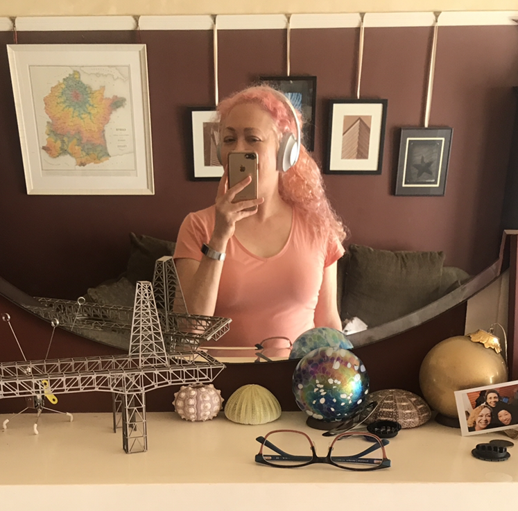
In March 2020, the pandemic ended professional salon hair color visits, and I was left to my own, not-fully-respectable devices. I noodled around a bit with gray, purple, and rose tints, some of which lasted a day, some of which stuck but didn’t stay true. I watched my roots grow out (and out, and out). I had to see my roots often, because I spent five hours daily on video calls for work, and I did not like what I saw. So, I decided to change direction. In August of 2020, I went pink, a color I had never seriously considered in the past. Pink hair. On ME, a middle-aged woman who showed visible signs of being cooped up indoors for too long. It seemed… unlikely to succeed.
And yet.
Pink hair inspired people to respond differently to me on video calls. They smiled more. They were more outgoing to me than they had been previously. When my employer was acquired, I met many people at the new parent company by video meeting, and it was fun to watch their faces change when my camera turned on. Yes, I was still a legal department representative, yes, we were going to discuss serious business, but their faces visibly brightened. The mood softened. They were professional, always, but also warmer than people usually are with legal department folks.
During the long, dark dread of the 2020 pandemic, that felt REALLY NICE.
2021 arrived, and as my hometown’s vaccination campaign succeeded and infection levels dropped, I left the house and learned that this cheerfulness toward me also happens in real life. Women say nice things to me every day I go out now. We don’t even need to be talking: I was smiling at a woman walking past with her dog, and she just said, “Yaaay, pink hair!” unexpectedly. I am awash in cheer and compliments, and it surprises me every time. It’s like I’m carrying a kitten on my head, or am dressed as a huggable mascot.
I’d already picked out my next color, but it won’t be as…soft, so perhaps I will stick with my friendly pastel pink (PINK! A color I didn’t own any clothes in until recently, and would not have been caught dead in during my youth!) for a while longer, so it can continue to soften my way as I readjust to the world.
Culture: Very French descriptions of colors
I write with fountain pens and colorful inks, and often check to see if there are new colors I could be enjoying. A favorite French brand, Herbin, as both lovely colors AND notable descriptions of those colors on their website.
Herbin Fountain Pen Inks | Bottled Fountain Pen Ink, Ink Cartridges, Scented Fountain Pen Inks
Herbin uses all natural dyes in their fountain pen inks. This natural composition is reflected in the very neutral pH of the inks.
What do I mean? There is a lovely brown called “Terre de feu.” It evokes certain volcanic islands south of Chile. And the English translation of the description says, “This brown ink has a red tone a reminder of the burnt lands and vast deserts where nothing ever grows.”
NOTHING EVER GROWS THERE. BUY THIS INK!!
I can’t resist that.
Or a dusty rose. “Bouquet d’antan (Bouquet of yesterday pink): It represents a bouquet that can be found at an elderly’s house.” It’s a lovely color (I will buy a bottle!), but it also sounds like someone is rebuking their grandmother for nostalgia, doesn’t it? Yes, it does, as the description continues: “The color is the symbol of nostalgia of the time that has gone by.” GET OVER IT, GRANDMÈRE!
I didn’t know there was a color for “grievance,” but there is, and who doesn’t want to emphasize their grievances with an appropriate color?? Grievance is a delicious shade of violet. Of course it is.
It’s as if I’ve discovered a new view of the world, and can now wander about, attributing attitude to all of the colors in my home. Me tomorrow morning: “This antique gold with a hint of green evokes a bitter, fading houseplant which rejects the window you have chosen in your new apartment. It will NOT forgive you. This flat was a mistake. Available in 25 ml or 10 ml travel size.”
Two fountain pen inks I take the greatest pleasure in writing with are from Herbin. They flow well, are well saturated with color, never feather on my preferred papers, flow smoothly, and don’t clog my pens.
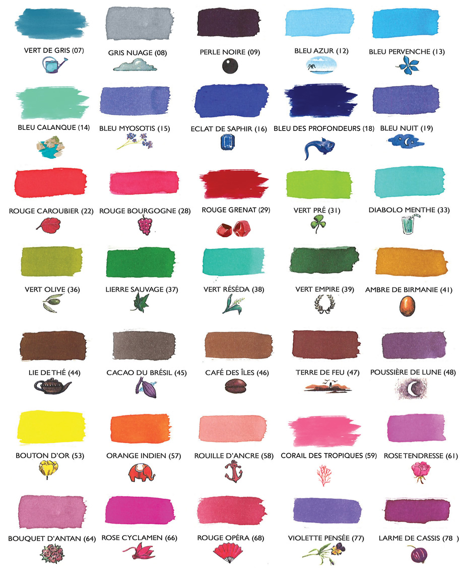
The colors I use regularly and love from Herbin: Poussiére de Lune (moondust, a rich violet); Vert Empire (a faded, velvety green); Rouge Grenat (a deep, pomegranate red); Corail des Tropiques (coral orange-pink, closer to Rouille D’Ancre than the color chart suggests; pleasantly legible, and as cheerful as a Caribbean beach vacation — now I’m really thinking this way); Emeraude de Chivor (turquoise-to-teal with bright red and metallic gold particles, which are only visible on less absorbent papers); and a new, tiny bottle of Bleu Myosotis (go read the description for that one!).
I also have a bottle of Herbin’s white calligraphy ink, which I use in a special pen on black paper, because: me. It offers good contrast, and handles well.
I’ve seen all the other fountain pen fanatic blogs, and I know I’m supposed to create a brilliant work of art with a watercolor brush AND write at least two major journal spreads in each of the colors I chose, plus provide a written specification of every tool in the room while I created it, describe what I had for lunch, and a provide an original recipe for that. Also, I must ensure that each color has its own separate blog entry. However, this just isn’t the day/week for that.
I understand the convention, so as a gesture of goodwill toward my fellow fanatics, I’ll share my own spontaneous, inept tribute to Emeraude de Chivor, because I can:
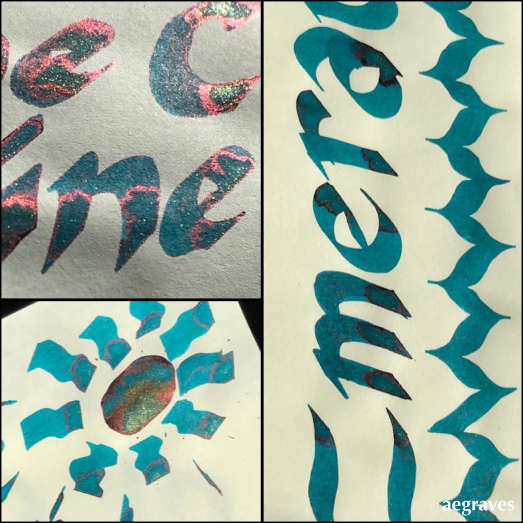
Example of me spontaneously going overboard in trying to pool Herbin’s Emeraude de Chivor drawn on Tomoe River cream-colored paper, in various bright or direct sunlight conditions. I went extra heavy with an oversized calligraphy pen to load up the paper so you can see the red and gold particles.
If/when I dedicate a post to this ink the way I use it most, I’ll use a fountain pen with a fat nib so you can see each inky letter outlined in the red and gold particles when dry. It’s quite an effect – all correspondence I’ve written with it generated questions about how I did this magic.
~~~
Related to the idea of fun with how colors are labeled, but not entirely on topic: AI generated names for paint colors from Janelle Shane:
New paint colors invented by neural network
So if you’ve ever picked out paint, you know that every infinitesimally different shade of blue, beige, and gray has its own descriptive, attractive name. Tuscan sunrise, blushing pear, Tradewind, etc… There are in fact people who invent these names for a living. But given that the human eye can see…
Book: Earth: Bernhard Edmaier Colors of the Earth
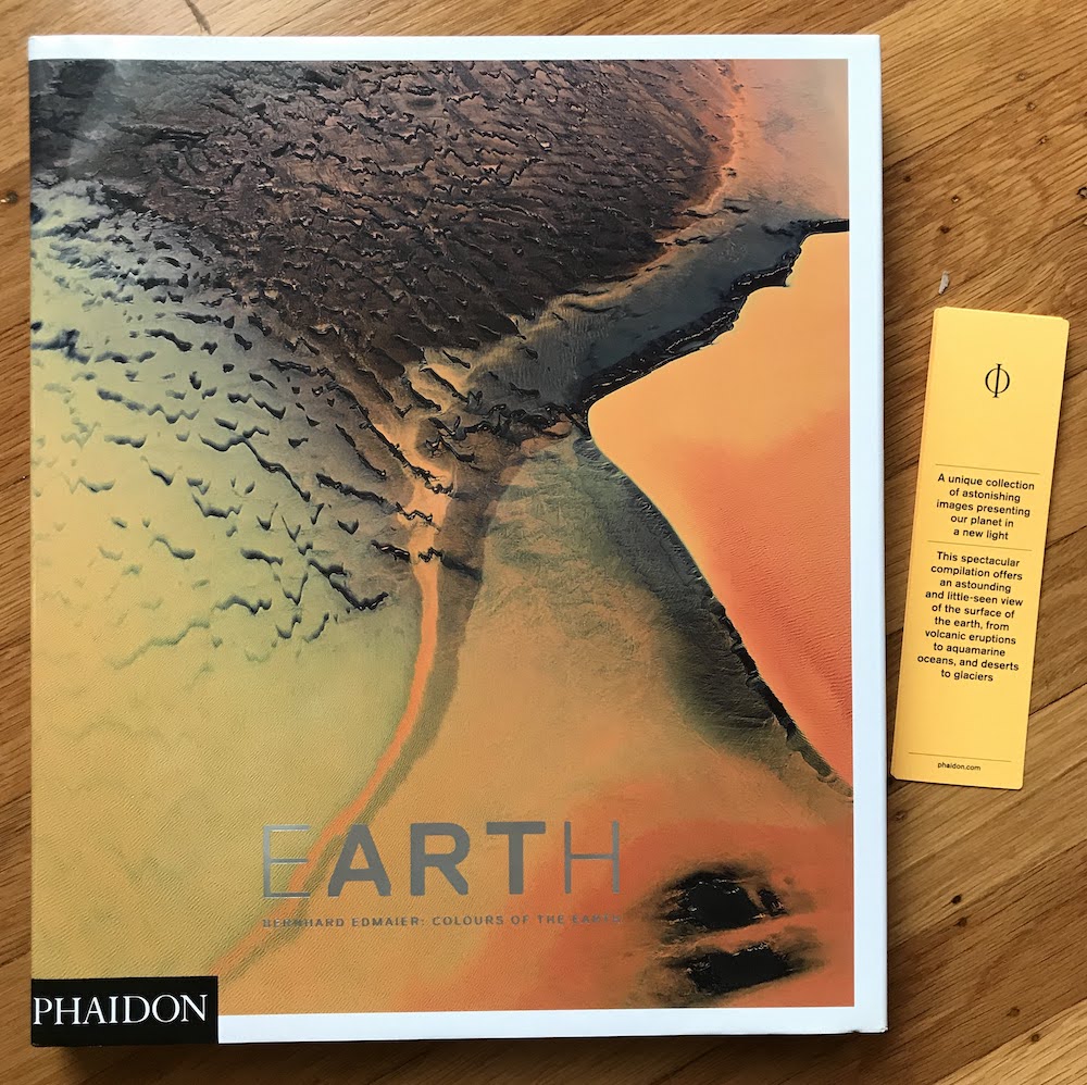
Earth: Bernhard Edmaier Colors of the Earth
by Bernhard Edmaier
published by Phaidon
2013
Edmaier’s aerial photography work is justifiably famous; Phaidon is my favorite photography book publisher; this oversized photography book combining what I appreciate about each is a fantastic work, especially for those of you who enjoy geology.
This book is FULL of geology. Geology which is composed beautifully and makes me think of the abstract paintings I am so fond of.
This isn’t JUST a book of beautiful photography which happens to be organized by color: it is also filled with scientific explanations for the colors and forms in the images. I hereby give a special shout out to iron oxide, for all the magic it does around the world!
Before you ask: OF COURSE there are images of volcanoes, volcanic cones, and LAVA. And oceans, and coral reefs, and icebergs that have just turned over and are glassy and clear, and glowing blue pools of meltwater, and…
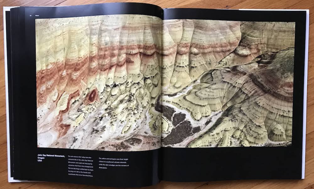
You’ll learn something new about how crystals or mountains formed; you’ll want to fly to remote islands and volcanoes to see their remarkable textures; you’ll have a new appreciation for all the colors a glacier can feature. My tiny, low-resolution teaser images won’t do this heavy, beautifully produced book justice, but I can say that I recommend it with great zeal.
You likely could have guessed this, but Bernhard Edmaier has a fantastic website, which reveals that he did study geology, and which features other books of his, some of which I don’t yet own. (Oh-oh.)
Enjoy the beauty of the natural world, and especially its geology, through the work of this talented photographer.