
I write with fountain pens and colorful inks, and often check to see if there are new colors I could be enjoying. A favorite French brand, Herbin, as both lovely colors AND notable descriptions of those colors on their website.
What do I mean? There is a lovely brown called “Terre de feu.” It evokes certain volcanic islands south of Chile. And the English translation of the description says, “This brown ink has a red tone a reminder of the burnt lands and vast deserts where nothing ever grows.”
NOTHING EVER GROWS THERE. BUY THIS INK!!
I can’t resist that.
Or a dusty rose. “Bouquet d’antan (Bouquet of yesterday pink): It represents a bouquet that can be found at an elderly’s house.” It’s a lovely color (I will buy a bottle!), but it also sounds like someone is rebuking their grandmother for nostalgia, doesn’t it? Yes, it does, as the description continues: “The color is the symbol of nostalgia of the time that has gone by.” GET OVER IT, GRANDMÈRE!
I didn’t know there was a color for “grievance,” but there is, and who doesn’t want to emphasize their grievances with an appropriate color?? Grievance is a delicious shade of violet. Of course it is.
It’s as if I’ve discovered a new view of the world, and can now wander about, attributing attitude to all of the colors in my home. Me tomorrow morning: “This antique gold with a hint of green evokes a bitter, fading houseplant which rejects the window you have chosen in your new apartment. It will NOT forgive you. This flat was a mistake. Available in 25 ml or 10 ml travel size.”
Two fountain pen inks I take the greatest pleasure in writing with are from Herbin. They flow well, are well saturated with color, never feather on my preferred papers, flow smoothly, and don’t clog my pens.
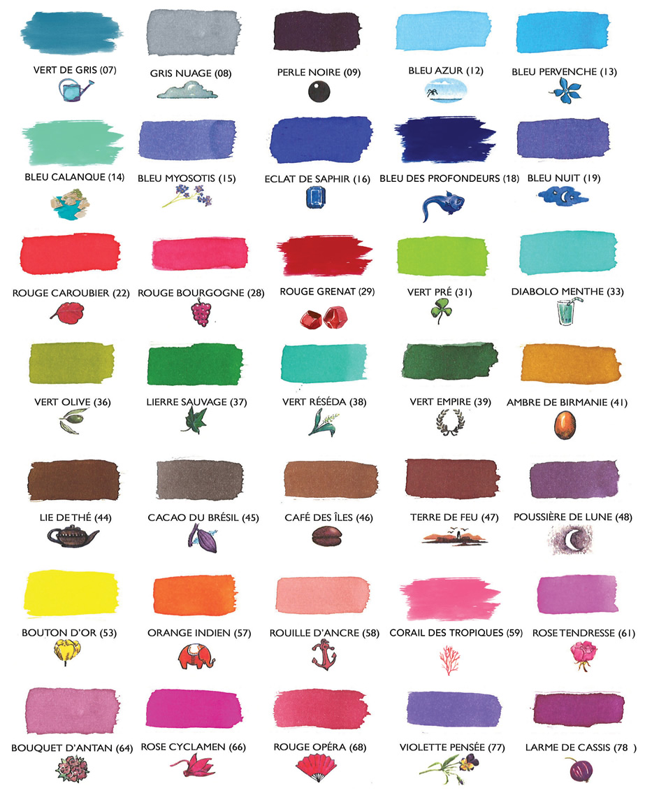
The colors I use regularly and love from Herbin: Poussiére de Lune (moondust, a rich violet); Vert Empire (a faded, velvety green); Rouge Grenat (a deep, pomegranate red); Corail des Tropiques (coral orange-pink, closer to Rouille D’Ancre than the color chart suggests; pleasantly legible, and as cheerful as a Caribbean beach vacation — now I’m really thinking this way); Emeraude de Chivor (turquoise-to-teal with bright red and metallic gold particles, which are only visible on less absorbent papers); and a new, tiny bottle of Bleu Myosotis (go read the description for that one!).
I also have a bottle of Herbin’s white calligraphy ink, which I use in a special pen on black paper, because: me. It offers good contrast, and handles well.
I’ve seen all the other fountain pen fanatic blogs, and I know I’m supposed to create a brilliant work of art with a watercolor brush AND write at least two major journal spreads in each of the colors I chose, plus provide a written specification of every tool in the room while I created it, describe what I had for lunch, and a provide an original recipe for that. Also, I must ensure that each color has its own separate blog entry. However, this just isn’t the day/week for that.
I understand the convention, so as a gesture of goodwill toward my fellow fanatics, I’ll share my own spontaneous, inept tribute to Emeraude de Chivor, because I can:
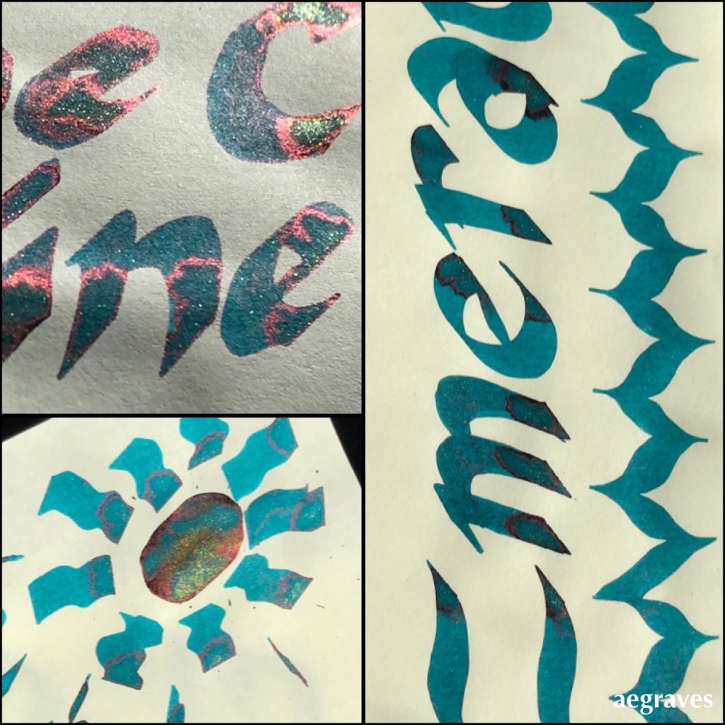
Example of me spontaneously going overboard in trying to pool Herbin’s Emeraude de Chivor drawn on Tomoe River cream-colored paper, in various bright or direct sunlight conditions. I went extra heavy with an oversized calligraphy pen to load up the paper so you can see the red and gold particles.
If/when I dedicate a post to this ink the way I use it most, I’ll use a fountain pen with a fat nib so you can see each inky letter outlined in the red and gold particles when dry. It’s quite an effect – all correspondence I’ve written with it generated questions about how I did this magic.
~~~
Related to the idea of fun with how colors are labeled, but not entirely on topic: AI generated names for paint colors from Janelle Shane: