Yes, I celebrated having time off my playing with paint, and it was deeply satisfying.
I learn so much every time.
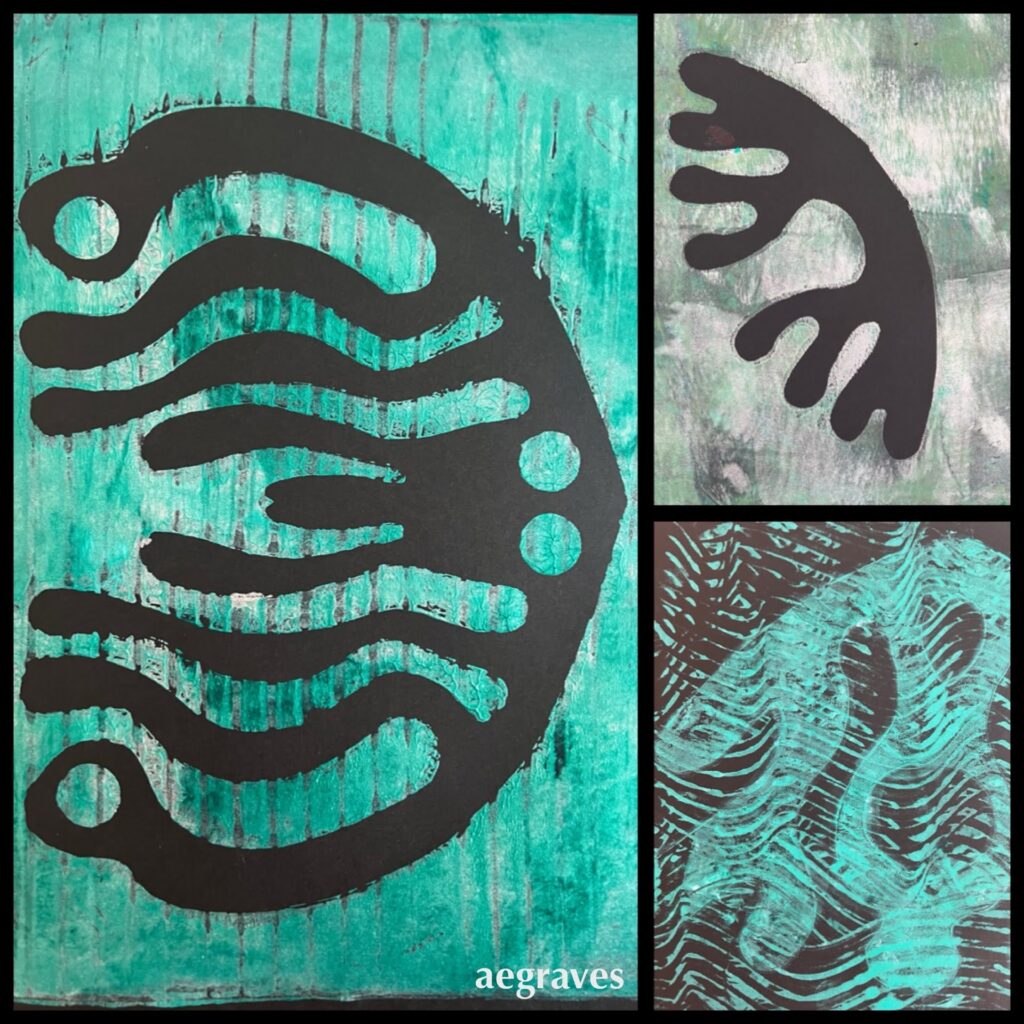
Also, I have an amazing collection of strange shapes I’ve cut by hand based on my own designs, which are covered with layers of paint, and which look great when compiled into albums, so I have fun with the materials beyond the experimental prints.
However, I have a smartphone photo blog, where I sometimes post photos of monotype prints. (Pretend that is meta.)
This is just a reminder that I post images at mobilelene.blogspot.com more frequently than I post book reviews and rambles about coffee here. I’ve been posting there since 2008 with my fancy new iPhone 1, exported my Google+ posts there (buggily) when that service shut down, and then kept on keeping on.
You may already know that I like skies, flowers, and buildings, but that blog provides PROOF.
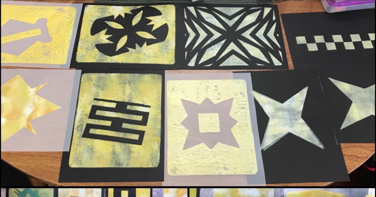
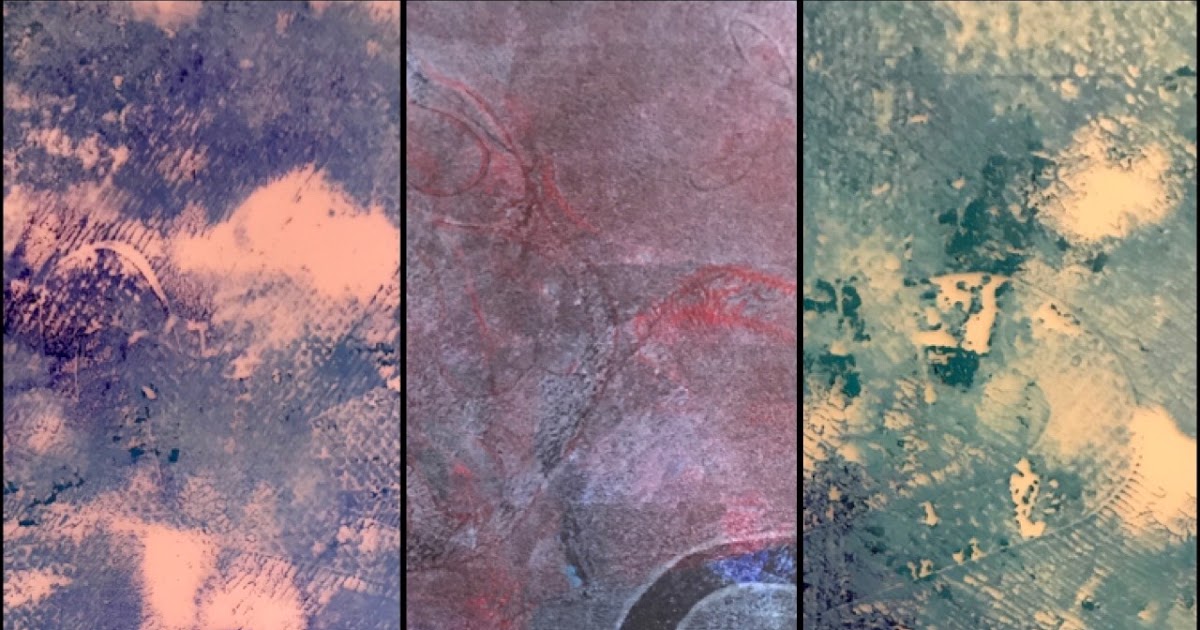
Monotype morning in yellow (31 January 2021)
Weblog by A. Elizabeth Graves. iPhone photography and links to science-y and foodie topics.
There are many ways to navigate Twitter, and I tend to have some geeky habits there. For example, I like this Ukiyo-e art bot which goes by @UkiyoeBot and posts items from ukiyo-e.org .
Weblog by A. Elizabeth Graves. iPhone photography and links to science-y and foodie topics.
I wasn’t as artistically productive as I wanted to be in 2020. While the pandemic kept me working from home for 10+ months, my job expanded to fill the time I’d reclaimed from my evening commute, and colleagues would ask for assistance regularly on nights and weekends. While there is plenty of work (my department has been notoriously understaffed), I suspect my colleagues also preferred to work constantly rather than read the same kind of pandemic news I’m reading too much of. Perhaps work was a shield against 2020’s damning news cycle.
“Doomscrolling” was my preferred method of coping – I like to keep informed AND look for patterns and solutions that may be useful – and my eyes tired from taking a break from one screen just to stare at another.
Also, angst about the election kept me from making the happy art I like to make. I can manage to find things I want to photography in just about any mood, but painting and printing require a lot more of my attitude and something closer to bravery, and I just haven’t had as much of that as I would like.
So: it’s nice to have made some acrylic monotype prints today, to have tried a new paper for this purpose, to have obtained interesting results, and to have learned something I can apply in the future. It brought me joy. We can all use more joy.
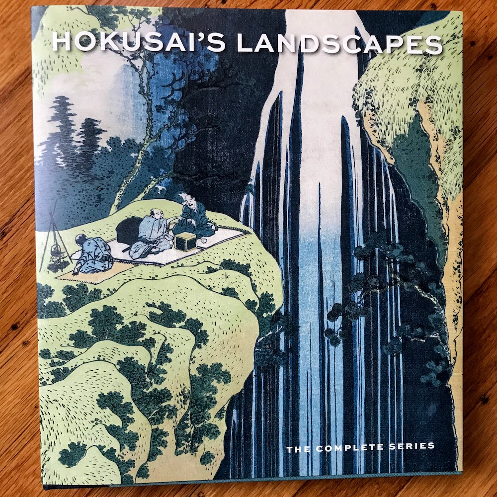
Hokusai’s Landscapes, the Complete Series by Sarah E. Thompson published by MFA Publications (The Museum of Fine Arts, Boston) 2019
Hokusai was a master of block printing, and he and his collaborators produced prints that extensively influenced the art world both within Japan and throughout Europe. This gorgeously produced hardcover book reproduces his famous collections, including the views of Mt. Fuji, famous bridges, and scenic waterfalls, along with gorgeous details and text that provides context for the locations the images are based on and explanations of the work frequently being performed in the scenes.
There are works dedicated to stops along historic pilgrimage trails, references to mountain-worship, works created to illustrate or allude to famous poems, and lovely blow-ups of details.
YES, he did more than one version of his famous wave!
YES, he did more than one version of Mt. Fuji in red light!
YES, he had a hazy, impractical idea of how large logs were sawn! But he really liked drawing that, and so you have to give him points for enthusiasm. He liked showing people at work generally, not just wealthy people lounging around, but people farming, gathering clams, washing fabric, and other ordinary tasks of daily working life. Even when someone fancy is present, there is always someone behind them, carrying their stuff!
I have multiple layers of interest in Hokusai’s work. I make prints of multiple types; I use Prussian Blue for much of my work (Prussian Blue is the color of cyanotypes!) ; I create some work in a series with grandiose names (I’ve got a set of acrylic ink & paint works in development since 2015 called One Thousand Abstract Thoughts, and the name may partly be Hokusai’s fault); and I am trying to understand how to document or commemorate specific places, or at least have a better grasp of how this was done prior to documentary photography.
I hadn’t seen all of the works in this collection before, and am thrilled to have it. The waterfalls and bridges are worth it – I’d seen so few of these!
Seeing more of his work organized in this way, I also can better distinguish what I like about Hokusai from other famous Japanese printmakers. Hokusai’s work has often appeared in collections / shows with other artists, including Hiroshige, who is similarly excellent but has a different compositional approach. (Hiroshige has more works that focus on specific details up-close, rather than these broad landscape and town scenes….)
This is a lovely book for fans who want to spend more time staring deeply into these well-designed and beautifully executed prints.
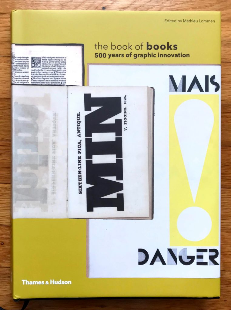
The Book of Books: 500 Years of Graphic Innovation edited by Mathieu Lommen published by Thames & Hudson 2012
I hand-sew and bind books, I read books, I buy books, I have books printed, I fill blank books, I collect books, I study books, I LOVE BOOKS! So it feels inevitable that I would find this book, which is about the printing technologies, fonts, and design of books, with an emphasis on Europe and/or printing that uses European alphabets.
This is a MASSIVE tome, and has reproductions of MANY books, with remarkable examples of everything from bibles to scientific texts to art books to books on how to break into castles. Which was apparently a really big thing. A thing that was important enough to buy books about. (My gift subscription to Castle Raider Monthly must have expired: I’ve been missing out.) If the term “siege engine” immediately came to mind, you win 500 Geek Points.
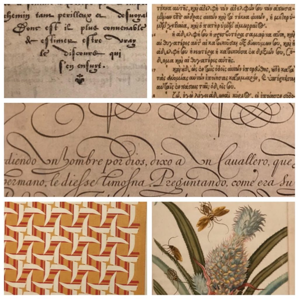
Collage of sample images from the Book of Books; older samples above, gorgeous Emigre image to the lower left, gorgeous Maria Merian image to the lower right.
The fonts are GORGEOUS. GORGEOUS! I would use some of them today! HOW DID WE EVER STOP USING SOME OF THESE!!! GAAAAAH! Sorry. I’ll pull myself together now. But really – such beauty! The folks who set this type, and who designed it – I hope they were lauded in their day!
Illustrated books and printing technologies are also discussed, and printing of this sort – etching and hand coloring and tipping in scientific illustrations – was once the key way to study sciences and the natural world in a time of limited travel opportunities. Books as a way to transmit key knowledge, not just as entertainment – that is so exciting!
After seeing remarkable samples of so many older works (going back to the late 1400s), thanks to the editor’s access to special collections in the Netherlands, I was beyond delighted that he extended all the way into the 2010s, and included the work of Emigre Fonts , an SF Bay Area-Local font foundry that arose with the Apple Macintosh back in 1984. The work of founders Rudy VanderLans and Zuzana Licko has always been impressive and presented brilliantly (in their magazines, catalogs, and in active use), so I was thrilled to see their inclusion here.
I’ve spent some quality time with this book, and there is so much in it, I need to return to it repeatedly to process all that I’ve seen. It’s quite a work!
(Yes, I also have the Parr & Badger Photobook history, all the volumes, since photo books are their own design challenge…)
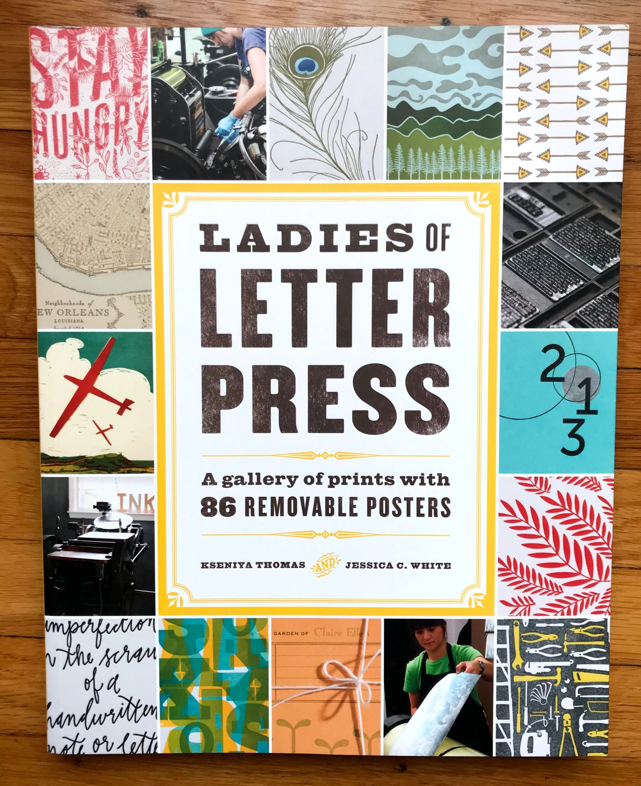
Ladies of Letterpress: A Gallery of Prints with 86 Removable Posters by Kseniya Thomas and Jessica C. White published by Princeton Architectural Press, NY 2015
This is a gorgeous, oversized publication showing off the work of passionate letterpress print makers, with large reproductions of their designs. From the embossed cover, to the beautiful, full-color reproductions on sturdy stock (perforated for removal and display!), this is a fantastic collection of both artist profiles and work samples across a large number of techniques.
It is a TREASURE.
I purchased this book from the always excellent San Francisco Center for the Book, where you can not only see samples of letterpress prints in real life, but can also learn to make them yourself!