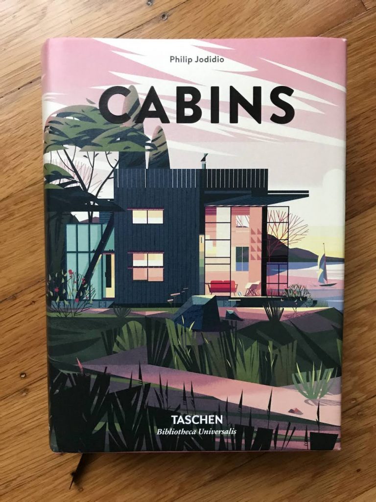
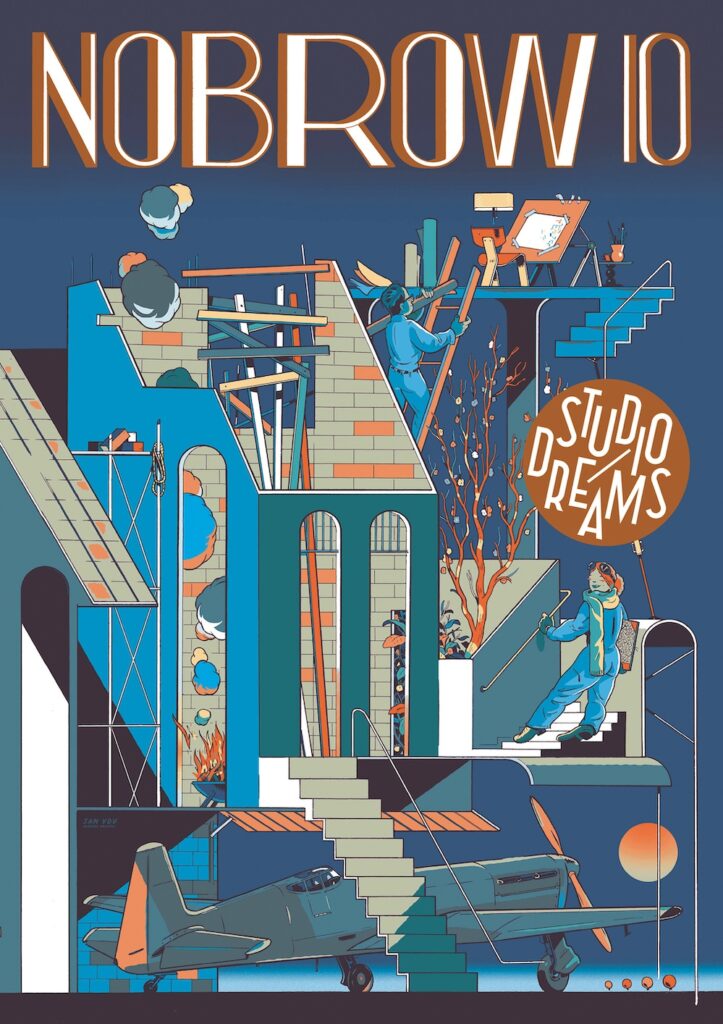
Book: Uncollected Works 2010 – 2021 by Mateusz Urbanowicz

Book: Uncollected Works 2010 – 2021
by Mateusz Urbanowicz
published by MdN corporation
2022

I’ve written enthusiastically about Urbanowicz’ Tokyo at Night book, and now I’m back for his book of drawings and paintings of Japanese scenes in different seasons and times of day.

These paintings show many types of structures, both traditional and modern, and have the same charm and attention to scale and detail that make Urbanowicz’ art so interesting. Unlike the store fronts, these are broader scenes and wider perspectives. (Yes, he works in anime also, and you can see how some of these could function as studies for both ordinary and extraordinary backgrounds for anime dramas.)

You can see scenes from the book at the artist’s website for this book:

I was happy to purchase this book at Kinokuniya (I can’t believe my SF store has already had a 50 year anniversary!), and appreciate Urbanowicz’ drawing styles, comments on watercolor pencils (I use them, so I laughed out loud), and the skill, sensitivity, and affection this artist has for his subjections.

If you loved Tokyo at Night, you might love this, too!

Book: Tokyo at Night by Mateusz Urbanowicz

Cover of Tokyo at Night, art book by Mateusz Urbanowicz

Tokyo at Night (translated Japanese title: Tokyo Night Train Works)
by Mateusz Urbanowicz
published by MdN Corp, Tokyo, Japan
2019

This is a beautiful book of NIGHT TIME contemporary, urban watercolors by a professional artist/illustrator for Japanese animation films. If you have ever wondered what animation artists do in their spare time, the answer is: they create MORE ART!

You may find this book review inevitable, between my fuss over ordering books from Kinokuniya Books in San Francisco, my background in architecture, and my appreciation of the background illustrations in Japanese anime I caught up on during the pandemic. Kinokuniya featured Urbanowicz’ other work, Tokyo Storefronts, prominently in its windows, and those are great, but night time watercolors are definitely within my special area of interest!

There is a lot to appreciate here.

First, Urbanowicz has some conflicted feelings about contemporary urban surfaces in Tokyo. There are a plenty of hyper-modern concrete facades, overhead wires, metal roll-up doors, overpasses, and other functional urban shapes, all of which are both a great visual challenge for an artist AND a sort of painful visual blight for someone who appreciates historic/traditional Japanese design more generally. I like that Urbanowicz embraces this hypermodern chaos, accepting it for what it offers visually, and sharing some of his feelings about it.

On a related note, Urbanowicz isn’t choosing beloved landmarks that would already have a warm place in your heart: he is choosing ordinary urban scenes that you wouldn’t ordinarily go out of your way to glorify. As so many people favor conventionally pretty, “popular” scenes to benefit from existing affection for a subject, I’m all the more impressed for his originality and effort to make remarkable work about ordinary locations.

As a professional illustrator, Urbanowicz takes a very practical approach to these works. He uses waterproof ink where that benefits the work; he uses opaque white paint when that creates an effect he wants; he uses masking fluid; he uses an airbrush when he wants to soften something. He uses watercolor for its strengths, and uses other tools when they contribute. He also revises compositions when the real life arrangement wouldn’t make a great image. He offers and illustrated guide near the end of the book to share his techniques, so we’ll appreciate the human effort that went into doing all this work by hand. It’s quite refreshing that he is so skilled with many tools, and isn’t unduly strict about single tool purity.

I’m especially impressed that he created all of this work on light paper. That required laying down a LOT of pigment, and he chose his materials and approach carefully, so that his washes remained clear and smooth. (My own washes get very grainy in unfortunate ways when I try to work this this kind of saturation, so I really appreciate his fantastic washes – I appreciate just knowing that this kind of saturation is possible!) Many painters render night scenes in opaque paints, especially oils, so seeing this work done in watercolor expands my idea of what is possible in watercolor.

This is an impressive and enjoyable book of great watercolors for fans of watercolor painting, hard-edged urban details, night scenes, Tokyo, Japanese urban environments, and any of Urbanowicz’ other work.

Book: Cabins by Philip Jodidio

Cabins
by Philip Jodidio
published by Taschen
2018

This hefty, dense, trilingual (English, German, and French) volume features extremely charming illustrations by Cruschiform (Marie-Laure Cruschi), great photos, consistent and clear floor plans (!gasp!), and outdoorsy-buildings, only some of which are cabins.

While the promotional text discusses rustic simplicity, and there are a few rugged/utilitarian structures, MOST of these aren’t modest buildings you could track mud into. I mean, there are some without heating, or that are only intended for seasonal use, but many are fully developed, large, contemporary homes for the well off.

I adore this “boathouse,” but we have boathouses in our public parks here in SF, and they are basically uninsulated garages for boats that are rusting and have bird poo on them. They don’t look like this:

This home by AR Design Studio in the UK is fantastic. Too fantastic for cabin-hood! It is a retreat from… another home on the property.

The design of the book is great – the illustrations are stylish, fun, colorful, and provide clear transitions between projects. The consistent floor plan graphics help explain how the buildings should work. The index is well organized, and the essay at the front is worth a read.

The projects themselves range from translucent structures that you can camp in, to wine country vacation homes, to buildings where you could live normally, to those that are better suited for ‘glamping’ (pretend glamour camping). There is at least one where I can imagine snowshoeing in from the edge of the property with a sled full of cocktail ingredients and catered food, though unpacking supplies in the immaculate kitchen that appears to have no food preparation tools of any kind would be daunting. 🙂

It’s difficult to tell what the criteria for SUCCESS in the design category is. The program for a cabin (a real cabin) is looser than one for a home, but that leaves their utility ambiguous. Are we snow camping, or are we entertaining? Can our older parents visit, or is it too difficult to access? Is it comfortable for a weekend only, or a week, or a month?

The structures that are fully furnished are easier to interpret – I know my parents could sit down without me having to bring furniture, so that’s great. Some bedrooms are completely filled by a bed. Why? Should you need to leave the bedroom to open a suitcase and dress? Should you need to climb a ladder into a loft to sleep? Does the enormous trap door in the floor without railings feel sketchy when you’re hauling in your supplies? Is a glass-enclosed bath a great idea if your parents are visiting for the weekend?

The client’s desires and goals for using the space are mentioned at various levels of detail, but without giving away too much, I’d love to have a scorecard to compare the programs on a practical level, considering the range of projects. Accessibility (how able-bodied do I need to be to get in, and how many stairs am I hauling supplies up), is there enough floor space to dress in the bedroom; is there enough light to read; is there space to draw/paint/write; is the temperature range comfortable in its intended seasons, is there any storage space for the outdoor gear you need to get there… This would be especially valuable because of the glossy architecture magazine convention of showing most of the spaces without human occupants, without normal personal possessions, and without any normal living functions being performed.

This is a fun collection to leaf through, and I do have at least one new Swedish island cabin getaway fantasy now, so I think this book has accomplished its mission.

Book: Maria Merian’s Butterflies by Kate Heard

Cover of Maria Merian's Butterflies

Maria Merian’s Butterflies
by Kate Heard
published by Royal Collection Trust
2016

I LOVE scientific illustrations – they are a glorious combination of art and science! I received a postcard with a gorgeous botanical illustration on it by Maria Sibylla Merian, and decided I needed to learn more.

This remarkable illustrator was born in 1647, and devoted her life to the study and documentation of insects, along with the plants they feed on. She became fascinated by insects at age 13, and studied them throughout the rest of her life. Her father and stepfather both made their living by painting; she taught young girls (including her daughters) to paint, and her painter husband (one of her stepfather’s former apprentices) helped her publish her first book on entomology of local (northern European) insects. After several complex life changes, she wound up selling most of her possessions and taking one of her daughters to a Dutch colony in Suriname to study insects in their natural environments. That trip provided the content that she developed into the publications that became her major life’s work, which were collected by scientific societies, royalty (which is how this book came to be published by the Royal Collection Trust), and wealthy amateurs.

It’s not ONLY that she was a remarkable observer, or that she could draw and paint: she also had to master printing arts to be able to sell editions of her work (printmaking is another skill set entirely), and business to sell different variations of the results at different price points (discounted advanced subscription prices, higher prices after publication; uncolored prints for one price, prints hand-colored by her and her daughters for a higher price, and painted variations on vellum for luxury editions…) . She also collaborated with a botanist to provide in depth information about the included plants.

While this little book is just about 6×8″, the printing is on heavy stock and of high quality. Not only are her plates shown in their entirety with their original titles, but there are many pages of details, so you can enjoy the precision and skill of both her drawing and coloring. It’s the color and detail excerpts that really pulled me in.

collage of details from Marian Merian's Butterflies

The book covers her early work, as well as her work in Surinam. (Note that, while she was born in Germany, she lived in Amsterdam, and the colony she visited was under the control of the Dutch at that time. There is a lot of discussion now about the meaning of the “Dutch Golden Age,” especially since so much of the wealth of Amsterdam was generated by exploitation (the death rate of Dutch sailors working for the Dutch East India Company was shockingly high), colonialism, and slavery. It’s good that this concept of whose hard work the country’s success was based upon is ongoing.)

The Royal Collection Trust has images of their copy of her book on Surinam, which I’ll link to here for your enjoyment:

Maria Sibylla Merian (1647-1717) – Metamorphosis insectorum Surinamensium

Maria Sibylla Merian travelled in 1699 with her younger daughter to Suriname in northern South America, to study the flora and fauna. The resulting natural history plates were published in Amsterdam in 1705, at her own expense.

I’m delighted with this book. I even inadvertently learned some things about moths! 🙂