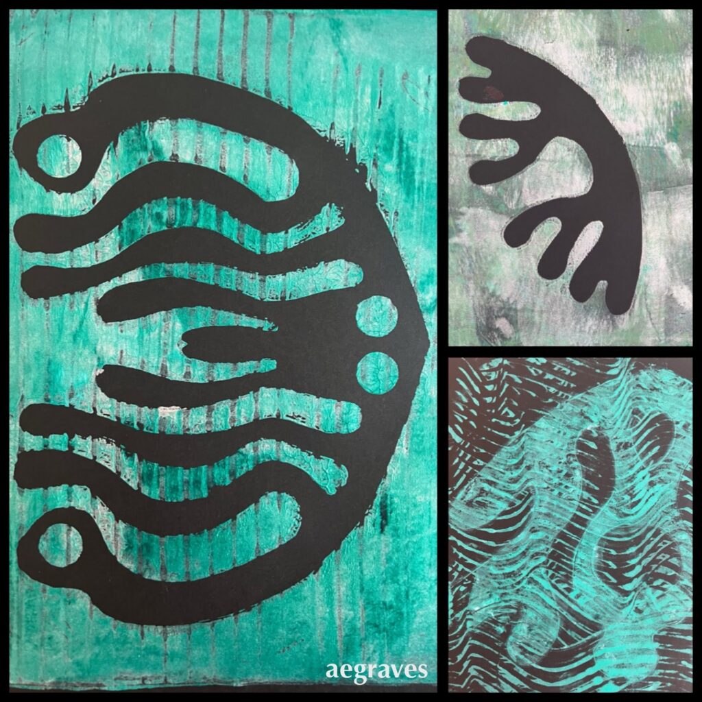
Life: I know you!

The streetcar that I almost-finished the watercolor study of passed me Monday evening, and I was all, “HEY!”

I felt rather… proprietary towards it. Friendly, but also with a sense of ownership.

Life: Managing Fear of (Watercolor) Failure

I sat down on the national holiday and made a little sketch to paint, and while it was harder than it should have been, it also wasn’t the end of the world. It isn’t finished – I need it to dry to glaze some sections that aren’t well defined – but it is recognizably the right general [vague hand-waving gesture] shape.

I could say this reminds me of going from being a swimming instructor with superb form to feeling like a brick dragging itself through the water with weak arms after many years of not swimming laps regularly. (A thing that happened to me.) But the difference is: I was actually good at swimming. (I practiced for years every summer weekday as a student, and kept practicing as a swimming teacher, so there was a least a decade of intensive swimming there, including recreational racing with others.). When I lost that ease in the water, I felt… wrong. Like I’d forgotten something important, and had ‘let myself go’ in a way that made me sad.

However, I was always a beginner-level painter, so I can’t pretend to be crushed at still being one now. I took up watercolor with enthusiasm back in college, but took too many classes, and had no time to play. Painting lost out in favor of manual drafting (a skill I was rewarded for as both a student and professional). (OMG, I am so old!) Watercolor back then was something great for “renderings,” which were hand-painted, intentionally pretty illustrations of what a building would look like in the future, to help clients visualize their project in flattering ways. Being a renderer was a professional speciality people paid extra for. Now that’s all done digitally, which means design projects by others made during my youth are going to wind up in museums, and people will be so impressed that people could once make such images without computers…

Ah, well. There are some watercolor projects I’d like to try, and yesterday’s sketch suggests I can chip away at my fears and work on them.

Some of my watercolor project ideas are mere fantasies: much like cafes with big windows and views of gardens, the IDEA of painting is a fantasy of leisure. Imagine, having time to paint! Imagine, painting often enough to be good at it! Imagine having time to drink good coffee and practice! I know what I’m like: I work too much, I see what these ideas of quiet painting time offer, and I understand why these projects are such a draw, even if my actual results are so basic.

Once I overcome my dread of being bad, painting allows me to enjoy the process of painting. The results are less important than the experience, in some ways. If the experience is pleasant, I will try again. Even if the results aren’t great, I am still able to sit still for a while and put paint on paper for a few hours, which is a joy.

Life: Watercolor paint (and fear of failure)

The last time I made a small watercolor painting, it turned out badly. Like the normal, totally well-adjusted person I am, I decided it turned out badly because I am a terrible painter, no matter how many decent paintings I produced in the past, and so I avoided watercolor painting for several years.

Most of this was based on a misunderstanding.

Back when I was a starving architecture school student, I could only buy small amounts of paint at a time. A tube of transparent watercolor here, another tube there, a lot of skilled mixing, and I could get by. I experimented and made some decent paintings with my mismatched tiny tubes, and I was happy.

My first FULL boxed set of watercolors YEARS later was Holbein’s Iródori Antique Watercolors. I had been a regular user of Holbein’s regular watercolors (they released colors that matched the landscape of my trips to Japan SO PERFECTLY!). I liked colors in traditional paintings, so I thought this was the right choice for me. Yet, my paintings with these colors all… lacked something. I blamed myself, put them away, and moved onto other things (including watercolor pencils, and a travel set of a different brand of watercolors, which I worked more effectively with). Years passed, I brought the set out again, painted a rather muddy painting of a Japanese scene form one of my own photos, blamed myself, and put them away again. I was already so familiar with Holbein, I couldn’t figure out why I’d become so RUSTY.

YouTube sorted me out. An artist with a shop called Hino Art Materials in Vietnam reviewed Holbein’s new sets of Iródori GOUACHE. Yes, Holbein re-relased the colors as OPAQUE watercolors, to giddiness from YouTube. She recommended not mixing these paints (they are very saturated, and muddy easily) and showed off a lovely gouache painting on a dark blue background. She showed off that some colors have been reformulated, but not all of them. Perhaps my existing set, even before this re-release, could be used like opaque paints?

So today, a precious day off work, I broke out BLACK WATERCOLOR PAPER (a thing that wasn’t available when I first purchased these paints so long ago) and white watercolor paper, and tested the paint out.

Two sheets of watercolor paper, one black, one white, with circles of Holbein Irodori watercolors painted upon them to show saturation and opacity.
Casual testing of Holbein Irodori Antique Watercolor on Clairefontaine mixed media black and Arches hot press white papers.

Oh, YES. So many of these colors are HIGHLY OPAQUE and look great on black paper. The great colors and saturation on white watercolor paper had fooled me! If only I’d had more experience with gouache when I purchased these, I could have put these to better use, and stuck to transparent colors for those other projects. Now that I understand their opacity, I can use them like gouache (and mix them with opaque white as needed when they need an opacity boost), and perhaps resist buying those French and German gouaches a bit longer… And actually get to enjoy these without fear of failure built in.

(Oh, that Antique Bronze Blue in particular is the color of the sky hours after sunset… I could USE that…)

Art: Monotype Printing

Collage of three silver-green abstract monotype prints on black paper, suggesting sea monsters, lichen, or antlers, by A.E. Graves

Yes, I celebrated having time off my playing with paint, and it was deeply satisfying.

I learn so much every time.

Also, I have an amazing collection of strange shapes I’ve cut by hand based on my own designs, which are covered with layers of paint, and which look great when compiled into albums, so I have fun with the materials beyond the experimental prints.

Book: The Neri Oxman Material Ecology Catalogue, edited by Emily Hall and Jennifer Liese

The Neri Oxman Material Ecology Catalogue
edited by Emily Hall and Jennifer Liese
published by The Museum of Modern Art, NY (MoMA)
2020

Art exhibitions are a special sort of book, and I was excited to obtain this one after having missed the exhibit at MoMA (because: COVID).

The curator’s essay notes that architecture has its movements and manifestos, and that Speculative Critical Design, which could include Oxman and her lab’s practice, “has featured earnest but inconsequential exercises and clichéd storytelling,” which could honestly be a summary of nearly every architectural movement/manifesto (I could stop the sentence here) that hasn’t delivered a robust body of work. Oxman’s written philosophical content can provide insights, but appears intended to produce a shell of theory for the practical purposes of funding an experimental practice. You can gloss over it, admire the design of the catalog itself (modeled in tribute to Stuart Brand’s Whole Earth Catalog), and then look at the interesting experiments and models that Oxman and her teams have produced.

Oxman produces attractive art objects that show off the potential of experimental, available natural materials. To utilize these materials, different fabrication methods involving both showy robots and insects are attractively documented, so that the processes behind the forming of materials is clear.

There is a tiny caption in an image “the shellfish industry produces more than 1 million tons of chitin-based waste per year,” and suddenly the context of the many forms and pieces involving chitin is clear. We have abundant supplies of materials that are the byproduct of other industries, which could offer opportunities to escape our petroleum and plastic-based problems.

The emphases on responsible material use, experimental manufacturing, and artistically documented processes interest and please me. Displays of models and experiments charm me (in a way similar to Studio Olafur Eliasson’s geometric model shop), though these models often have forms suggesting industrious insects made them, or perhaps volcanic springs formed them over time – and I mean that as a compliment. There are a few pieces that aren’t as tightly conceptualized to appeal to me (the death masks, for example), but the results are attractive, and they aren’t here to please me alone, so I won’t complain.

This is an attractive, well-designed catalog that shows off intelligent and attractive materials engineering experiments. I appreciate Oxman’s innovative work and overall practice, which is very STEAMY (in the putting the Art back into STEM way).

Book: Rag & Pulp: Creativity with Paper, edited by Correy Baldwin

Cover of Rag & Pulp book from Uppercase Publishing: one of five covers

Rag & Pulp: Creativity with Paper
By Correy Baldwin
Published by Uppercase Publishing, Inc., Calgary, Alberta, Canada
2023

Janine Vangool does many things well at Uppercase, and one of those is providing a video previewing every page of this book on here on this overview page! You know EXACTLY what you are getting before you order it! There are also non-video image spreads to show off selected contents. Go have a look.

This is a beautiful and hefty compilation of artist and manufacturer profiles relating to paper.

Paper sculptors, artists, watercolor paper manufacturers, paper cutters from multiple cultures (papel picado and Asian/international techniques), wet paper oragami artists, African paper bead makers, paper felt painters who form paper from poured colored fiber slurry… While I own multiple books about paper arts, this one has a greater breadth – famous and not famous, industrial and artisanal, Awagami Paper AND lone papermakers – and each profile is longer and more heavily illustrated than in most other such books, providing a better sense of each participant’s product range and/or creative practice. The caliber of the participants is high, and the range of content is impressive.

This is a very professionally produced collection of profiles, and I (a person who has visited paper-making museums in multiple countries!) enjoyed it very much.

Art: Indigo Cotton Handmade Book – progress

four image spreads of an open, oversized indigo-painted book, featuring freehand illustrations in black and white acrylic ink by A.E. Graves

I addition to reading and writing books, I also DRAW in blank books.

The Topdrawer shop (topdrawershop.com), a subsidiary of Japan’s delightful Itoya brand, has been carrying these handmade, 100% cotton rag paper notebooks from Lamali for a while. They are deckle-edged (meaning you can see how the fibers filled out the frame, untrimmed) and have a nearly crispy texture. The indigo version of the book has indigo-painted pages, and there is something appealing about being able to see the brushmarks, which have a lot of character and variation.

I finally purchased an oversized notebook, and have been filling its pages with abstract acrylic ink drawings. The paper appears to be heavily sized, so my acrylic ink sits on the surface nicely without bleeding or feathering. the contrast is good. The textured surface is hard on the pen tips, but this is why I have replacement pen tips!

Any day I sit and enjoy drawing in this notebook with my markers is a good day.

Book: Uncollected Works 2010 – 2021 by Mateusz Urbanowicz

Book: Uncollected Works 2010 – 2021
by Mateusz Urbanowicz
published by MdN corporation
2022

I’ve written enthusiastically about Urbanowicz’ Tokyo at Night book, and now I’m back for his book of drawings and paintings of Japanese scenes in different seasons and times of day.

These paintings show many types of structures, both traditional and modern, and have the same charm and attention to scale and detail that make Urbanowicz’ art so interesting. Unlike the store fronts, these are broader scenes and wider perspectives. (Yes, he works in anime also, and you can see how some of these could function as studies for both ordinary and extraordinary backgrounds for anime dramas.)

You can see scenes from the book at the artist’s website for this book:

I was happy to purchase this book at Kinokuniya (I can’t believe my SF store has already had a 50 year anniversary!), and appreciate Urbanowicz’ drawing styles, comments on watercolor pencils (I use them, so I laughed out loud), and the skill, sensitivity, and affection this artist has for his subjections.

If you loved Tokyo at Night, you might love this, too!

Art: Drawing practice (for paint cravings)

A collage of recent sketches of boats I’ve seen in recent months, after a long break from drawing

I AM DRAWING – BY HAND! ON PAPER! It has been a while since I’ve done this… I drew often in childhood, and regularly sketched for architecture school in my late teens and early 20s, but after leaving architecture professionally, I stopped drawing regularly. Drawing is slow and thoughtful, and I have too often struggled with long hours and demanding work – drawing felt like something I didn’t have time for. Photography, especially once I started carrying a small camera in my purse, was more accessible – and FASTER. Drawing fell by the wayside, a cost of my non-creative profession.

I never gave up drawing entirely: I still enjoy drawing in flurries, especially when I want to really take my time to enjoy studying things. I’ll take a new sketchbook to a museum, sketch sculptures for a day or two, and then set it aside until the mood strikes again.

I’m drawing again this month, because I’ve been suffering from paint lust. In my fantasies, I’m about to make a series of really great gouache representational paintings, and I’ll need to lay out some great drawings and buy some gouache to make this happen. This is an outrageous fantasy: I have been making primarily abstract (non-representational) drawings and paintings since 2012, so I am out of practice in representational (representing the shape of real world things) drawing. Plus, I have never been IN practice with gouache: I have just one, small notebook with abstract or patterned gouache multimedia sketches.

This fantasy is grandiose, and so I’m putting conditions on it, such as: I can’t buy gouache until I make a representational gouache painting with my existing little set of 5 colors FIRST.

And I can’t make a representational painting without a drawing to guide me, and so this is why the sketches at the top of the page exist. I need the practice. Badly. This is a fun prerequisite, even if I am clumsy and using a museum-gift-shop pencil with multiple leads.

*

There is more to this plan: I can’t just buy any paint, because gouache paintings are delicate (there is no natural seal against moisture, abrasion, or UV light, like traditionally varnished oils or acrylics have), and I insist on using permanent, artist-grade paints. Gouache has often been used for commercial art with a short lifespan, and so many colorful gouaches aren’t made with stable, long-lasting pigments.

I’ve done my research, ruled out familiar brands with unstable pigments, and have a surprise choice in mind (German!?!), but… I don’t want to write about that until I’m actually painting with that product. So, hopefully I’ll get some more drawings in, and knock out at least one cheerful little painting before money flies out of my wallet for this.

Book: Blue Territory: a Meditation on the Life and art of Joan Mitchell by Robin Lippincott

Image from the SFMoMA shop

Blue Territory: a Meditation on the Life and art of Joan Mitchell
by Robin Lippincott
published by Tidal Press
2015

This is an artist’s biography, but not a traditional one. It does a great job of describing the life of Joan Mitchell, the abstract expressionist painter who spent many of her later years working in Paris while showing in the U.S.

Rather than a list of facts and documents, this biography reads like an oral history, told by a friend who was a big fan of Mitchell’s, who is sharing quotes and interpretations of pivotal phases of Mitchell’s life. It’s fluid, like fiction, as if Lippincott was walking down Paris streets with her and is remembering the mood and the color of the light in between snippets of paraphrased conversation and quotes from interviews.

It isn’t the biography I expected: it was more fun, like having a biography interpreted by a poetic friend.