Janine Vangool does many things well at Uppercase, and one of those is providing a video previewing every page of this book on here on this overview page! You know EXACTLY what you are getting before you order it! There are also non-video image spreads to show off selected contents. Go have a look.
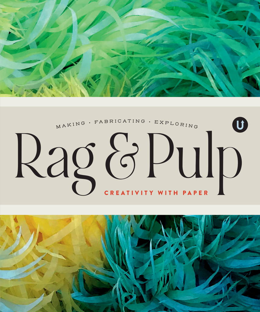
This is a beautiful and hefty compilation of artist and manufacturer profiles relating to paper.
Paper sculptors, artists, watercolor paper manufacturers, paper cutters from multiple cultures (papel picado and Asian/international techniques), wet paper oragami artists, African paper bead makers, paper felt painters who form paper from poured colored fiber slurry… While I own multiple books about paper arts, this one has a greater breadth – famous and not famous, industrial and artisanal, Awagami Paper AND lone papermakers – and each profile is longer and more heavily illustrated than in most other such books, providing a better sense of each participant’s product range and/or creative practice. The caliber of the participants is high, and the range of content is impressive.
This is a very professionally produced collection of profiles, and I (a person who has visited paper-making museums in multiple countries!) enjoyed it very much.
I addition to reading and writing books, I also DRAW in blank books.
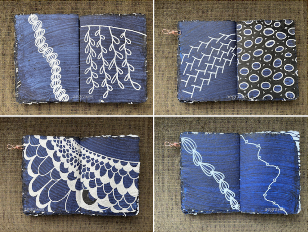
The Topdrawer shop (topdrawershop.com), a subsidiary of Japan’s delightful Itoya brand, has been carrying these handmade, 100% cotton rag paper notebooks from Lamali for a while. They are deckle-edged (meaning you can see how the fibers filled out the frame, untrimmed) and have a nearly crispy texture. The indigo version of the book has indigo-painted pages, and there is something appealing about being able to see the brushmarks, which have a lot of character and variation.
I finally purchased an oversized notebook, and have been filling its pages with abstract acrylic ink drawings. The paper appears to be heavily sized, so my acrylic ink sits on the surface nicely without bleeding or feathering. the contrast is good. The textured surface is hard on the pen tips, but this is why I have replacement pen tips!
Any day I sit and enjoy drawing in this notebook with my markers is a good day.
These paintings show many types of structures, both traditional and modern, and have the same charm and attention to scale and detail that make Urbanowicz’ art so interesting. Unlike the store fronts, these are broader scenes and wider perspectives. (Yes, he works in anime also, and you can see how some of these could function as studies for both ordinary and extraordinary backgrounds for anime dramas.)
You can see scenes from the book at the artist’s website for this book:
“Okuradashi 2010-2021”「お蔵出し」 · Mateusz Urbanowicz
Home website of Mateusz Urbanowicz; artist, creator working in Japan.
I was happy to purchase this book at Kinokuniya (I can’t believe my SF store has already had a 50 year anniversary!), and appreciate Urbanowicz’ drawing styles, comments on watercolor pencils (I use them, so I laughed out loud), and the skill, sensitivity, and affection this artist has for his subjections.
If you loved Tokyo at Night, you might love this, too!
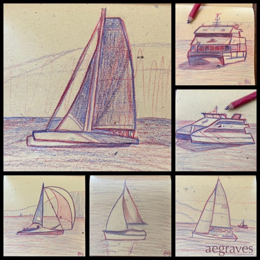
A collage of recent sketches of boats I’ve seen in recent months, after a long break from drawing
I AM DRAWING – BY HAND! ON PAPER! It has been a while since I’ve done this… I drew often in childhood, and regularly sketched for architecture school in my late teens and early 20s, but after leaving architecture professionally, I stopped drawing regularly. Drawing is slow and thoughtful, and I have too often struggled with long hours and demanding work – drawing felt like something I didn’t have time for. Photography, especially once I started carrying a small camera in my purse, was more accessible – and FASTER. Drawing fell by the wayside, a cost of my non-creative profession.
I never gave up drawing entirely: I still enjoy drawing in flurries, especially when I want to really take my time to enjoy studying things. I’ll take a new sketchbook to a museum, sketch sculptures for a day or two, and then set it aside until the mood strikes again.
I’m drawing again this month, because I’ve been suffering from paint lust. In my fantasies, I’m about to make a series of really great gouache representational paintings, and I’ll need to lay out some great drawings and buy some gouache to make this happen. This is an outrageous fantasy: I have been making primarily abstract (non-representational) drawings and paintings since 2012, so I am out of practice in representational (representing the shape of real world things) drawing. Plus, I have never been IN practice with gouache: I have just one, small notebook with abstract or patterned gouache multimedia sketches.
This fantasy is grandiose, and so I’m putting conditions on it, such as: I can’t buy gouache until I make a representational gouache painting with my existing little set of 5 colors FIRST.
And I can’t make a representational painting without a drawing to guide me, and so this is why the sketches at the top of the page exist. I need the practice. Badly. This is a fun prerequisite, even if I am clumsy and using a museum-gift-shop pencil with multiple leads.
*
There is more to this plan: I can’t just buy any paint, because gouache paintings are delicate (there is no natural seal against moisture, abrasion, or UV light, like traditionally varnished oils or acrylics have), and I insist on using permanent, artist-grade paints. Gouache has often been used for commercial art with a short lifespan, and so many colorful gouaches aren’t made with stable, long-lasting pigments.
I’ve done my research, ruled out familiar brands with unstable pigments, and have a surprise choice in mind (German!?!), but… I don’t want to write about that until I’m actually painting with that product. So, hopefully I’ll get some more drawings in, and knock out at least one cheerful little painting before money flies out of my wallet for this.
Blue Territory: a Meditation on the Life and art of Joan Mitchell by Robin Lippincott published by Tidal Press 2015
This is an artist’s biography, but not a traditional one. It does a great job of describing the life of Joan Mitchell, the abstract expressionist painter who spent many of her later years working in Paris while showing in the U.S.
Rather than a list of facts and documents, this biography reads like an oral history, told by a friend who was a big fan of Mitchell’s, who is sharing quotes and interpretations of pivotal phases of Mitchell’s life. It’s fluid, like fiction, as if Lippincott was walking down Paris streets with her and is remembering the mood and the color of the light in between snippets of paraphrased conversation and quotes from interviews.
It isn’t the biography I expected: it was more fun, like having a biography interpreted by a poetic friend.
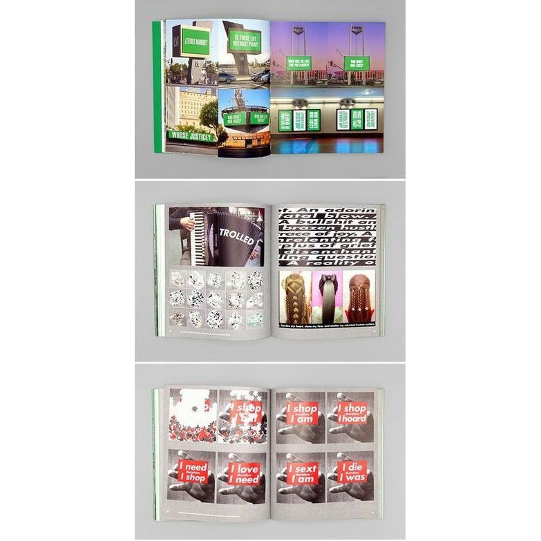
Barbara Kruger’s retrospective has been calling to me from afar, and I was able to buy the book to read up in advance of seeing it!
Kruger’s most famous past works are widely recognized for their iconic consistency: a bold, black and white image with direct, engaging, nearly accusing Future Bold Oblique text on a high-contrast (often red) background. (I can just say, “Your Body is a Battlefield,” and the image will pop into your head!) She’s done much more with words, and I’ve had the pleasure of exploring a room wrapped in her power-questioning, engaging, accusatory texts.
This book features a significant amount of engaging, unsurprisingly bold, unsurprisingly relevant new works by Kruger, plus excellent essays about her and the ongoing relevance of the questions her work asks. Her work quotes Orwell, mocks the powerful, and challenges our willingness to be reduced from active citizens to consumers. The essays approach her challenges to us from different angles, quote James Baldwin, ask about our tendencies to judge, discuss empathy and contempt, and are thoughtful throughout.
The collection of recent work includes long walls/rooms of text, and it’s great to have them in book form to be able to take the time to read them all the way through.
It also comes with homework! There’s a collection of essays at the end which are presented as a sort of “syllabus” to the lessons we could be learning from all of this.
It’s a great book – not just in content, but also in form! The covers are boldly printed book-board with a printed fabric spine, and all the fore-edges are painted the same green as her work (and the x’s on the cover). I appreciate the boldness of the design.
I have been on an acrylic monotype bender this year, but I hope to return to watercolor painting again. I do it in flurries, and I’m overdue for a return.
I use transparent Japanese, Holbein brand tube watercolors (primarily: I also like a French brand); Swiss watercolor pencils and crayons; and I have a German travel set of watercolors I bought at a museum in Switzerland on one of my last trips there, but haven’t used much since. I also have a tiny mixing set of Holbein’s opaque gouache, which I love, and can mix just about any color I need from. I’ve gone through multiple tubes of it, and love its dense color.
I have enough supplies. Probably. I’m always missing a shade of green or blue that can’t be mixed, but I surely have enough.
Anyway, there’s a type of Japanese watercolor that I (somehow) do not have. It had escaped me, because we call several things “watercolor” in English, but they have different names there.
The paint is called gansai. It is often mineral based, opaque, and generally not vegetarian in composition, commonly using animal skin binders. I wanted to know more about it, to see if a vegetarian version is available, and to know if it offers colors I don’t already have in the only big set of paints I’ve ever bought, which is a set of Holbein’s “antique” Japanese colors.
Does Holbein offer a gansai range?Yes! But only in Japan: the product isn’t available through their US distributor. Also, they don’t address my animal ingredient concern, so I may need to ask.
Is it similar in color range to Holbein Irodori Antique Watercolors? Well, this was a hard question, because that set is no longer listed on the Holbein sites. Why? It has been replaced with a full line of Holbein Irodori GOUACHES!
Irodori
The NEW Holbein Artist’s Gouache, Traditional Colors of Japan Irodori Series of opaque watercolor allows the user to experience the rich beauty and delicate expressions that the four seasons of Japan bring to mind during spring, summer, autumn and winter.
[insert sound of me, a gouache lover, losing my mind]
Oh oh oh oh oh… I need to know more about this, and found an Irodori fan who runs her own art supply shop in Hanoi to share her insights:
Knowing that I already love gouache complicates my research into gansai… Though it’s not like a huge box of tubes and all the related equipment is very portable, and I was looking for something portable in this instance. (During my business travels, I used the portable tools and got satisfactory results. While I’m at home, the bulky tube paints give me better results, but require more space and equipment. Since I created work while traveling to justify that purchase, this means I can justify having both! 😀 )
So, setting aside how gorgeous the gouache looks (though there are only a few colors that I feel I can’t go on without in that new line), I chose to go back to research gansai.
Did I see other magical things during this research? Oh, goodness yes. Tons of tours of various art supply shops in Japan, plus this gem on one VERY SPECIAL art supply store:
A New Japanese Painting Supply Store Lines its Walls With 4,200 Different Pigments
Thousands of pigments fill glass vials below the slatted wood ceilings of the new concept Pigment, an art supply laboratory and store that just opened in Tokyo by company Warehouse TERRADA. The store design was created by architect Kengo Kuma, utilizing bamboo and large open spaces to create a sense
My mind is filled with colorful paint fantasies now… I’ll try not to talk about paint again until I show you something I’ve made with it.
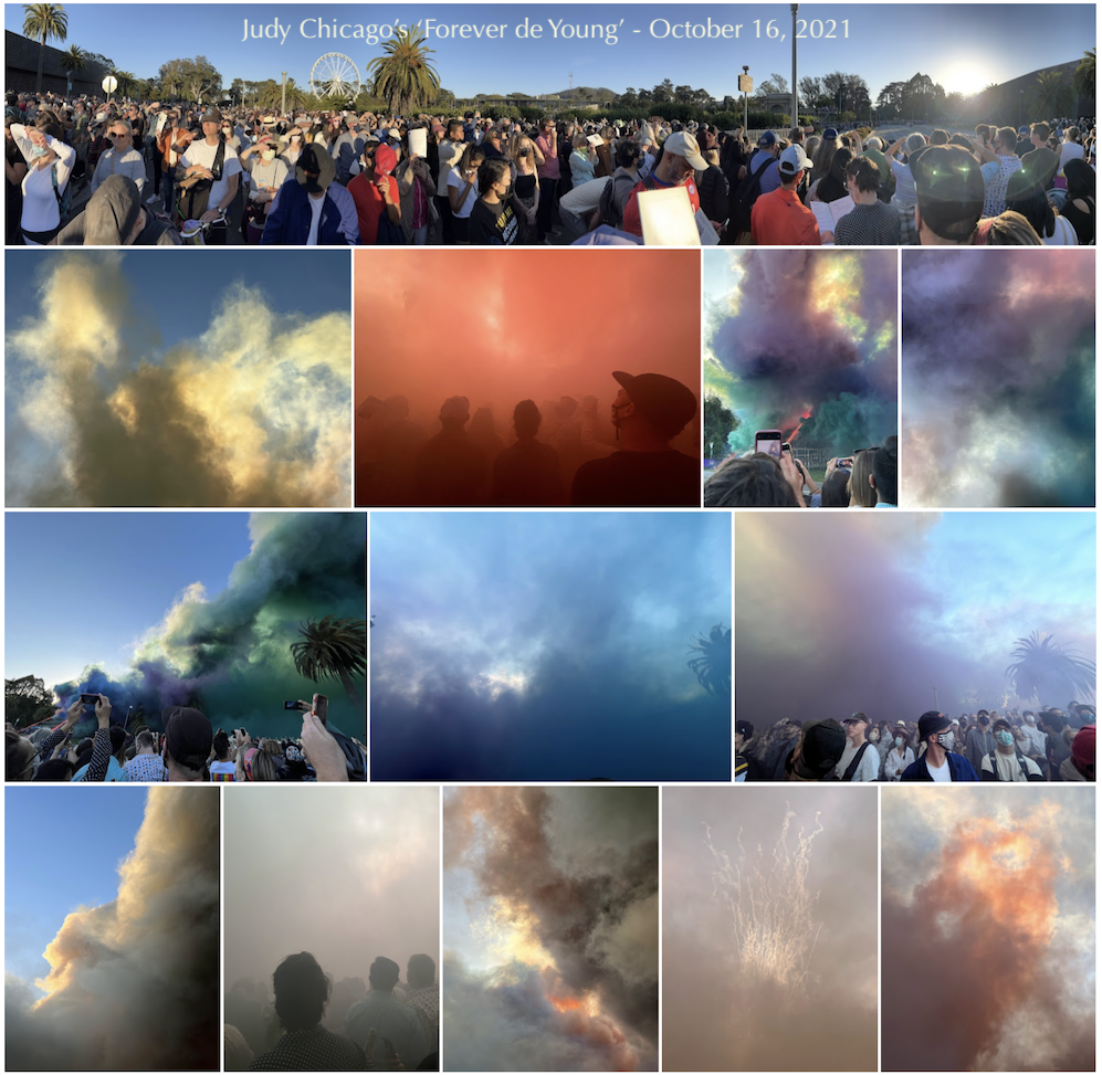
Yes, I did choose a viewing spot downwind of the performance. I REGRET NOTHING!
I always marvel at how lucky I am to live in San Francisco. While taking long walks with friends, I often say aloud that we are extraordinarily lucky to live here, in such a beautiful city, with such a vibrant and creative and international population, mild weather year round, and the remarkable influence of the bay and our famous fog.
October 16th was one of those days that inspires outbursts of gratitude, not only because the weather was warm and mild, but also because I also got to participate with friends in an ART EXPERIENCE! The brilliant Judy Chicago performed one of her Atmospheres installations: a gorgeous, colored smoke performance of vast size, here for the public in San Francisco’s Golden Gate Park.
IT WAS FANTASTIC.
It’s not every day I come home starry-eyed and reeking of gunpowder, but this was one of those days!
The de Young live-streamed the event, and packaged it with a great overview of the exhibit. It’s a GREAT use of video, and I want to compel everyone I know to see it (giving me a moment’s overlap with the sort of zeal religious missionaries possess, which is a funny feeling).
It was gorgeous; it allowed me to follow my habit of photographing other people while they photograph; it was great to see so many people so excited about an art event; it was pleasant to participate in a masked group activity outdoors; my phone is filled with abstract colors and texts from the friend who participated with me; I left completely delighted.
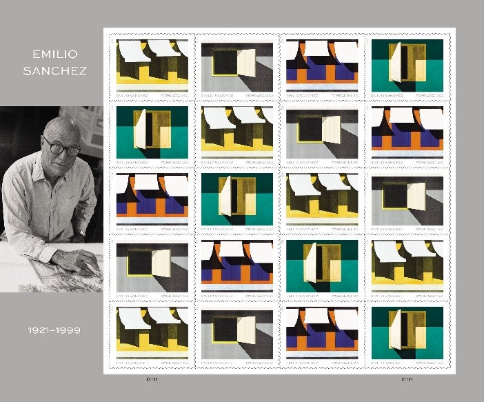
The paintings read well at stamp size (and the stamps are generously sized, which I appreciate!), and are even better at oversized postcard size. The oversized postcards are printed on surprisingly sturdy card stock – I feel confident they’ll travel well, even to my international pen friends. The colors are great – rich and deep – with a matte finish.
Sanchez’s work is a great choice for postal products, and I’m sure the recipients of my mail will enjoy and appreciate these cards and stamps.
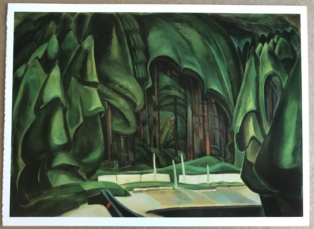
I’m sending art postcards, and just prepared to mail Old-Time Coast Village by Emily Carr, and… it’s just so GOOD! The way she shapes the forest, so the canopy looks solid, or like a blanket… it’s just WONDERFUL. Dark, mysterious, fresh, and wonderful.
The Vancouver Art Gallery’s website is down, so I’ll link to it (expecting it to return?), but also share a thumbnail of the card:
Postcard of Old-Time Coast Village by Emily Carr. Hopefully the Vancouver Art Gallery website will be restored, so you can look at their Emily Carr collection. I LOVE LOVE LOVE her work!
Vancouver Art Gallery – Emily Carr – Old Time Coast Village
The largest, most comprehensive website on the artist Emily Carr. Searchable database of artworks, biographical and contextual texts, and educational resources for teachers and students. Old Time Coast Village, oil on canvas, 1929 – 1930, Collection of the Vancouver Art Gallery, Emily Carr Trust