I bought the Diamine Inkvent Black Edition for 2024, an advent calendar in which each little window contains a bottle of ink. Each year Diamine invents new colors, releases them this way, and then produces full-sized glass bottles later. This is my second year of purchasing the set. Prior years were impressive and produced two of my favorite sheening inks (Polar Glow and Holly), and so the series has high expectations to live up to.
This year’s set is influenced by the popularity of very muted colors (mostly coming from Asia – muted pastel grays and browns especially), colorful particulate glittering inks, plus a few sheening inks.
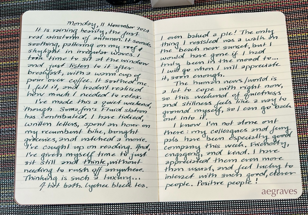
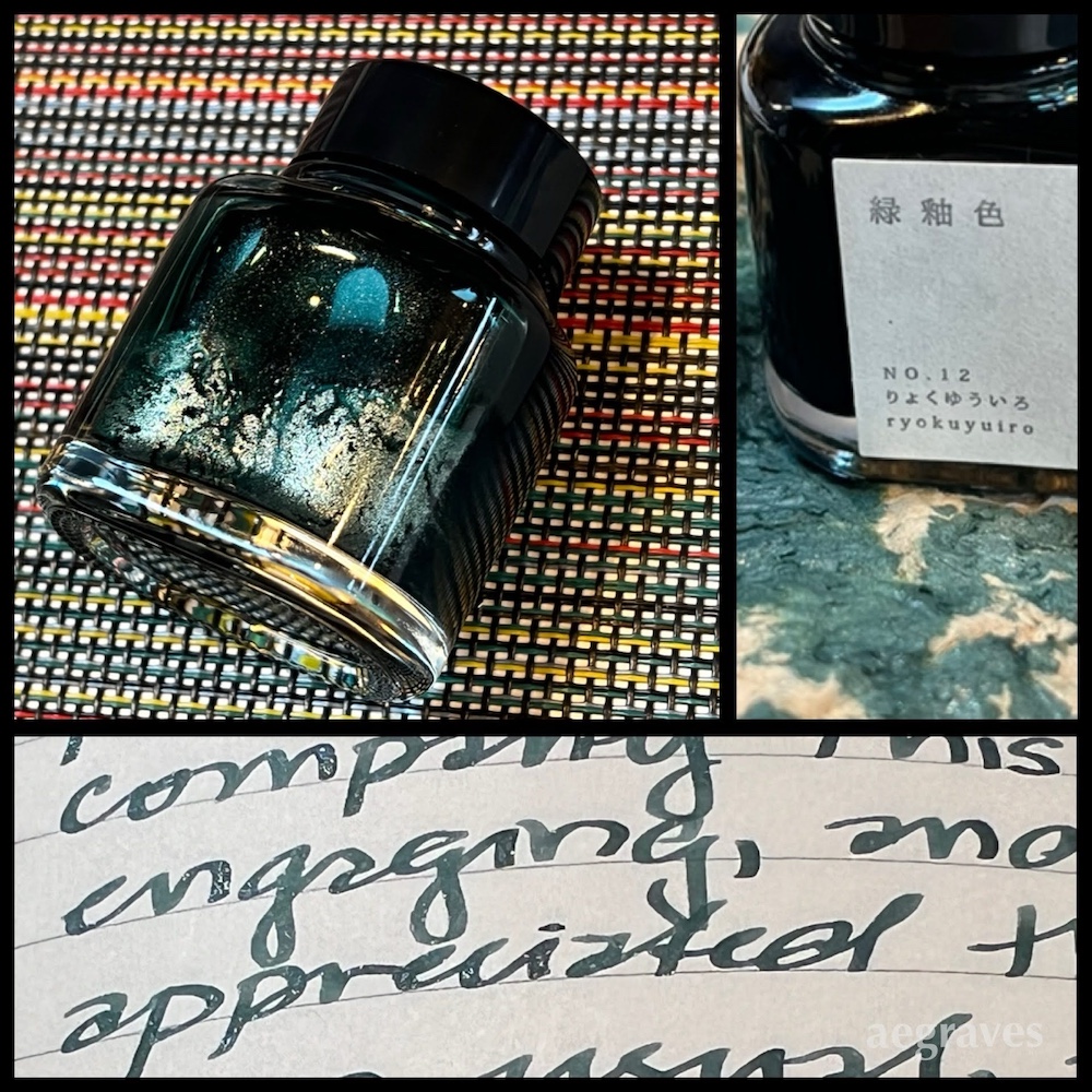
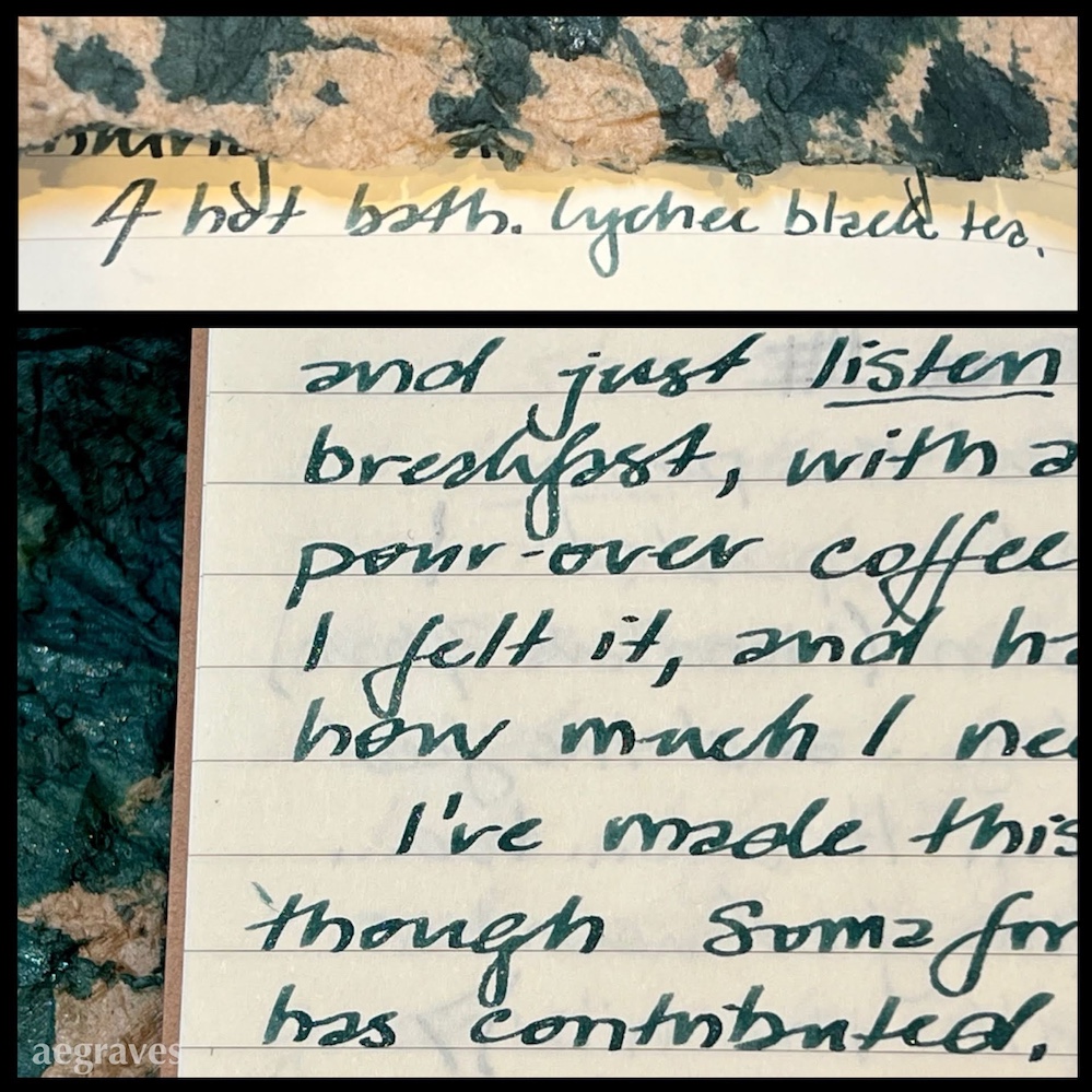
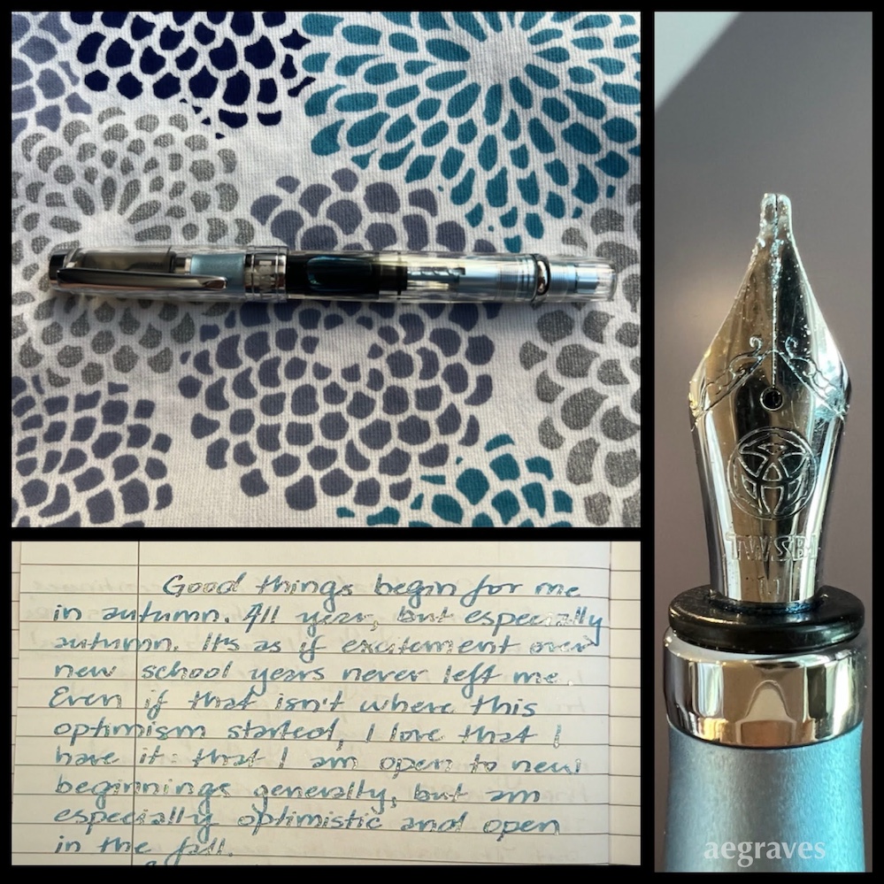
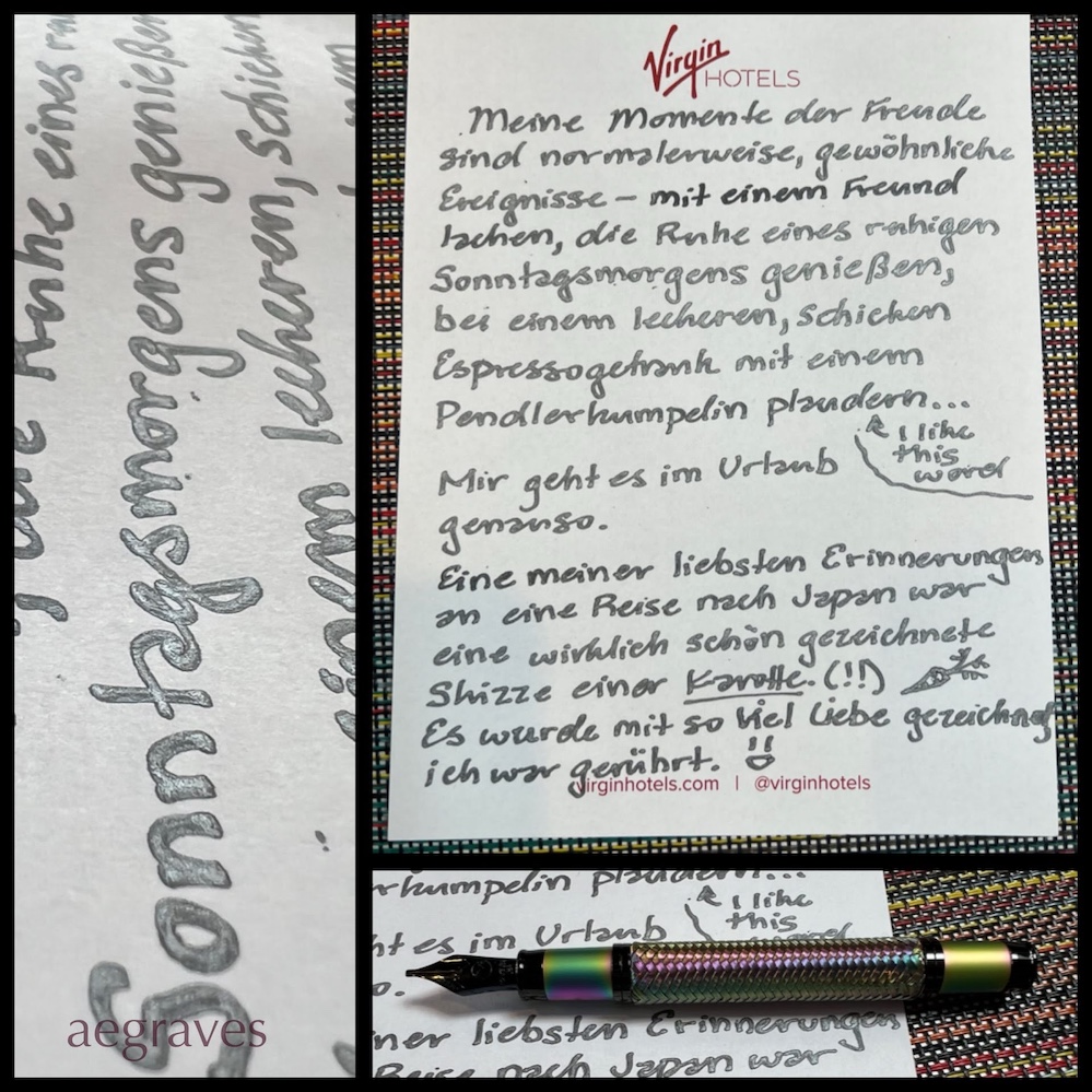
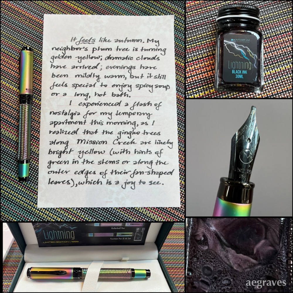
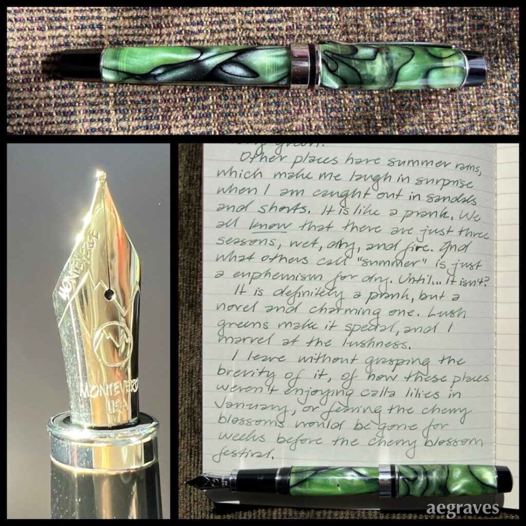
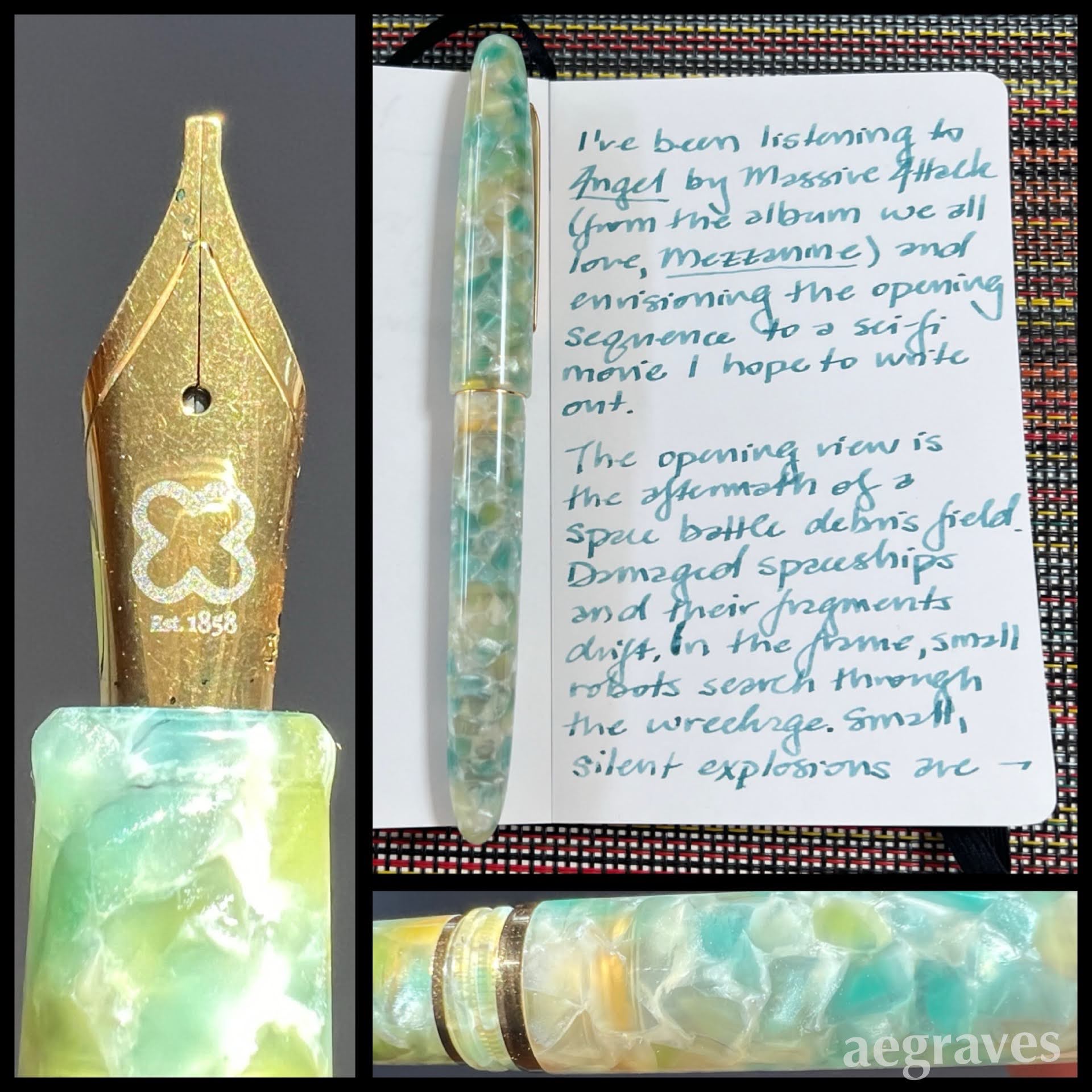
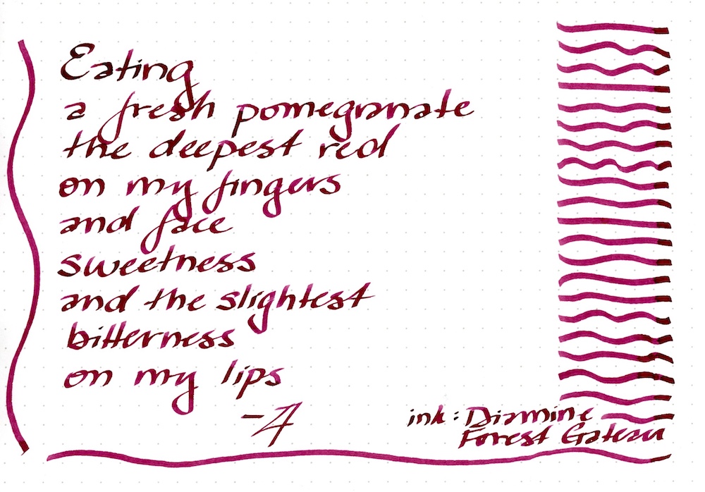
Other Diamine fans posted ink swatches and art daily to show off the inks, but long working hours and my desire not to just be another form of advertiser meant I took time to write letters and journal entries with the inks and get accustomed to my favorites. I also finally accepted that my phone mutes the colors too much, and scanning is really the only reliable way to go. I’ll post small writing samples of these inks, and others of many brands in my ink collection, over time.