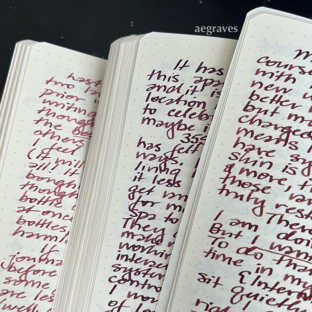
Right: Private Reserve’s Claret (more red than I expected).
Oh, I am wallowing in ink in all the best ways.
Some of my pen friends enjoy it; some don’t notice. I know I became one of those ink people when I identified a colleague’s ink by brand when he was taking notes in the office. [shaking my head]
It’s difficult to show the inks off, especially the inks with multiple colors and sheens: my clever phone tries to increase the contrast on its images in a way that hides the subtle changes of colors. And how likely is it that you’re looking at these on a color-calibrated monitor, anyway? I’ll likely need to put the inks on my flatbed scanner to show them properly – the scanner’s flat light is more honest (and harsh), though it may struggle with the glitter.
Just the same: it is satisfying to write with good inks. I don’t need the colors, but I like them.
