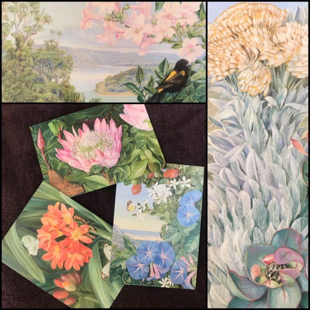
Book: Anni Albers edited by Ann Coxon, Briony Fer, and Maria Müller-Schareck

Anni Albers
edited by Ann Coxon, Briony Fer, and Maria Müller-Schareck
published by Yale University Press
2018

Anni Albers, a gorgeously printed exhibition catalog and book of essays, shows off the work of phenomenal modernist Anni Albers, and her work in design, weaving, painting, and printmaking.

Those of us who have been fans of the pre-war Bauhaus school in Germany may know her work from compilations of the school’s many famous graduates and teachers; we may also know that women were sent off into the weaving department regardless of their design interests to an extent that raises questions about the motivations of the male staff. Albers really took to it, produced some fantastic, ultra-modernist work, and raised the profile of textile design at a time when it was profoundly under-appreciated.

The hair on the back of your neck may rise up a bit when you read about the punch cards that were used to set the patterns for jacquard looms… The Bauhaus operated in a time where mass production seemed like an opportunity to democratize access to basic goods, like shoes and housewares, and that good design could directly improve day-to-day life. (Yes, of course the Nazis shut them down.)

The details of Alber’s work are beautifully reproduced in remarkably color plates, often showing both the entire work (ranging widely in scale) plus details that allow you to appreciate the craft.

And there is more to her work! As an aspiring pattern designer, I love seeing how she worked out some of her designs on grid paper. As a textile lover, the reproductions thrill me. And as a print-maker – HEY, she does those really well, too!

Details of the remarkably high quality reproductions of Alber’s sketches, textiles, typewriter art, and the lovely binding, which does my book-binder’s heart glad.

She even has some typewriter art, which makes me think of Mira Schendel (different continent, later time), and of how my fellow geeks should really appreciate where the roots of ASCII art came from. (Geek joy!)

So much of her work is understated in that she uses muted colors, or relatively few colors – it never shouts. Which means it might have a hard time getting attention in our current, loud, shiny, sequined art world – but the design is BOLD. And the quality! The detail! The attention to everything! The essays follow her career from Germany to the US; from teaching at colleges and universities; from the loom to the press. It shows evidence of her processes (which were key to the experience for her, as an artist and as a teacher), of the interests in Central/South American textiles and collecting, and of her design approaches. (There is a white-on-white printed plate that I just ADORE…) This woman had RANGE.

This is one of those, HOW COULD SHE NOT BE BETTER KNOWN, TAUGHT IN SCHOOLS, AND SHOUTED ABOUT IN CAFÉS kind of revelatory books. Albers herself was a bit frustrated that she could earn so many paid commissions, design textiles for Knoll (ooooooh!), and yet people would only get excited when she worked on paper – when she created art that could not possibly have any utilitarian application. Fabric had been seen as TOO USEFUL, even though it is a brilliant technology – its association with women goes back to ancient times (see another favorite book of mine: Women’s Work: The First 20,000 Years by Barber), and that seems to have held textile art back. Wrongly. SO WRONGLY.

The book – essays, production, binding, range of work included – is of the highest quality. The exhibition must have been phenomenal!

Film: Beyond the Visible: Hilma af Klint by Halina Dyrschka

I love ART. I especially love ABSTRACT art. Enough to make it in several media! Creating abstract drawings and paintings is liberating sometimes, and a refreshing change from representational drawing or photography, but a lot of it is mental work intended to… solve a conceptual problem. It’s not easy to explain: it is representing something, just not something material.

I’ve loved going to museums, and seeing a grid of pastel colors, and thinking, “YES! This artist was working on the same issue I was working on last month, and s/he solved it a different way! That is fantastic!”

The film Beyond the Visible: Hilma af Klint from Zeitgeist films is like a delightful visit to a museum, with lots of pleasant, knowledgeable, passionate friends along for the ride.

It’s well paced! The art is amazing! The representational early work by the artist is gorgeous, too! But the abstracts are just fantastic – the colors! The scale! The patterns! It’s the best field trip I’ve been on in ages.

Beyond the Visible: Hilma af Klint – Roxie Cinema

Hilma af Klint was an abstract artist before the term existed, a visionary, trailblazing figure who, inspired by spiritualism, modern science, and the riches of the natural world around her, began in 1906 to reel out a series of huge, colorful, sensual, strange works without precedent in painting.

While my dear Roxie Theater is closed due to the COVID-19 outbreak, The Kino Now link above allows me to watch the films they would be screening at home, and have part of the ticket price go to them. (Other indie theaters are available to support, too!) Go visit!

Mood: Graffiti edition of a My Little Pony

I’m still reading Olafur Eliasson In Real Life, which is fantastic through and through, and got to his interview with Fab 5 Freddy (Fred Brathwaite).

F5F reveals how it was German TV (!!) that gave him the start up money for his street culture film, Wild Style (1982); OE reveals that he was a breakdancer with a crew in the Netherlands, who took the crew to see the film in Copenhagen, and the crowd went wild; F5F is talking about how moving it is to see kids around the world still influenced by this movement in art and culture… They are each giddy to be discussing these topics, and the giddiness is contagious.

Oh, F5F is/was a painter!

OE refers to 80s era early rap as “electric boogie,” and I burst out laughing each time.

(Aside: Wild Style features rappers wearing v-neck sweaters. Because: the 80s. )

Art: Olafur Eliasson In Real Life

While I’m enjoying the catalog-textbook-deep-dive, I realized that the web page for the exhibit that it is based on is excellent. It is worth sharing, so I will.

On how I read

It is a foggy day, and I am filled with French press coffee, vegan sandwiches, birdsong (without automobile traffic, you can hear the birds!), and things I want to research that I’m either reading about, or that came up while reading about something else.

Reading is a rabbit hole with many tunnels.

I’m writing out reviews about books I enjoy(ed) here, because writing about them is part of my ‘processing.’ Conveying feelings and thoughts in language requires a lot of translation, and that translation teaches me things. If I really enjoy something, I should be able to describe it concisely and well in words, and choosing the right words thoughtfully can take some time. (For example, it wouldn’t be enough to say that the protagonists of William Gibson’s recent fiction are “cool,” because that doesn’t convey what I mean: I mean that they are capable, curious, observant, cool-headed, and have some special niche expertise that they enjoy. I admire people like that, and want to be like that. “Cool” wouldn’t cover it. )

While I am writing reviews of recently read books in a linear fashion, I’m also various stages of reading other books. In my youth, I would force myself to finish each book (whether or not I was enjoying it) before I could go onto the next; but now I drop any I’m not in the mood for (I have so little time – why spend it on a book that isn’t working for me?), and to jump in and out of longer books, based on where they are taking me. Truly stimulating books send me on research projects or reveries that take me a while to return from!

I am in various stages of reading:

  • The Power by Naomi Alderman (fiction, about women being able to generate electricity and defend themselves – fun and a real page-turner!),
  • Appreciate Your Life: The Essence of Zen Practice by Taizan Maezumi Roshi (deep, but likely to inspire reverie about the meaning of life, which distracts from reading),
  • My Seditious Heart: Collected Nonfiction by Arundhati Roy (1000 pages including the extensive footnotes! I had to stop to recover from the pain of reading about injustices done to various minority groups in India by more politically dominant groups, especially “development” programs that make minorities landless while enriching the majority),
  • The Second Sex by Simone de Beauvoir, translated by Constance Borde and Sheila Malovany-Chevallier (I’d read the earlier translation, but this one is much better – the only catch is that I keep using up all my book flags, pad after pad of them, because there are SO MANY CONCEPTS I want to revisit…),
  • You Look Like a Thing And I Love You: How Artificial Intelligence Works and Why It’s Making the World a Weirder Place by Janelle Shane (I started this last night, and was laughing so hard I was nearly in tears from examples of her neural net transitioning from generating death metal band names to naming ice cream flavors – I may finish this today), and
  • Olafur Eliasson In Real Life, (which I started this morning), which appeared at first to be a typical catalog of the brilliant show I saw at the Tate Modern last fall, but which is sending me in many directions because it also includes interviews with scientists, artists, chefs, and others, and is becoming more like the best current-topics magazine I’ve ever read.

My reading of the Eliasson book today has made me pause to:

  • write for myself about what it means to be a California artist, a San Francisco native, and a product of the optimistic and green international cultural sensibilities of California in my 1970s childhood (Eliasson is a similar age, but clearly Icelandic-Danish in his influences);
  • look up artists like Fujiko Nakaya (fog installations!);
  • wonder if artists I like have any new work to marvel at (maybe not – Michael Rosenfeld Gallery’s Lou Bontecou Selected Works page doesn’t suggest so, but she could be saving up for a new show),
  • admire the design of the catalog (it is beautifully composed and printed; I’ll save the rest of my gushing for the write up);
  • remember that I recently read other books I haven’t posted reviews of (oops); and
  • try to decide if I should use my photos of Harpa to play with in MirrorLab…

It is FUN to let my mind wander so freely, and to have such stimulating material to read.

Working long hours prevents me from spending more time thinking like this – while I am working, I am VERY dedicated to solving work problems, and sometimes dream about possible solutions, or wake up dwelling on work issues to solve – but a weekend like this is like a brain vacation / day spa / slice of free-thinking heaven.

Book: Mail / Art / Book curated by Jennie Hinchcliff and John Held, Jr.

Cover of Mail / Art / Book

Mail / Art / Book
curated by Jennie Hinchcliff and John Held, Jr.
published by San Francisco Center for the Book
2014

This is another stellar catalog from the SFCB’s shows, and from longstanding teacher and author Jennie Hinchcliff (co-author of the fun book, Good Mail Day).

Mail art – art that is specifically intended to be sent through the mail, and enjoyed by other mail artists – is small and can be difficult to display, but this book does a solid job of arranging and photographing this exhibit in a way that preserves the many 3-D items, as well as the relationships between envelope and contents (when there is a distinction).

The submissions were fun and varied widely, and it was great to see all the complex, thoughtful, colorful, creating works that made it through the mail!

Book: Calligraphies In Conversation, 6th Annual Exhibition curated by Arash Shirinbab

Cover of Calligraphies in Conversation

Calligraphies In Conversation, 6th Annual Exhibition
curated by Arash Shirinbab
published by San Francisco Center for the Book and Ziya Art Center
2019

This is a beautiful, fully illustrated catalog of an exhibit of calligraphic writing from multiple traditions, and it is really gorgeous. Work from fourteen artists shows a lovely stylistic and creative range. I had been expecting Chinese calligraphy for its local (SF Bay Area) popularity and long tradition, plus some western-language calligraphy, and was delighted to see those PLUS work in Urdu, Hebrew, Arabic, and more. My favorite piece is in a Devanagari / Sanskrit script over gorgeous shades of blue – the composition and color are WONDERFUL.

This is a beautiful and inspiring catalog.

Digital Art: Seoul Triangle

Seoul Triangle

Would you believe I’d been planning this particular image for days and days and days? I wasn’t sure how it would turn out, but I’m happy with it. (It is based on the same photo as the prior two images.)

Book: Vija Celmins: To Fix The Image In Memory, edited by Gary Garrels

Cover of Vija Celmins: to Fix the Image in Memory

Vija Celmins: To Fix The Image In Memory
edited by Gary Garrels
published by San Francisco Museum of Modern Art, in association with Yale University Press
2018

In late 2018 & early 2019, SFMoMA had a fantastic exhibit of the art of Vija Celmins, and that show led to the publication of this enormous, substantive catalog of her work. It contains essays with a broad range of interpretations of her catalog, high quality reproductions, a collection of insightful interview excerpts, AND a biographical timeline that is unusually well written. It is one of the better catalogs I’ve purchased, and after enjoying it in small servings since the viewing the exhibit in person TWICE (it was that good), I read it from end to end today.

There is something remarkable about Celmins’ artistic focus. She has created a range of work to show off her skills, but her long term commitment to drawing and painting certain subjects, such as the surface of the ocean or the depth of the sky, in a very particular method, has led to a profound body of work. It is remarkable to have such a range of skills, to have shown them off through solid early representational work in oil paints and remarkable sculptures (though she considered those drawings or paintings of a sort), and also to perform time-consuming, in-depth studies of a few subjects in graphite with such SATISFYING results, all while bucking other artistic trends, and maintaining a unique “voice.”

I’m old enough to have trained in architecture back when we actually drew (no, really), and so seeing such amazing work in graphite means something to me – it’s a medium I worked in for so many years… and she does wonders with it.

The graphite drawings in particular are inspiring and gorgeous in person. From afar, they are the sea; from up close, they are the texture of graphite on paper; and you can feel yourself slipping between the two understandings, especially around the edges, and being pleased with that experience.

Her pictures of the surface of another planet are also remarkable, and you realize after viewing several that you recognize specific rocks appearing in the drawings, because the rocky landscape is NOT a random drawing of high precision, but a high precision interpretation of a specific NASA image, methodically mapped out and reinterpreted in different weights of pencil, or from a closer point of view.

The reproductions would have been satisfying enough for me, but the texts, including the interview snippets on her NEED to do this work, and on the way drawing and painting on these projects became part of her way of living in awareness… it’s all quite informative.

I love her consistency; the way she challenged herself by changing media when the time felt right; the depths of the blacks in her drawn skies; the inverse skies she created recently… there is a lot to enjoy.

Great artist; great show; unusually satisfying catalog.

Book: Maria Merian’s Butterflies by Kate Heard

Cover of Maria Merian's Butterflies

Maria Merian’s Butterflies
by Kate Heard
published by Royal Collection Trust
2016

I LOVE scientific illustrations – they are a glorious combination of art and science! I received a postcard with a gorgeous botanical illustration on it by Maria Sibylla Merian, and decided I needed to learn more.

This remarkable illustrator was born in 1647, and devoted her life to the study and documentation of insects, along with the plants they feed on. She became fascinated by insects at age 13, and studied them throughout the rest of her life. Her father and stepfather both made their living by painting; she taught young girls (including her daughters) to paint, and her painter husband (one of her stepfather’s former apprentices) helped her publish her first book on entomology of local (northern European) insects. After several complex life changes, she wound up selling most of her possessions and taking one of her daughters to a Dutch colony in Suriname to study insects in their natural environments. That trip provided the content that she developed into the publications that became her major life’s work, which were collected by scientific societies, royalty (which is how this book came to be published by the Royal Collection Trust), and wealthy amateurs.

It’s not ONLY that she was a remarkable observer, or that she could draw and paint: she also had to master printing arts to be able to sell editions of her work (printmaking is another skill set entirely), and business to sell different variations of the results at different price points (discounted advanced subscription prices, higher prices after publication; uncolored prints for one price, prints hand-colored by her and her daughters for a higher price, and painted variations on vellum for luxury editions…) . She also collaborated with a botanist to provide in depth information about the included plants.

While this little book is just about 6×8″, the printing is on heavy stock and of high quality. Not only are her plates shown in their entirety with their original titles, but there are many pages of details, so you can enjoy the precision and skill of both her drawing and coloring. It’s the color and detail excerpts that really pulled me in.

collage of details from Marian Merian's Butterflies

The book covers her early work, as well as her work in Surinam. (Note that, while she was born in Germany, she lived in Amsterdam, and the colony she visited was under the control of the Dutch at that time. There is a lot of discussion now about the meaning of the “Dutch Golden Age,” especially since so much of the wealth of Amsterdam was generated by exploitation (the death rate of Dutch sailors working for the Dutch East India Company was shockingly high), colonialism, and slavery. It’s good that this concept of whose hard work the country’s success was based upon is ongoing.)

The Royal Collection Trust has images of their copy of her book on Surinam, which I’ll link to here for your enjoyment:

Maria Sibylla Merian (1647-1717) – Metamorphosis insectorum Surinamensium

Maria Sibylla Merian travelled in 1699 with her younger daughter to Suriname in northern South America, to study the flora and fauna. The resulting natural history plates were published in Amsterdam in 1705, at her own expense.

I’m delighted with this book. I even inadvertently learned some things about moths! 🙂