I had an interesting experience over the weekend, which was reading a novella that I wrote (!) in 2004, to see if I think it is viable for development into a full novel.
At the time I wrote it, I was concerned that it was too fresh in my mind to evaluate properly, so I set it aside and wrote three more novellas, one each in subsequent years, as part of National Novel Writing Month (NaNoWriMo). Then I allowed my demanding job(s) to take over my life again. Now that so very much time as passed, I thought I’d see if it is worth working on.
The answer, to my own surprise, is YES.
Editing and expanding on a draft novel is a HUGE project, and… I’m a bit alarmed and intimidated.
But… I’m already more than 50,000 words committed! Why NOT develop it?? I was briefly indignant while reading about some confident middle schooler seeking agents to publish the first thing they ever wrote, before realizing that nothing is preventing me from taking similar steps. (Aside from my career, haha!)
I want to spruce it up and build it out a bit more, since the feedback I got from another writer is that there SHOULD be more of it – it held his interest all the way through, and he wanted to read more to read within the same story.
Editing a novel can take months or years, so I’m unsure how to set a schedule for myself on this. But I know it is worth starting, at the very least.
** ~ **
Meanwhile, I spent most of my energy yesterday laying out a new photography book, and… I’m supposed to do the same today!
It has been a while since I laid one out properly, and there are some new features at my favorite book printer, Blurb, that I am testing out. (I’ll write about those once my prototype arrives.)
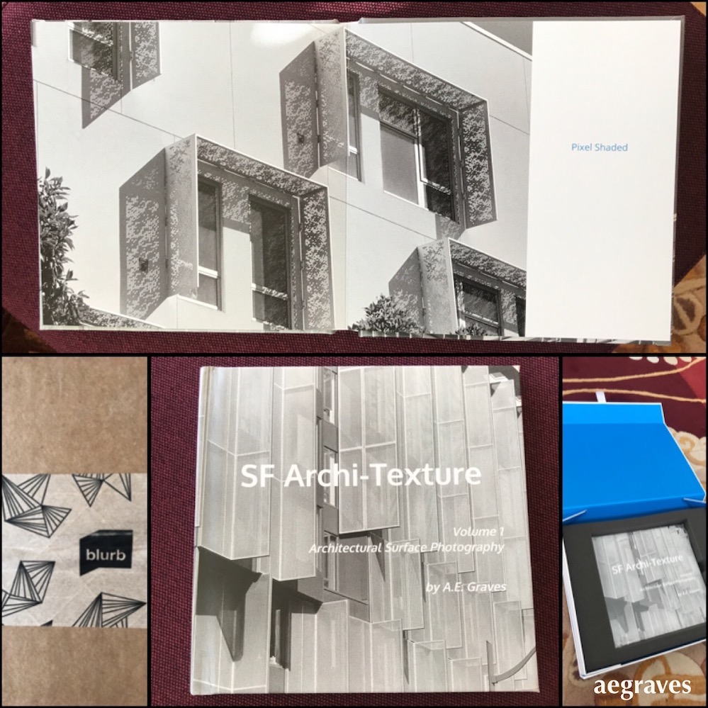
I have laid out and self-published photo books before: eleven of them, including nine volumes of my iPhone 1 photo diary (!) and two thematic/place-based photo essay books. Blurb, which is based here in my hometown of San Francisco, does a beautiful job in printing and binding them, and provides a great online storefront to sell and display them. Their services are superb.
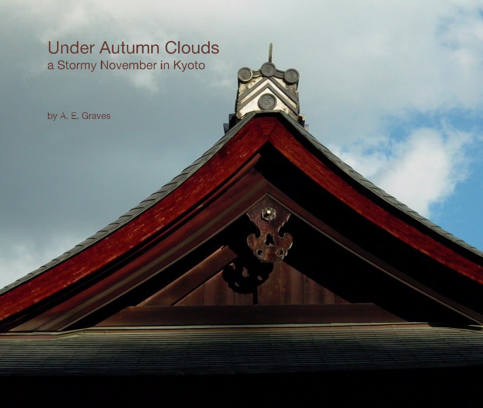
My best book so far was just an ordinary travel photography book, which I know is an awkward genre. Local photographers do the best work of documenting their location, because they see it in all seasons and in all of the lighting variations that occur over a year – there are photos local photographers take that a visitor is sure to miss. Visitors are subject to whatever the weather happens to be. I was just an outsider-tourist visiting during a cold and stormy month, and will never see these sites in all the familiar glory of a local who loves where they are every day.
Just the same, the process of creating this particular book was good for me. I had to think about photos as a set, rather than individually; think about how to lay them out, and how page spreads relate to each other; and learned how to mix slightly higher resolution digital images (from my whopping 4 megapixel digital camera of the time (weeping sound)) with very low resolution ones (from my iPhone 1), which inspired me to use some special effects to make use of the low-res images’ softness.
Under Autumn Clouds by A. E. Graves | Blurb Books
In 2008, I visited Kyoto again after a 16 year absence. Kyoto is a remarkably beautiful city, filled with both modern and ancient places. This is a collection of my favorite details from the ancient side, the little things that I want to remember, rather than an encyclopedia of everything in town…
While I was taking photos for this book, I was continuing my (ordinarily domestic) phone photo diary practice, which also resulted in a Blurb book as part of my photo diary series. This was educational in different ways, most relating to its different content from my efforts to follow conventions in my formal work.
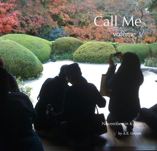
My phone photos are created for my own satisfaction, rather than to attempt to impress others or formally document some monument, and so are casual. I take photos of details at odd angles that won’t be good for drawing; I photograph ads and menus; I intentionally take photos of crowds of tourists at tourist sites, and especially enjoy photographing other people photographing. That isn’t the sort of thing included in most artsy/destination books, but are true to my experience of a place. (Note: Sylvia Plachy does a GREAT job of photos of people at tourist sites, though she brilliantly captures their personal drama at a level I cannot hope to achieve!). My phone photos show that I take photos of ads, signs, trash, art museum displays, selfies, and things I want to buy in shop windows, and the result is more…. comprehensive? Realistic? Varied in subject matter and more contemporary in representation? Maybe all of those things.
Under self-imposed rules of my phone-photo diary series, I also had to include EVERY photo I took in the book, so there was no editing of either content or the resulting jpeg files (except for limiting myself at the time due to storage limitations, and awareness that I had this rule). This means the book includes images which indulge my personal quirks, meet social obligations, and capture extremely minor details that are not especially artistic. (I did use some of these as an appendix in the art book, to personalize the book with experiences without including images of myself.)
Call Me volume 3 by A.E. Graves | Blurb Books
Volume 3 of “Call Me” continues the author’s personal collection of EVERY phone photo taken since the phone was purchased. Set entirely in Japan, it includes photographs of fellow tourists taking photos, meal sets, train stations, hotel rooms, and other images that are concerned more with the exper…
(Aside: the garden on the cover was especially fun for me: I took a photo OF the other tourists in the designated/popular taking-photos-patio shown here FROM alongside the popular view of the landscape (an image of that appears within the book), and there was laughter from my fellow tourists when they looked away from that view and noticed…)
** ~ **
Back to the present: I intend to produce three photo books this autumn:
- a book of black and white San Francisco architectural facades,
- a book of images from an old, plastic-lensed camera from my paternal grandfather’s attic (which I can’t find my negatives for, so this project is delayed until those turn up), and
- one of new (2021) Polaroid Duochrome images.
I only have one of these three books laid out, uploaded, and ordered. I haven’t scanned a single Polaroid yet, so I’ve got lots of work ahead of me… Wish me luck!