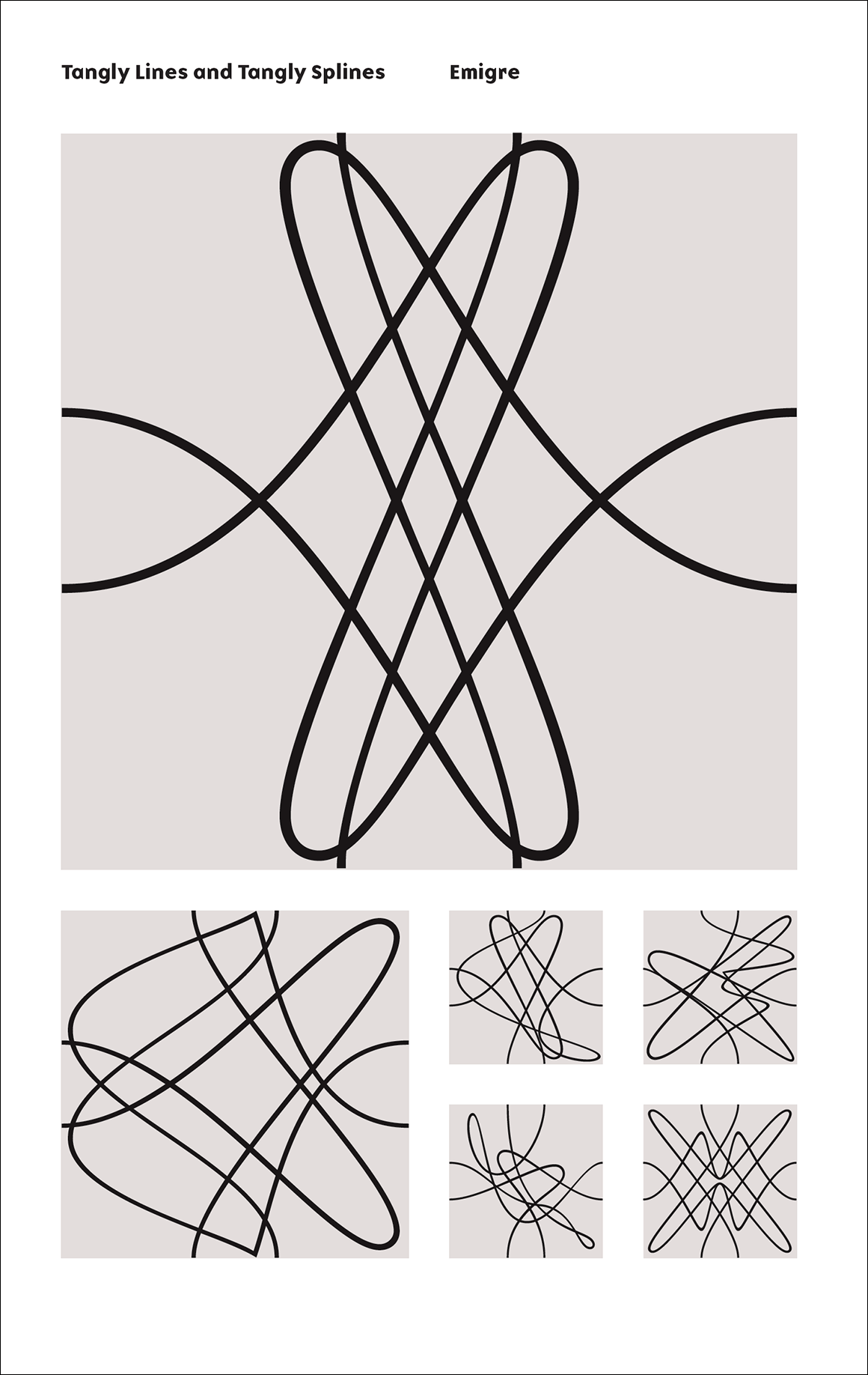
You likely know that I think Zuzana Licko is BRILLIANT, and that Emigre Fonts is remarkably cool. But this new set of patterns called Tangly is blowing my mind.
I like to make patterns by hand, and am studying repeats, and… THIS IS SO AMAZING. The lines. The splines. The everything.
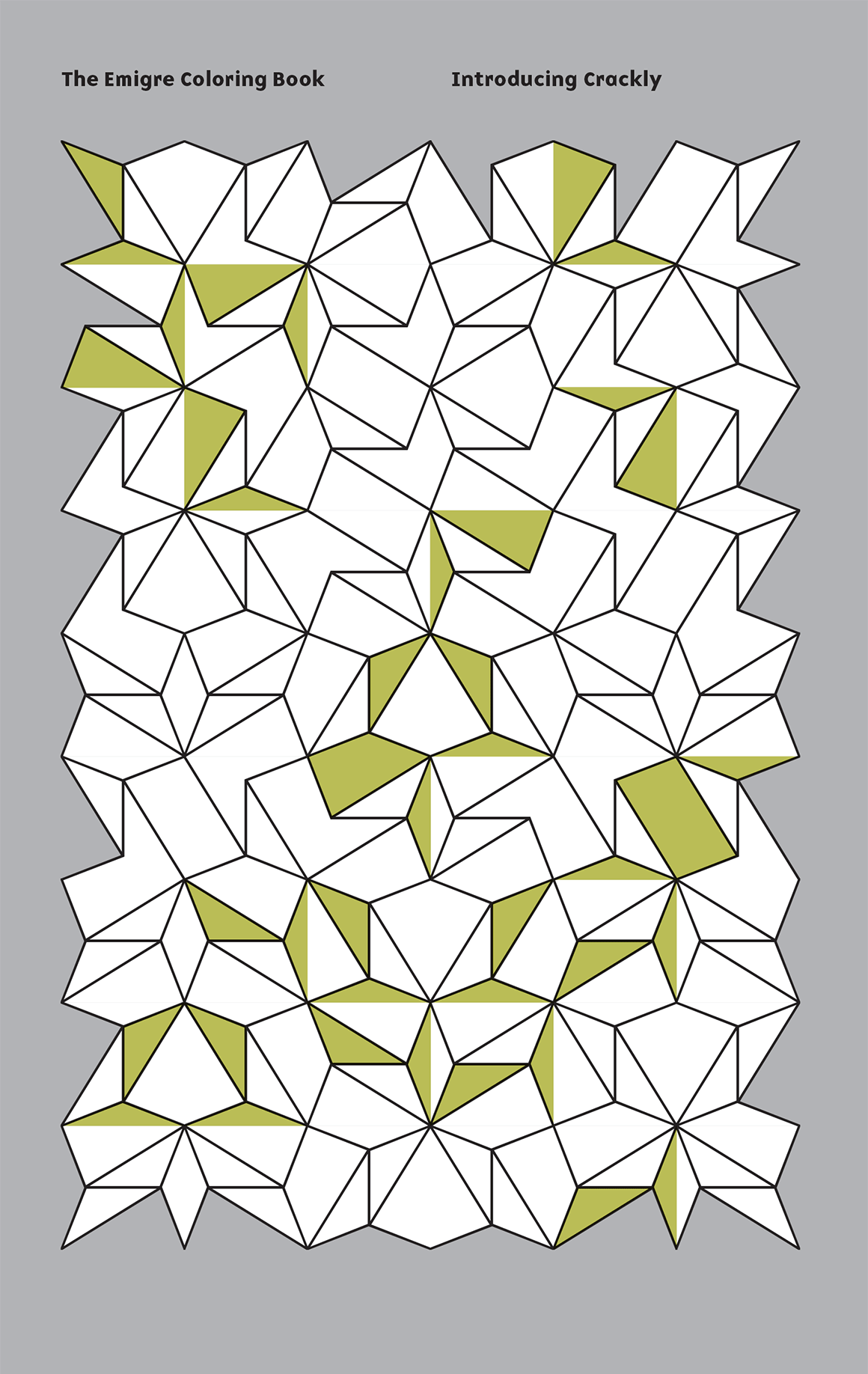
Since I just mentioned the wonderful, inspiring SF Bay Area font foundry, Emigre Fonts, I should share a link to their geometric wonderland known as Crackly. Not only is it very visually satisfying, but there is “coloring book” PDF you can download, to appreciate it FULLY.
The dedicated Crackly page on the Emigre site is here, and you should have a look at it. Go! Do it! It pleases me on multiple levels, as a fan of geometry, fonts, design, my beloved Bay Area, Zuzana Licko’s work, and the playfulness of coloring books.
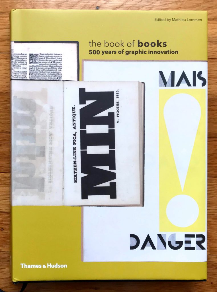
The Book of Books: 500 Years of Graphic Innovation edited by Mathieu Lommen published by Thames & Hudson 2012
I hand-sew and bind books, I read books, I buy books, I have books printed, I fill blank books, I collect books, I study books, I LOVE BOOKS! So it feels inevitable that I would find this book, which is about the printing technologies, fonts, and design of books, with an emphasis on Europe and/or printing that uses European alphabets.
This is a MASSIVE tome, and has reproductions of MANY books, with remarkable examples of everything from bibles to scientific texts to art books to books on how to break into castles. Which was apparently a really big thing. A thing that was important enough to buy books about. (My gift subscription to Castle Raider Monthly must have expired: I’ve been missing out.) If the term “siege engine” immediately came to mind, you win 500 Geek Points.
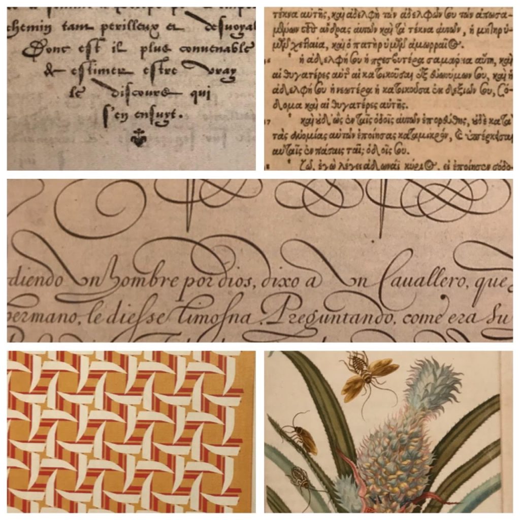
Collage of sample images from the Book of Books; older samples above, gorgeous Emigre image to the lower left, gorgeous Maria Merian image to the lower right.
The fonts are GORGEOUS. GORGEOUS! I would use some of them today! HOW DID WE EVER STOP USING SOME OF THESE!!! GAAAAAH! Sorry. I’ll pull myself together now. But really – such beauty! The folks who set this type, and who designed it – I hope they were lauded in their day!
Illustrated books and printing technologies are also discussed, and printing of this sort – etching and hand coloring and tipping in scientific illustrations – was once the key way to study sciences and the natural world in a time of limited travel opportunities. Books as a way to transmit key knowledge, not just as entertainment – that is so exciting!
After seeing remarkable samples of so many older works (going back to the late 1400s), thanks to the editor’s access to special collections in the Netherlands, I was beyond delighted that he extended all the way into the 2010s, and included the work of Emigre Fonts , an SF Bay Area-Local font foundry that arose with the Apple Macintosh back in 1984. The work of founders Rudy VanderLans and Zuzana Licko has always been impressive and presented brilliantly (in their magazines, catalogs, and in active use), so I was thrilled to see their inclusion here.
I’ve spent some quality time with this book, and there is so much in it, I need to return to it repeatedly to process all that I’ve seen. It’s quite a work!
(Yes, I also have the Parr & Badger Photobook history, all the volumes, since photo books are their own design challenge…)