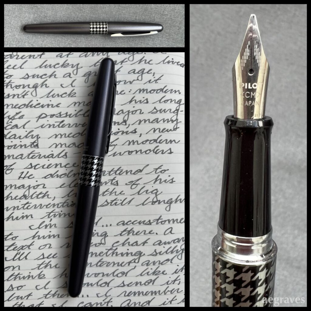
This is another Pilot Metropolitan fountain pen with a calligraphy medium (CM) nib. The writing sample is made with Private Reserve Gray Flannel ink.
Here’s another modest-but-fun pen in my collection, with matching velvety ink. I’ve been surprised at how many shades of gray ink are available, especially since some are so subtle and pale that I’m unsure how they can be used…
My handwriting with this style of pen is nicer when it is not hurried, but all of this year I’ve felt like I have so much to write and so little time that I can’t slow down…
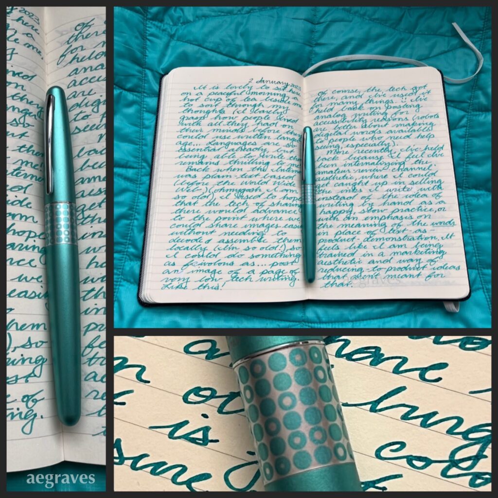
A journal spread – collage of pages I wrote in January 2023. The ink color is Diamine Steel Blue; the pen is a Pilot Metropolitan.
My elementary school encouraged and required all of us Kindergartners to keep a journal. We needed to practice writing, and having a black and white, speckled-cover composition notebook of our own was DELIGHTFUL. I filled mine with colorful-but-poorly-formed words! I wrote and illustrated stories about red-haired girls having adventures! IT WAS GREAT!
And, the habit stuck with me. By the time I was finishing college on weekends while working full time at a law firm (note: do not do this, it is exhausting), and the college offered a few units each semester for maintaining a journal, I jumped at the chance… and then startled my college advisor by filling it in the very first semester, and starting another…
I still write by hand, especially for letters to pen pals and journals. My hands get sore easily, so I can’t write with dry ball point pens for long: they involve too much pressing. It turns out that very wet gel pens are better (HELLO, Uni-ball SIGNO!), but I fly through them, and feel terrible throwing out handfuls of disposable pens each month. Refillable gel pens come and go, and are very portable, but still involve tossing significantly smaller bits of plastic and metal out almost daily. The lowest waste and lightest-ergonomic-touch pens I can use are fountain pens with “converters” that can be filled with ink directly from a bottle.
It turns out I LOVE writing with fountain pens.
I have friends who collect these, but when they spoke of it, I didn’t really grasp the point: they showed me the pens themselves, not what they were capable of, how they performed as pens. Also, they didn’t mention to me, an overzealous color fan, how many ink colors are available.
Now I know. Oh, do I ever know.
I’ve been reluctant to show off either my ink or pen collections, even though both are very modest. Despite their modesty, writing with these tools brings me disproportionately large joy. My reluctance comes from the popular ways of writing about products by presenting oneself as a semi-professional expert reviewer, who talks up the qualities of the product yet never really MAKES anything with them.
There are countless video tutorials on how to SWATCH EVERYTHING – how to provide samples of a display quality that would please a salesperson. But… why?
While this swatching approach may help me better document my watercolor paint tube collection and so prevent me from buying the same shades of celadon green accidentally, it’s awkward as one’s only shared output. (Also: one can never have too many shades of celadon.) I don’t really trust someone who has only swatched a paint to tell me whether or not it belongs in their paintbox for their actual painting practice (if they have one)… I have some credible enthusiast reviewer sources of fountain pen ink who have recommended against using inks they received for free AND who freely remark on beautiful inks that aren’t LEGIBLE for actual writing, and that is feedback I can use. But there is a lot of reviewing-popular-products-for-clicks content, and I don’t want to participate in that.
So, how will I be different? I’m going to show what I wrote with the pen and the ink for my own enjoyment. Maybe you’ll like it. Maybe you won’t. Perhaps styling of these images by coordinating pens, inks, and backdrops will prevent me from staring deeply into my favorite pen shop’s Instagram feed and purchasing pens I don’t need. I expect it to make my blog more visibly interesting.
Either way, now is a GREAT time to create these posts. Everyone in my mother’s family has terrible arthritis: my ability to write legibly with fancy pens won’t always be available! I’ll seize the (quiet, quaint, pen-geeky) moment.
I’m using these on my mail now, often in combination with other stamps for my overseas pen friends.
Day of the Dead has long been popular as a cultural celebration here, and it’s nice to see a stamp for this holiday. The USPS shop link is here while the stamp is available.
As a hobbyist postcard designer, I loved watching this video about a color photo postcard printer whose art department had an interesting influence on the way specific postcards looked, which is only noticeable if you see enough of them. I’m sharing the video, because I just love the story.
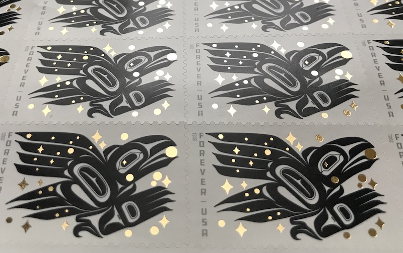
Tlingit/Athabascan artist Rico Worl designed a GREAT stamp.
Mine just arrived, and they are GORGEOUS! I hadn’t realized that the stars and discs in the design are rendered in metallic gold.
News release here. USPS product link here (while available). I’m also providing an embedded visual link to Wikipedia’s entry on Formline Art, which I find very graphically satisfying!
The premise behind this book is that lots of women are designing impressive buildings you recognize, buildings that are worth celebrating, but you may not be aware of this because their work is often shown under a firm name or misattributed to men. To correct this gap in your knowledge, this book collects excellent projects, both recent and historical, and tells you about the architects behind them.
So many gorgeous projects, including projects you have seen in magazines or in person! (Via Phaidon’s website)
The selection of projects neatly tilts toward my favorite types: large public works, plus large private projects, both of the type that are experienced by a lot of people: concert halls, offices, museums, schools. Each architect is represented by a brief biography and one or more excellent project photos with key details for further research. Collaborations between men and women are recognized and celebrated in an acknowledgement of the team effort that contemporary architecture ordinarily requires for large scale projects.
Hall is very modest about her research and the limitations of the Europe-centric architectural awards processes that favor Europe and selected other regions, but I am delighted by the geographic range of her selections.
The essay and quotes in the book underline the importance of spotlighting these high quality projects to correct for the erasure of women in the field. Hall calls out the 2014 scandal around having architect Patty Hopkins photoshopped out of a photo of architecture award winners, while her husband was left in for a BBC show about their shared firm’s work – even though she co-founded the firm, and their shared name is on it! (See the article in Architects’ Journal entitled, “BBC slammed for ‘bias’ after Patty Hopkins is sidelined in TV show” dated March 5, 2014 by Richard Waite and Laura Mark.) It isn’t just about the photo, it’s about the program’s premise that men were exclusively responsible for the shape of contemporary design – the photo was just a reminder that the facts did not support that narrative. If your are actively edited out of discussions about the firm you co-founded and the projects you worked on, just to indulge some stranger’s all-male hero narrative, who is safe? The lone genius theory is bad enough, but diminishing key founders because of their gender is outrageous.
“No matter how my work was published or credited, it was seen as Venturi’s. The notion that we might both design seemed inconceivable.”
–Denise Scott Brown
(This issue is, unfortunately, relatable: a male teacher happily gave my boyfriend/classmate credit for my architecture work because just once I used my bf’s woodworking tools to build a model, though if he had borrowed equipment from me, the reverse would NOT have been suggested. My bf told me he took it as a compliment (to him). Their creepy camaraderie over rewarding him for my work made quite an impression on me.)
This is a beautiful, oversized book of great projects with lovely photos. The core details about the firms behind the designs are enough to send you in the right direction to learn more. The presence and success of the women behind these projects is encouraging and satisfying.
This book also gives you an excuse to visit the Phaidon website, which is GORGEOUS and has many wonderful temptations, especially the fine art monographs and design books.
Eco Living Japan: Sustainable Ideas for Living Green by Deanna MacDonald published by Tuttle, Rutland, Vermont 2015
This is a beautifully illustrated survey of Japanese building projects which show a commitment to environmental sustainability.
This book grabbed me right away by immediately explaining something that had always confused me: why are homes made with renewable, traditional materials so rare? The answer that explains it all: insurance companies won’t insure old houses. One MUST tear down and rebuild to new codes every 30 years to get insurance. And so houses are basically disposable, and less sustainable materials can be cheaper, faster, less flammable, or more fashionable.
Some of the edgy, innovative Japanese house books I’ve seen are now so easily explained: no one is building for the long term, so being over-specific for a point in time, or taking risks, and being daring makes more sense – you won’t have to grow old in what you build! (Even in the recent Japanese fiction I’ve been reading, families tear down buildings to sell an empty lot – this seems to be considered the best choice almost always…)
This book profiles a range of projects from architects with a range of attitudes and credentials about environmentally sustainable building. It is a buffet of different eco-emphases: some projects focus on energy use, some on thermal insulation, some on traditional wood treatments (like charring to protect against insects), some on attempting to preserve the natural features of a landscape by resting on smaller foundations (which involves using a lot of steel, however), and all result in a range of reasonably conventional homes that wouldn’t jump out as eco-friendly without some explanation.
By showing a diversity of approaches and solutions, the book provides a good survey of concerns that CAN be addressed and SHOULD be considered. You CAN have a normal-looking house while making better choices!
As with all architecture books, I get a better sense for how living in the spaces could be when they have signs of human life in them, such as art or furnishings, so I am relieved that several of the homes are furnished, at least minimally. While a few of the homes are absolutely palatial (the vast, full floor height, insulated windows in some of these projects alone probably cost more than my entire house), there are some modest / practical ones in the mix. I also appreciate the interludes to cover topics such as the use of landscaping, and kit homes (hello, Muji!), and the inclusion of some international projects to tie what is happening in Japan to global trends.
Overall, this is an attractive, nicely presented book showing how many potential approaches there are to improve the sustainability of residential construction, especially in the climate and circumstances found in Japan. I enjoyed it.
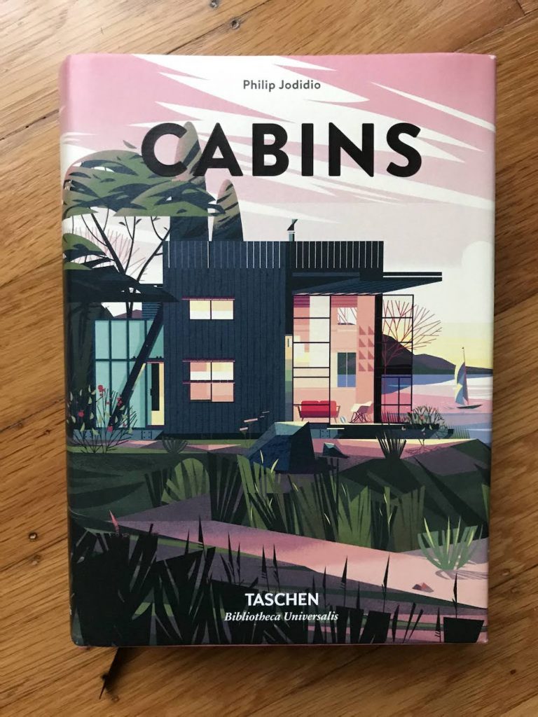
Cabins by Philip Jodidio published by Taschen 2018
This hefty, dense, trilingual (English, German, and French) volume features extremely charming illustrations by Cruschiform (Marie-Laure Cruschi), great photos, consistent and clear floor plans (!gasp!), and outdoorsy-buildings, only some of which are cabins.
While the promotional text discusses rustic simplicity, and there are a few rugged/utilitarian structures, MOST of these aren’t modest buildings you could track mud into. I mean, there are some without heating, or that are only intended for seasonal use, but many are fully developed, large, contemporary homes for the well off.
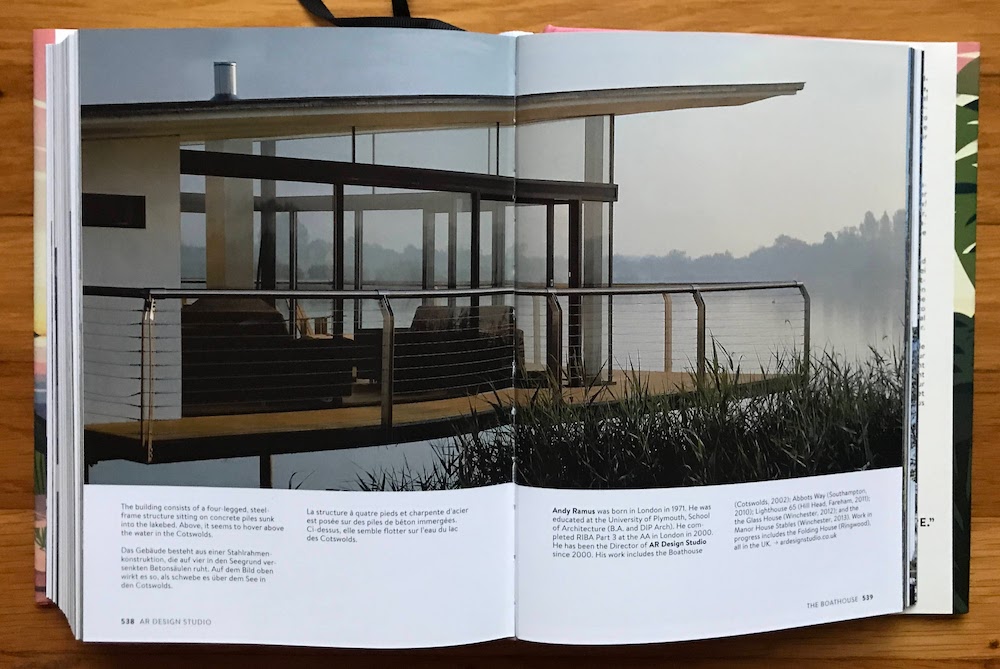
I adore this “boathouse,” but we have boathouses in our public parks here in SF, and they are basically uninsulated garages for boats that are rusting and have bird poo on them. They don’t look like this:
This home by AR Design Studio in the UK is fantastic. Too fantastic for cabin-hood! It is a retreat from… another home on the property.
The design of the book is great – the illustrations are stylish, fun, colorful, and provide clear transitions between projects. The consistent floor plan graphics help explain how the buildings should work. The index is well organized, and the essay at the front is worth a read.
The projects themselves range from translucent structures that you can camp in, to wine country vacation homes, to buildings where you could live normally, to those that are better suited for ‘glamping’ (pretend glamour camping). There is at least one where I can imagine snowshoeing in from the edge of the property with a sled full of cocktail ingredients and catered food, though unpacking supplies in the immaculate kitchen that appears to have no food preparation tools of any kind would be daunting. 🙂
It’s difficult to tell what the criteria for SUCCESS in the design category is. The program for a cabin (a real cabin) is looser than one for a home, but that leaves their utility ambiguous. Are we snow camping, or are we entertaining? Can our older parents visit, or is it too difficult to access? Is it comfortable for a weekend only, or a week, or a month?
The structures that are fully furnished are easier to interpret – I know my parents could sit down without me having to bring furniture, so that’s great. Some bedrooms are completely filled by a bed. Why? Should you need to leave the bedroom to open a suitcase and dress? Should you need to climb a ladder into a loft to sleep? Does the enormous trap door in the floor without railings feel sketchy when you’re hauling in your supplies? Is a glass-enclosed bath a great idea if your parents are visiting for the weekend?
The client’s desires and goals for using the space are mentioned at various levels of detail, but without giving away too much, I’d love to have a scorecard to compare the programs on a practical level, considering the range of projects. Accessibility (how able-bodied do I need to be to get in, and how many stairs am I hauling supplies up), is there enough floor space to dress in the bedroom; is there enough light to read; is there space to draw/paint/write; is the temperature range comfortable in its intended seasons, is there any storage space for the outdoor gear you need to get there… This would be especially valuable because of the glossy architecture magazine convention of showing most of the spaces without human occupants, without normal personal possessions, and without any normal living functions being performed.
This is a fun collection to leaf through, and I do have at least one new Swedish island cabin getaway fantasy now, so I think this book has accomplished its mission.
I received a gorgeous postcard in the mail today from Norway; it’s a card from a retrospective art show in Sweden of the artist Märta Måås-Fjetterström. She’s famous for her amazing carpets, which have been used in Nobel Prize ceremonies, and are in design collections of museums around the world.
I was delighted to search for her, and see some of her work. Her studio is still active and producing her designs, and so there are MANY search results!
Märta Måås-Fjetterström | Artnet
Märta Maas-Fjetterström was an influential Mid-Century Swedish textile designer. View Märta Måås-Fjetterström’s artworks on artnet. Learn about the artist and find an in-depth biography, exhibitions, original artworks, the latest news, and sold auction prices.
Somehow, the WSJ has one of the best-illustrated article on the operation of her studio in the present time.
The Enduring Appeal of Märta Måås-Fjetterström’s Modernist Swedish Rugs
At 100, the Swedish rug firm still produces covetable designs
I learn so much from my friendly postcard senders!