Culture: Very French descriptions of colors

I write with fountain pens and colorful inks, and often check to see if there are new colors I could be enjoying. A favorite French brand, Herbin, as both lovely colors AND notable descriptions of those colors on their website.

What do I mean? There is a lovely brown called “Terre de feu.” It evokes certain volcanic islands south of Chile. And the English translation of the description says, “This brown ink has a red tone a reminder of the burnt lands and vast deserts where nothing ever grows.”

NOTHING EVER GROWS THERE. BUY THIS INK!!

I can’t resist that.

Or a dusty rose. “Bouquet d’antan (Bouquet of yesterday pink): It represents a bouquet that can be found at an elderly’s house.” It’s a lovely color (I will buy a bottle!), but it also sounds like someone is rebuking their grandmother for nostalgia, doesn’t it? Yes, it does, as the description continues: “The color is the symbol of nostalgia of the time that has gone by.” GET OVER IT, GRANDMÈRE!

I didn’t know there was a color for “grievance,” but there is, and who doesn’t want to emphasize their grievances with an appropriate color?? Grievance is a delicious shade of violet. Of course it is.

It’s as if I’ve discovered a new view of the world, and can now wander about, attributing attitude to all of the colors in my home. Me tomorrow morning: “This antique gold with a hint of green evokes a bitter, fading houseplant which rejects the window you have chosen in your new apartment. It will NOT forgive you. This flat was a mistake. Available in 25 ml or 10 ml travel size.”

Two fountain pen inks I take the greatest pleasure in writing with are from Herbin. They flow well, are well saturated with color, never feather on my preferred papers, flow smoothly, and don’t clog my pens.
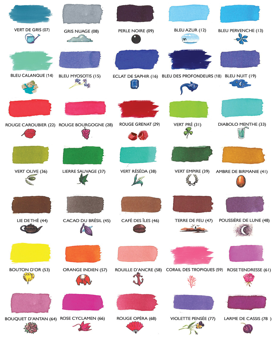
Your letters or journals will obviously look more clever in these colors. Your pen pals will sigh. You can sigh directly at https://www.jherbin.com/fountain_pen_inks.html

The colors I use regularly and love from Herbin: Poussiére de Lune (moondust, a rich violet); Vert Empire (a faded, velvety green); Rouge Grenat (a deep, pomegranate red); Corail des Tropiques (coral orange-pink, closer to Rouille D’Ancre than the color chart suggests; pleasantly legible, and as cheerful as a Caribbean beach vacation — now I’m really thinking this way); Emeraude de Chivor (turquoise-to-teal with bright red and metallic gold particles, which are only visible on less absorbent papers); and a new, tiny bottle of Bleu Myosotis (go read the description for that one!).

I also have a bottle of Herbin’s white calligraphy ink, which I use in a special pen on black paper, because: me. It offers good contrast, and handles well.

I’ve seen all the other fountain pen fanatic blogs, and I know I’m supposed to create a brilliant work of art with a watercolor brush AND write at least two major journal spreads in each of the colors I chose, plus provide a written specification of every tool in the room while I created it, describe what I had for lunch, and a provide an original recipe for that. Also, I must ensure that each color has its own separate blog entry. However, this just isn’t the day/week for that.

I understand the convention, so as a gesture of goodwill toward my fellow fanatics, I’ll share my own spontaneous, inept tribute to Emeraude de Chivor, because I can:
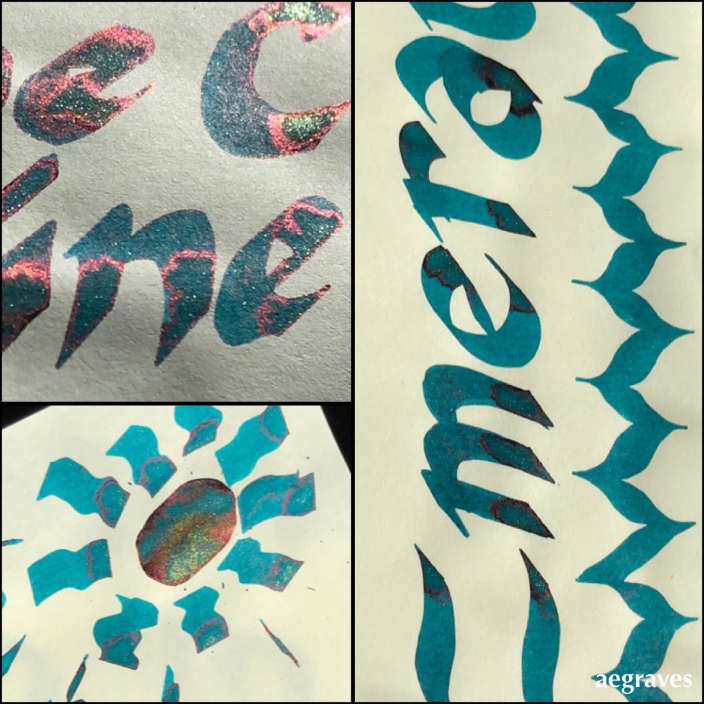

Example of me spontaneously going overboard in trying to pool Herbin’s Emeraude de Chivor drawn on Tomoe River cream-colored paper, in various bright or direct sunlight conditions.  I went extra heavy with an oversized calligraphy pen to  load up the paper so you can see the red and gold particles. 

If/when I dedicate a post to this ink the way I use it most, I’ll use a fountain pen with a fat nib so you can see each inky letter outlined in the red and gold particles when dry. It’s quite an effect – all correspondence I’ve written with it generated questions about how I did this magic.

~~~

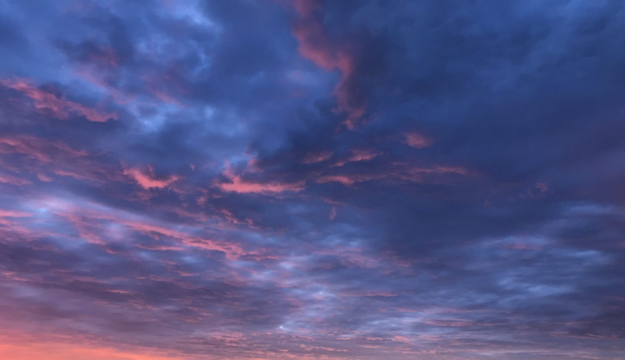
Related to the idea of fun with how colors are labeled, but not entirely on topic: AI generated names for paint colors from Janelle Shane:
Life: Writing Amid Too Much Real News

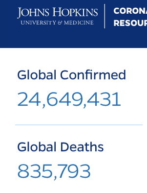
Tiny clip from the reliable https://coronavirus.jhu.edu/ site

I’ve been quiet here, because there is a lot happening. A LOT. I’m not good at pretending otherwise.

I don’t want force false cheer or deny current events in my posting, because then it will read as, “A dangerous pandemic is raging out of control around the globe, my home state is on fire, my lungs are filled with smoke, my country is sliding into fascism, and HERE IS A NEW RECIPE FOR PICKLED BEETS!”

–me, just now

I’m having two kinds of interactions with people about the current state of affairs.

People who are cautious and have changed their lives since the pandemic became widespread are easy to chat with about our condensed, indoor lives. We’re trying to stay healthy and almost sane. We exchange recipes, movie recommendations, tell each other stories, share links, have video calls, compare masks, and discuss ways to solve pandemic-related logistical problems. (I want some of that fancy, vacated office space to be made available to schools which can no longer safely accommodate all of the students. Some of those offices (the ones that won’t have elevator lobby traffic jams) have VAST amounts of floor space, decent ventilation, zippy fast internet, and natural light. At even 30% occupancy per floor, they could support a lot of students! And yes, we’ll need to hire more teachers and support staff to make that work, and that would be worth it and potentially good for the recovery! And and and and…) My friends who are cautious may need to visit ailing relatives, and plan long, arduous car trips that may not involve stopping. They run errands, but do so cautiously and efficiently while masked. They avoid non-cautious people. If I have seen them within the last six months, I socialized with them outdoors and while wearing a mask.

People who are not cautious are living very different lives, and I can’t entirely relate to them. They are flying in airplanes. They are going on vacations and drinking in bars. They might as well tell me they are from Alpha Centauri. They aren’t appearing in Karens-gone-wild videos, thankfully, but I’m still judging them the way I judge people who don’t stop at stop signs. It’s not that I don’t understand taking risks to oneself: it’s putting others at risk that really bothers me.

These events are also changing what I read, and my reading has become GEEKY IN NEW WAYS. I have waaaay too many conversations about virology, antibodies, vaccine development, how clinical trials are supposed to be done (no, not all the researchers who don’t have the illness injecting themselves – THAT is just a bad version of Phase 1, people!); I’ve given two brief informal gushing chats on angiotensin-converting enzymes 2 (ACE2); I’ve translated acronyms for cardiac conditions potentially aggravated by COVID-19 to my father; I’ve started “liking” too many posts from UCSF about their nanobody-based potential treatment, AeroNabs; and I am constantly frustrated that I’ve got a lung health issue that is holding me back from going out to show up in person for the biggest civil rights mass movement of my adult life, Black Lives Matter.

I am NOT sending Twitter invitations to that asteroid that everyone is writing about, either.

null

Will #asteroid 2011 ES4 hit Earth? 🌎 No! 2011 ES4’s close approach is “close” on an astronomical scale but poses no danger of actually hitting Earth. #PlanetaryDefense experts expect it to safely pass by at least 45,000 miles (792,000 football fields) away on Tuesday Sept. 1.

I’m sure I’ll find a way to write, perhaps even as if there isn’t ash in my hair from taking my compost bin out, but my brain is full, I’m tired, I’m discouraged at the state of my country, and I have not done anything to get the abs I was convinced (half-heartedly) that I could have had by now. This will all inevitably seep into my writing, and that is okay.