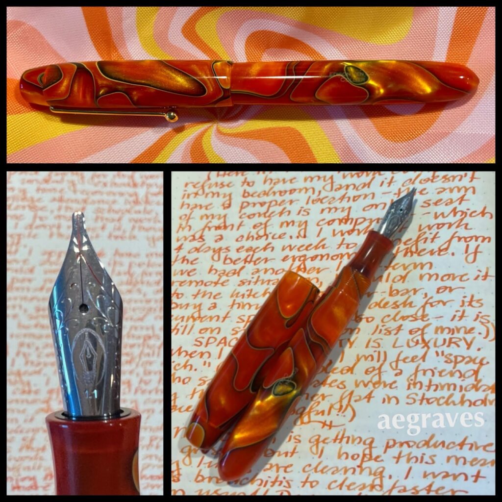
This is an Edison Collier fountain pen (made in Ohio!) in the color Persimmon Swirl; a Goulet 1.1mm stub nib assembly; a writing sample in Pelikan Edelstein ink in “Mandarin” orange on Rhodia cream paper.
I was writing yesterday about how wonderful it is to have a desk to write at (I have space!), was enjoying the orange theme a bit too much, and decided to post about it. (Materialism happens to me, too! I use a lot of tools and art supplies, and have been choosing prettier ones recently.)
This pen isn’t very “like” me – I own almost nothing that is orange – but it is so attractive looking, and so vivid, that I couldn’t resist. It is a lovely size and shape to hold, large, gently rounded, and easy to write with. It came with a medium nib, but I’m on a broad nib bender, so I ordered a replacement nib-and-feed assembly from Goulet, and am happier with it. I have ink feeding issues from time to time with the converter (it withholds ink after I’ve written a few pages, and I have to dial the converter to be more generous (postscript: this appears to be specific to certain inks, Herbin is flowing beautifully)), but standard international cartridges flow just fine.
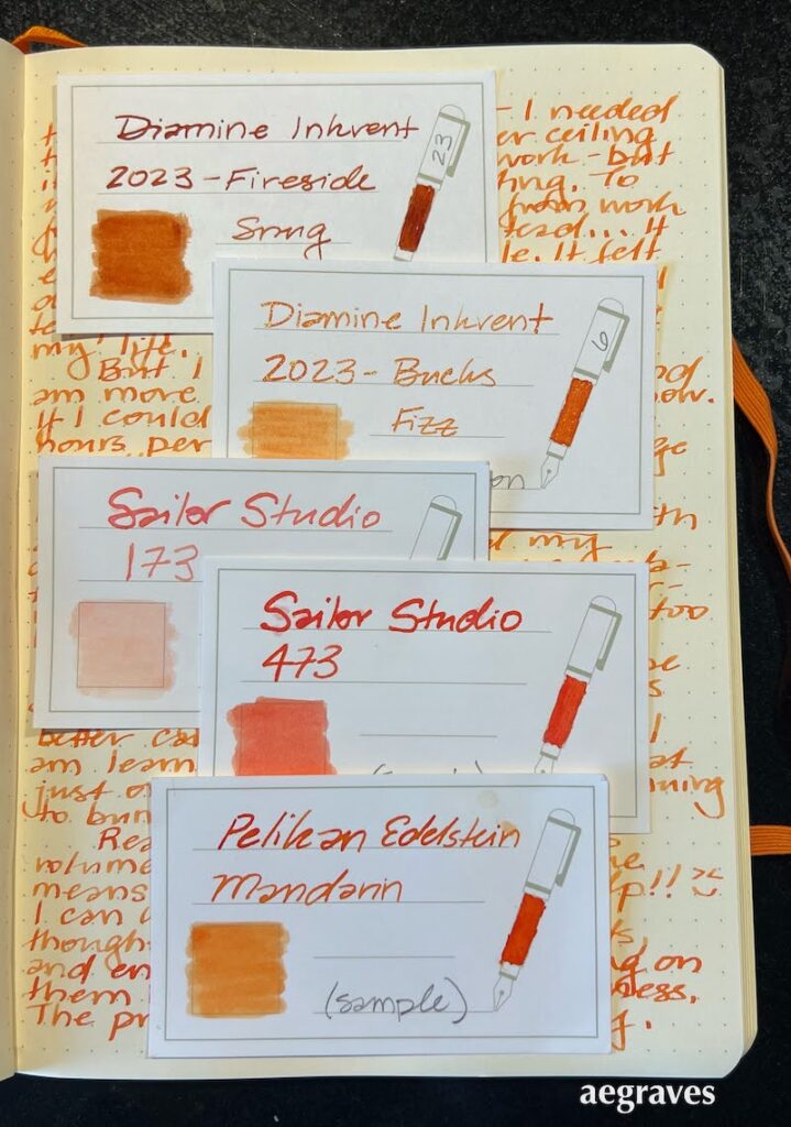
Orange inks can be limited in legibility, but I’ve been testing some good ones. By coincidence, the 2023 Diamine Inkvent calendar (an advent calendar with a 12ml bottle of ink behind 24 doors, and a bigger bottle behind door 25 for Christmas), happens to have added two new oranges to my little collection, including one that was behind Saturday’s tiny door.
Sample cards displaying the five (!) orange inks currently in my collection. Diamine Fireside Snug, Diamine Bucks Fizz, Sailor Studio 173 & 473, and Pelikan Edelstein Mandarin.
My employer’s theme color is orange, and I’ve grown accustomed to using a sanctioned shade of burnt orange in my presentations, so I may be more open to using this color than I’ve historically been. Goodness knows there have been many shades of orange in the gorgeous sunsets recently! So, we’ll see if these tiny bottles lead to a bigger commitment for my writing. There are some famous American and Japanese orange inks I haven’t sampled yet, so it’s possible…
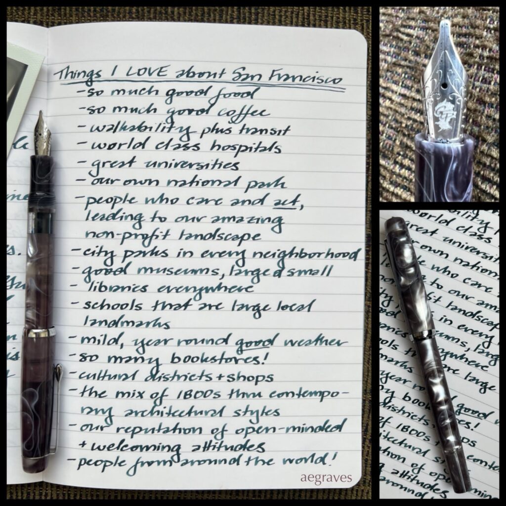
Handwriting! This spontaneous, incomplete, outburst-type list (in no particular order) is written with a Noodler’s Konrad fountain pen in Appalachian Pearl that has been modified with a Goulet Pens stub nib. The gorgeous gray-green ink is Herbin’s Vert de Gris on Clairefontaine paper.
I have periodically called up my parents to thank them for raising me in San Francisco.
Sure, they met and married here, but there was always a chance they could have returned to the midwest or northeast with me. But I’m so glad they stayed!
It was wonderful to grow up in a place where school building dominate the neighborhoods; where there are so many libraries; where I had so many classmates from other places, domestically and internationally; where I could hear different languages while riding the bus or visiting a friend at home; where there are so many cool, kid-friendly parks and museums; where I could go trick or treating with grown men dressed as fairies; where my multi-racial background and my parents’ interracial marriage were within local norms; where I could see adults with a very wide range of professions, and know how many options there are….
It has also been great to be an adult here. There is an economy! While there are boom-bust cycles, there are often plenty of jobs, and many are in new industries. The idea of changing the world with an invention seemed totally possible – nearly inevitable! I didn’t know in childhood that I (and many of my friends and classmates) had futures working in industries that were just being created.
The boom-bust cycles are rough, and both the wild successes (like tech) and the disasters (like COVID) can be disruptive and devastating. For the past few years, the City has felt a bit hollowed out, though I see positive signs of revival when I am out and about.
San Francisco is a great place, and I feel lucky to live here.
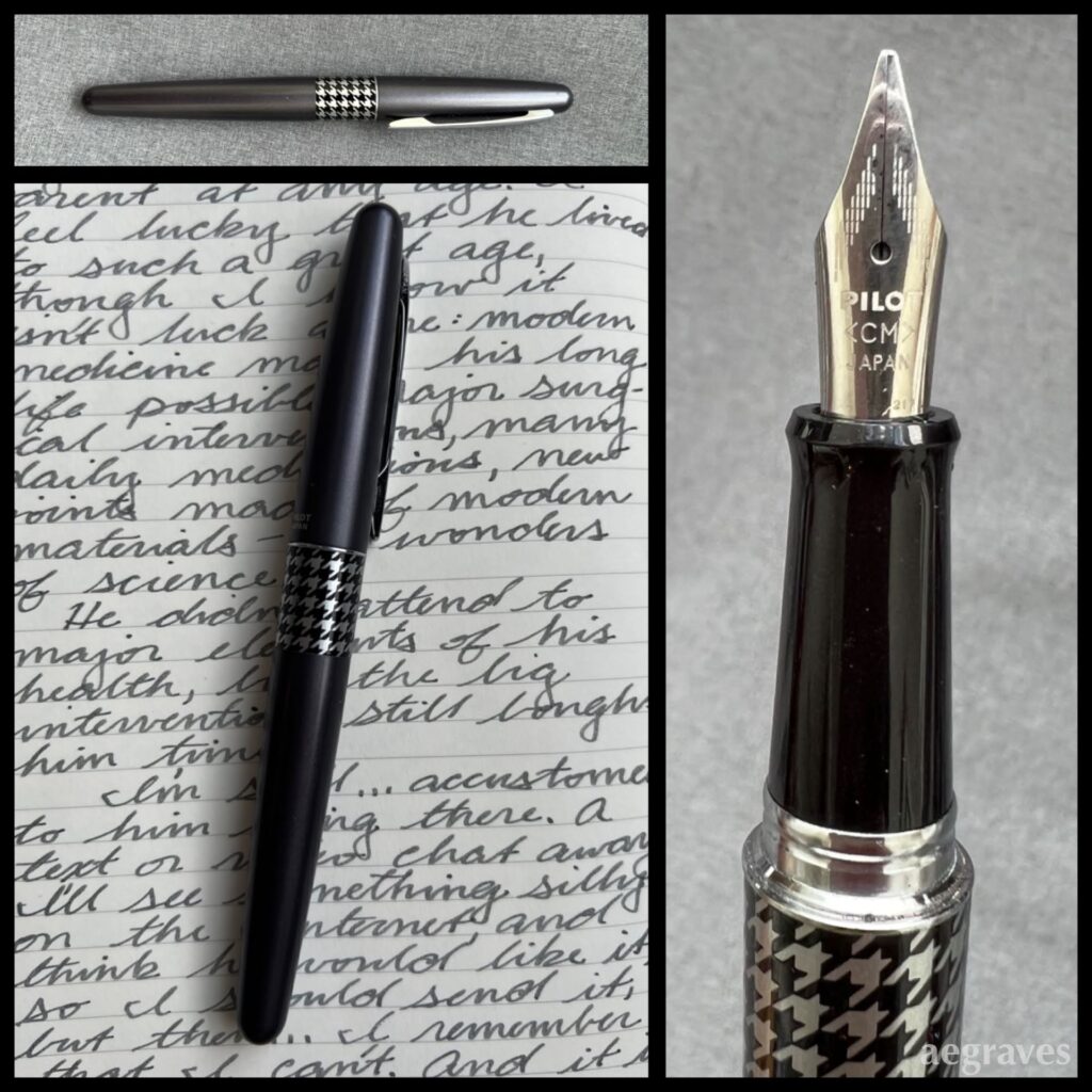
This is my first Pilot Prera, with a fine nib – my least favorite nib size! It was scratchy when I bought it, yet the right ink and smooth paper make it pleasant. The ink is likely Herbin’s Corail des Tropiques.
This is another Pilot Metropolitan fountain pen with a calligraphy medium (CM) nib. The writing sample is made with Private Reserve Gray Flannel ink.
Here’s another modest-but-fun pen in my collection, with matching velvety ink. I’ve been surprised at how many shades of gray ink are available, especially since some are so subtle and pale that I’m unsure how they can be used…
My handwriting with this style of pen is nicer when it is not hurried, but all of this year I’ve felt like I have so much to write and so little time that I can’t slow down…
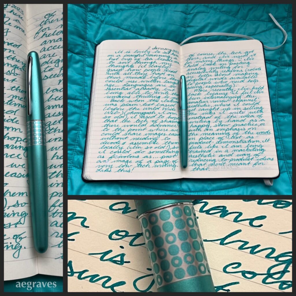
A journal spread – collage of pages I wrote in January 2023. The ink color is Diamine Steel Blue; the pen is a Pilot Metropolitan.
My elementary school encouraged and required all of us Kindergartners to keep a journal. We needed to practice writing, and having a black and white, speckled-cover composition notebook of our own was DELIGHTFUL. I filled mine with colorful-but-poorly-formed words! I wrote and illustrated stories about red-haired girls having adventures! IT WAS GREAT!
And, the habit stuck with me. By the time I was finishing college on weekends while working full time at a law firm (note: do not do this, it is exhausting), and the college offered a few units each semester for maintaining a journal, I jumped at the chance… and then startled my college advisor by filling it in the very first semester, and starting another…
I still write by hand, especially for letters to pen pals and journals. My hands get sore easily, so I can’t write with dry ball point pens for long: they involve too much pressing. It turns out that very wet gel pens are better (HELLO, Uni-ball SIGNO!), but I fly through them, and feel terrible throwing out handfuls of disposable pens each month. Refillable gel pens come and go, and are very portable, but still involve tossing significantly smaller bits of plastic and metal out almost daily. The lowest waste and lightest-ergonomic-touch pens I can use are fountain pens with “converters” that can be filled with ink directly from a bottle.
It turns out I LOVE writing with fountain pens.
I have friends who collect these, but when they spoke of it, I didn’t really grasp the point: they showed me the pens themselves, not what they were capable of, how they performed as pens. Also, they didn’t mention to me, an overzealous color fan, how many ink colors are available.
Now I know. Oh, do I ever know.
I’ve been reluctant to show off either my ink or pen collections, even though both are very modest. Despite their modesty, writing with these tools brings me disproportionately large joy. My reluctance comes from the popular ways of writing about products by presenting oneself as a semi-professional expert reviewer, who talks up the qualities of the product yet never really MAKES anything with them.
There are countless video tutorials on how to SWATCH EVERYTHING – how to provide samples of a display quality that would please a salesperson. But… why?
While this swatching approach may help me better document my watercolor paint tube collection and so prevent me from buying the same shades of celadon green accidentally, it’s awkward as one’s only shared output. (Also: one can never have too many shades of celadon.) I don’t really trust someone who has only swatched a paint to tell me whether or not it belongs in their paintbox for their actual painting practice (if they have one)… I have some credible enthusiast reviewer sources of fountain pen ink who have recommended against using inks they received for free AND who freely remark on beautiful inks that aren’t LEGIBLE for actual writing, and that is feedback I can use. But there is a lot of reviewing-popular-products-for-clicks content, and I don’t want to participate in that.
So, how will I be different? I’m going to show what I wrote with the pen and the ink for my own enjoyment. Maybe you’ll like it. Maybe you won’t. Perhaps styling of these images by coordinating pens, inks, and backdrops will prevent me from staring deeply into my favorite pen shop’s Instagram feed and purchasing pens I don’t need. I expect it to make my blog more visibly interesting.
Either way, now is a GREAT time to create these posts. Everyone in my mother’s family has terrible arthritis: my ability to write legibly with fancy pens won’t always be available! I’ll seize the (quiet, quaint, pen-geeky) moment.
I write. A LOT. Years ago, I was distressed over how many disposable pens I could go through in a month (too many), and looked for environmentally responsible options. I switched to refillable cartridges/tubes for work and travel, and fountain pens that refill with bottled ink for home. Most of my writing now relies on no-waste refills!
The fountain pens are FANTASTIC and surprisingly ergonomic: I chose pens that are larger and easier to hold than disposable pens, and which glide over smooth papers, all without the strain of pressing down hard that normal paste-ink rollerball pens require.
Something was missing, though: nothing could beat the Uniball Signo white gel ink pens. I use them to write on black paper; I use them to write in photo albums; I use them to draw on watercolors. However, they are disposable, no refills are available, I consume them quickly, AND they dry up fast, so that efforts to stock up on them backfire. (The only thing BETTER is the Uniball Signo silver pen, but that only solves the drying up problem, and doesn’t work for all of my art needs.)
I tried to emulate my solution for replacing other pens: I purchased bottles of white ink and put them into fountain pens. Good opaque white inks clog up the fine feed, however, and I’ve had to clean the same pen every few pages (!!) while writing a long letter.
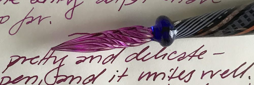
Glass pen tip dipped into Pilot Iroshizuku ink in Yama Budo (wild grape), to bring out the swirly ink channels.
Long story short: I bought a glass pen. Yes, a pen made of glass. Aside from the fact that I will OBVIOUSLY let it roll off a table and break eventually, it seems perfect: it has no moving parts, is easy to clean, and holds ink on its exterior grooves. Conveniently, it works with BOTH the thicker and thinner inks I’m testing it with.
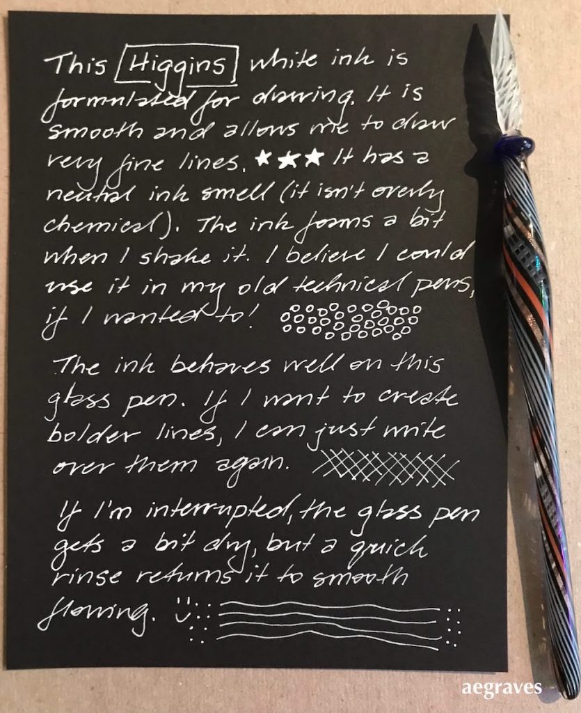
This shows my reasonably natural writing with Higgins Super White. It’s waterproof, though my paper isn’t.
There is an adjustment to make: you need to dip the pen to add ink every paragraph or two. It’s manageable with practice.
Both of my chosen inks flow really well with it. The pen is easy to write with, even with my healthy fear of accidentally snapping it in two. (I have snapped metal garlic presses in half more than once, so I’m a bit sensitive.) It doesn’t glide AS smoothly as a fountain pen would, so it makes a little bit of noise on textured paper, but it glides well enough to write naturally when loaded with ink.
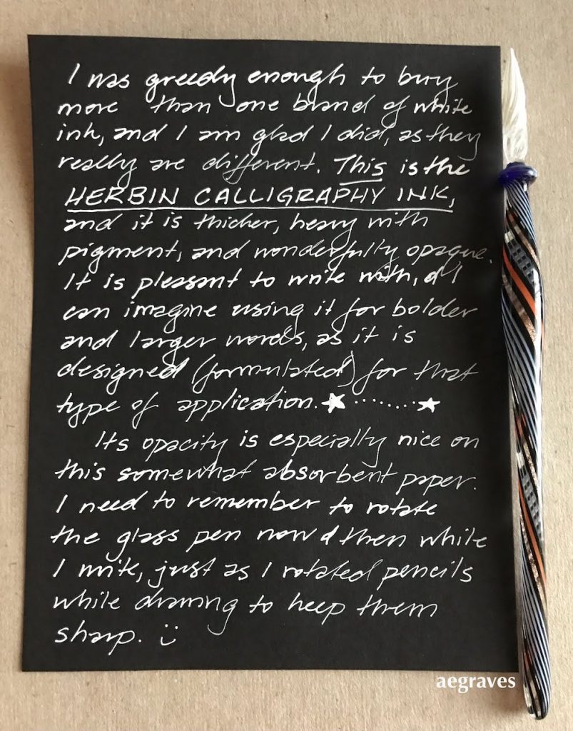
Here’s a sample on my soft German paper with the thicker ink, Herbin’s Encre de Calligraphie in blanc. It says right on the label, “Not for fountain pens,” though that didn’t stop me from trying for a while.
The Higgins ink lies very flat; the Herbin ink can be built up slightly, and is thicker and more opaque, but to my surprise, I can write finely with either one. (You can see the difference in thickness in opacity just by looking at the pen tip in the photos above.)
So: I have a solution to my disposable white gel ink pen problem! A FANCY solution. I’m delighted. I can now heartily recommend either or both of these inks on smooth, relatively non-absorbent (non-feathering) papers.
I write with fountain pens and colorful inks, and often check to see if there are new colors I could be enjoying. A favorite French brand, Herbin, as both lovely colors AND notable descriptions of those colors on their website.
Herbin uses all natural dyes in their fountain pen inks. This natural composition is reflected in the very neutral pH of the inks.
What do I mean? There is a lovely brown called “Terre de feu.” It evokes certain volcanic islands south of Chile. And the English translation of the description says, “This brown ink has a red tone a reminder of the burnt lands and vast deserts where nothing ever grows.”
NOTHING EVER GROWS THERE. BUY THIS INK!!
I can’t resist that.
Or a dusty rose. “Bouquet d’antan (Bouquet of yesterday pink): It represents a bouquet that can be found at an elderly’s house.” It’s a lovely color (I will buy a bottle!), but it also sounds like someone is rebuking their grandmother for nostalgia, doesn’t it? Yes, it does, as the description continues: “The color is the symbol of nostalgia of the time that has gone by.” GET OVER IT, GRANDMÈRE!
I didn’t know there was a color for “grievance,” but there is, and who doesn’t want to emphasize their grievances with an appropriate color?? Grievance is a delicious shade of violet. Of course it is.
It’s as if I’ve discovered a new view of the world, and can now wander about, attributing attitude to all of the colors in my home. Me tomorrow morning: “This antique gold with a hint of green evokes a bitter, fading houseplant which rejects the window you have chosen in your new apartment. It will NOT forgive you. This flat was a mistake. Available in 25 ml or 10 ml travel size.”
Two fountain pen inks I take the greatest pleasure in writing with are from Herbin. They flow well, are well saturated with color, never feather on my preferred papers, flow smoothly, and don’t clog my pens.
Your letters or journals will obviously look more clever in these colors. Your pen pals will sigh. You can sigh directly at https://www.jherbin.com/fountain_pen_inks.html
The colors I use regularly and love from Herbin: Poussiére de Lune(moondust, a rich violet); Vert Empire (a faded, velvety green); Rouge Grenat (a deep, pomegranate red); Corail des Tropiques (coral orange-pink, closer to Rouille D’Ancre than the color chart suggests; pleasantly legible, and as cheerful as a Caribbean beach vacation — now I’m really thinking this way); Emeraude de Chivor (turquoise-to-teal with bright red and metallic gold particles, which are only visible on less absorbent papers); and a new, tiny bottle of Bleu Myosotis (go read the description for that one!).
I also have a bottle of Herbin’s white calligraphy ink, which I use in a special pen on black paper, because: me. It offers good contrast, and handles well.
I’ve seen all the other fountain pen fanatic blogs, and I know I’m supposed to create a brilliant work of art with a watercolor brush AND write at least two major journal spreads in each of the colors I chose, plus provide a written specification of every tool in the room while I created it, describe what I had for lunch, and a provide an original recipe for that. Also, I must ensure that each color has its own separate blog entry. However, this just isn’t the day/week for that.
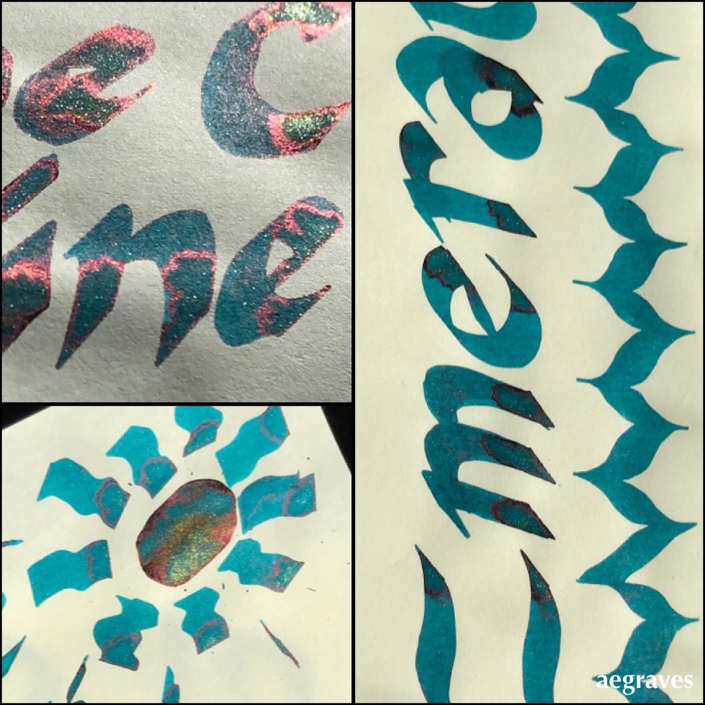
I understand the convention, so as a gesture of goodwill toward my fellow fanatics, I’ll share my own spontaneous, inept tribute to Emeraude de Chivor, because I can:
Example of me spontaneously going overboard in trying to pool Herbin’s Emeraude de Chivor drawn on Tomoe River cream-colored paper, in various bright or direct sunlight conditions. I went extra heavy with an oversized calligraphy pen to load up the paper so you can see the red and gold particles.
If/when I dedicate a post to this ink the way I use it most, I’ll use a fountain pen with a fat nib so you can see each inky letter outlined in the red and gold particles when dry. It’s quite an effect – all correspondence I’ve written with it generated questions about how I did this magic.
~~~
Related to the idea of fun with how colors are labeled, but not entirely on topic: AI generated names for paint colors from Janelle Shane:
New paint colors invented by neural network
So if you’ve ever picked out paint, you know that every infinitesimally different shade of blue, beige, and gray has its own descriptive, attractive name. Tuscan sunrise, blushing pear, Tradewind, etc… There are in fact people who invent these names for a living. But given that the human eye can see…