I was cheered earlier this year during videos from the French crew of the solar-sailing-hydrogen ship Energy Observer, which is sailing around the world to publicize solutions to the climate crisis.
I got a little misty when they arrived here in San Francisco earlier this year, and spoke with such optimism of the technology and solutions that our region offers.
I recommend the Energy Observer YouTube Channel, which is filled with short, manageable clips on diverse projects, which include interviews with innovators solving specific environmental problems, including locals who are responsibly improving the natural environment in their areas (normal people, not JUST VC-backed inventors!). You can turn on English subtitles for the videos, and hear members of the crew speak about a range of topics during their adventures.
Their well planned media approach shows there are MANY solutions to our current environmental challenges available, each fit for its local purpose, and that we’ll need many of them to solve the climate crisis.
You can also visit them for a detailed look at their own ship’s tech at the Energy Observer website (energy-observer.org).
While I grew up on the sunny side of San Francisco, I currently live near the edge of the fog belt. I love fog, but not every day – I like variety.
When the fog belt limits visibility, I often believe that it is foggy EVERYWHERE, but sunny weather may be just a streetcar ride away! As a lighting-obsessed photographer, always interested in which buildings and other features are lit from which direction, I began to rely on live webcams back in 2004 to tell me if the fog belt has an edge.
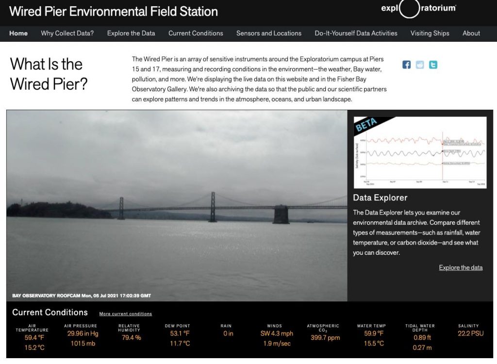
The fancy webcam I currently use and recommend is at the Exploratorium (exploratorium.edu), now located at Pier 15 along the Embarcadero. (Embarcadero = the pier(s) in Spanish.)It looks eastward from the pier, toward the east bay and our Bay Bridge, day and night. It not only provides a view, but also weather station and other monitoring equipment measuring the wind, any rain (we wish), water depth, salinity, and other cool data. This screenshot gives you a preview of what I mean:
It’s not looking good for the sunlit scenes I was hoping to capture today…
At the moment, I can see that it was too optimistic of me to take film out of the refrigerator before I even had breakfast this morning, but at least I know now, rather than after I’ve geared up and headed out.
The link for your enjoyment is here:
Wired Pier Environmental Field Station | Exploratorium
A collection of sensors around the Exploratorium campus is measuring and recording conditions in the environment—the weather, Bay water quality, pollution, and more.
Yes, there is a Wikipedia page devoted to June Gloom, which also names “May Gray,” “No-Sky July,” and “Fogust” as some of our regional nicknames for these anti-postcard weather patterns, if you need to sound like a local over your artisanal, locally roasted cup of coffee.
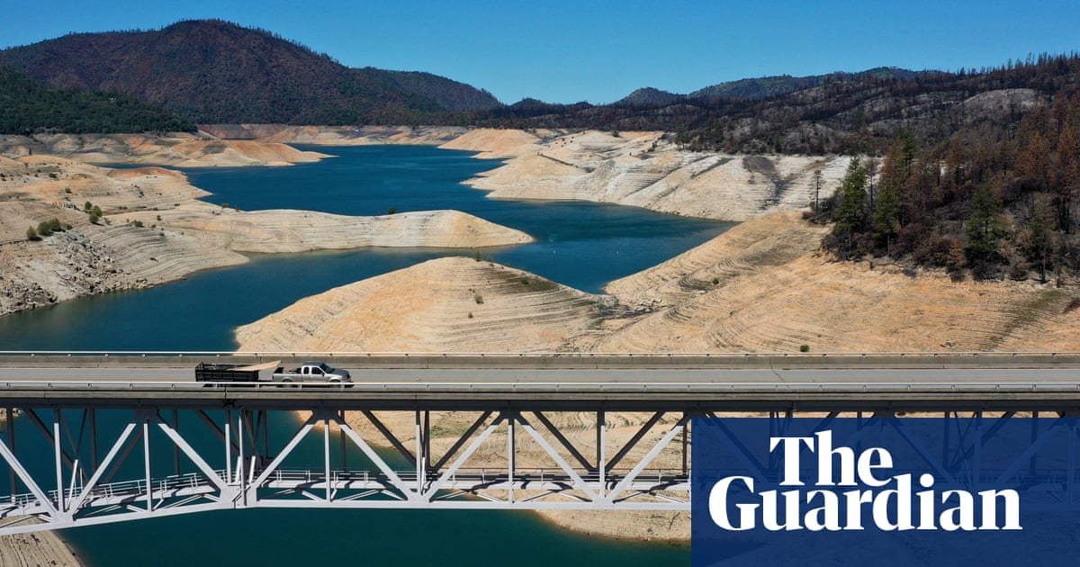
California faces another drought as lake beds turn to dust – a photo essay
Water shortages and dry conditions are already affecting the state as the governor has declared an emergency in 41 of 58 counties
We Californians always complain about how dry it is, and how we are feeling the long term effects of climate change slowly desiccating us. But what does that LOOK like?
The UK Guardian, which has a fantastic US bureau (I am a happy digital subscriber), pulled these images together to show you what a dry spring looked like.
And it’s even drier now.
To give you a sense of how widespread this is, the US Drought Monitor (droughtmonitor.unl.edu) makes simplified graphics to show how the many different climates of California, from snowy mountain to redwood forest to foggy coast, are in various stages of water shortage.
It is HISTORICALLY dry.
This isn’t just abstract news for us. This is why trees and plants that never needed supplemental water are now dying in our local parks and gardens; why our forests are vulnerable to insects and fires; why people who retire to the Sierra foothills suddenly can’t get insurance for their homes; why salmon can’t make it out to sea from far up the rivers where they hatched; why farmers are watching their orchards from a more optimistic expansion era dry up…
We have always been zealous about drought tolerance and water conservation, but there is only so much we can do at home when the natural systems that get that water first are already dry.
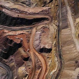
My Cousin had an issue loading a satellite image of the Nevada desert. He showed me a glitchy version of an image that looked like the same image wallpapered across the screen. He said the land looked painted; that he wondered if what he’d seen was being censored; and he showed me a dark screen grab of what looked like an open pit mine.
My brain went down several different paths.
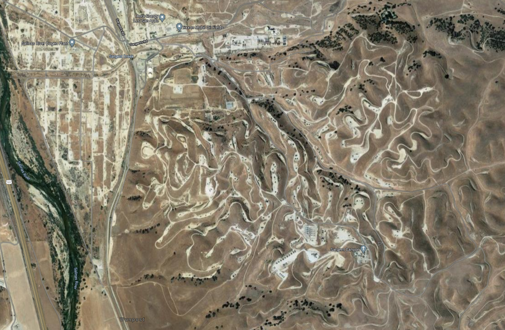
Satellite images of resource extraction: I wanted to know if he had also been looking at mining or drilling sites more generally, because many of them don’t make sense to me. The day before, I’d been looking at oil wells I used to pass on 101 north along the Salinas river. I’ll never really understand why the wells are where they are (it looks like many sites are high up, though I was led to believe the oil they are looking for is quite deep, so this would be making their drilling job harder, I would think.) That image happened to be on my desktop:
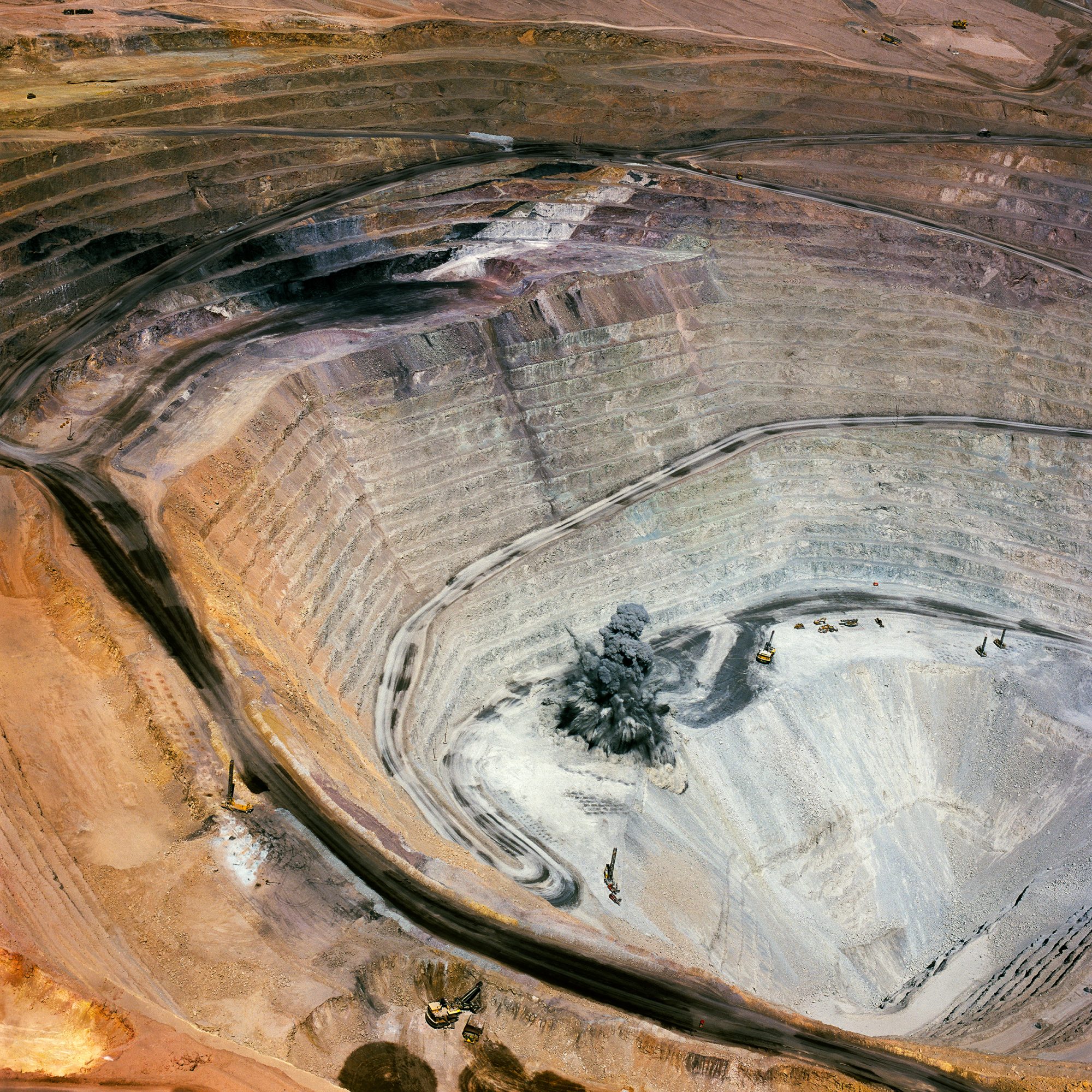
Art depicting open pit mines: there are some interesting (and extremely unfortunate) open pit mines around the world with remarkably colorful soil. My Cousin mentioned that he might have been looking at images of the Goldstrike Mine. So I went looking for images of Goldstrike, and wound up asking him if he had been looking at this geometry-themed site and open pit mine ART (you read that right) by Antonio Gutierrez:
Goldstrike Mine, Betze-Post Open-Pit mine, Nevada, Open Pit Mining Art.
Art depicting Nevada bombing ranges: my mind turned to an art book about the government’s destruction of wide swathes of Nevada, including the contamination of private land, and the documentary photography project on this theme by Richard Misrach (fraenkelgallery.com). Yes, of course I have this book.
Bravo 20: The Bombing of the American West | Fraenkel Gallery
In 1952, the U.S. Navy began illegally testing high-explosive bombs on an enormous expanse of public land near Fallon, in northwestern Nevada. The land had long been sacred to the Northern Paiute Indians, who called it the “Source of Creation.” The Navy called it “Bravo 20.” Here is the dramatic st…
Art depicting toxic Landscapes (including mines): Another photographer based in my area, David Maisel (davidmaisel.com), has a body of work and a book called The Lake Project, which I never managed to obtain. It is one of several by him on similar themes, and includes extraordinarily vivid images of toxic waste that are beautiful and abstract. It’s painful to know what they depict, however.
His website is lovely:
David Maisel
In his latest photographic series, Desolation Desert, David Maisel brings his focus to the massive mining operations in the vast territory of Chile’s Atacama Desert. The highest and driest desert on the planet, this sensitive eco-region of the Atacama is being transformed at an unparalleled pace and…
There is a great article with many illustrations from several of Maisel’s toxic landscape projects in the Design Observer (designobserver.com), so I shared this article with my Cousin, since it was also on this theme.
David Maisel’s Photographs of the Apocalyptic Sublime
David Maisel’s photographs are visions of the Earth as we have never seen it full of beauty and terror.
Eventually, my Cousin was able to find the satellite image he wanted, and showed me the painted-looking ridge that had captured his attention, which is visible if you zoom into the center of this Google map:
Google Maps
Find local businesses, view maps and get driving directions in Google Maps.
He is an EXCELLENT Cousin, so he both shared the ridge when he finally relocated it AND hadn’t minded the speculative, mine-and-art-themed detour I took him on. It’s good to know that my Cousin ALSO wanders through the deserts of the American West virtually.
Now I’ll wait until he starts also wandering the most remote islands of the Pacific Ocean, and take him on another tangential virtual adventure. 😀