Machine Art (Sixtieth Anniversary Edition)
by The Museum of Modern Art
published by The Museum of Modern Art (and Abrams)
1934, reprinted in 1994
I don’t think I’ve written up a review of the de Young Museum of San Francisco’s show & book on Precisionism called Cult of the Machine (which I should do!), but suffice to say for now that I’m interested in how “the machine age” changed how we think about the design of utilitarian (useful) objects. While the de Young show was a retrospective, Machine Art is a catalog of a show DURING the era of fascination with what machines can do.
It’s a pretty funny catalog.
The new preface by Philip Johnson is a light-hearted acknowledgement that the catalog essays he’d written were a bit naive, and that he was very zealous with his ‘machine made = good, handmade = bad’ arguments. The essays are unbalanced in favor of mass production, though there is some acknowledgment that early machine production made inferior products to those of artisans. There is also a decoration-is-evil thread to the writing, because of course there is – this is how we know we are modern! 🙂
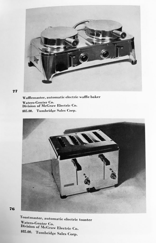
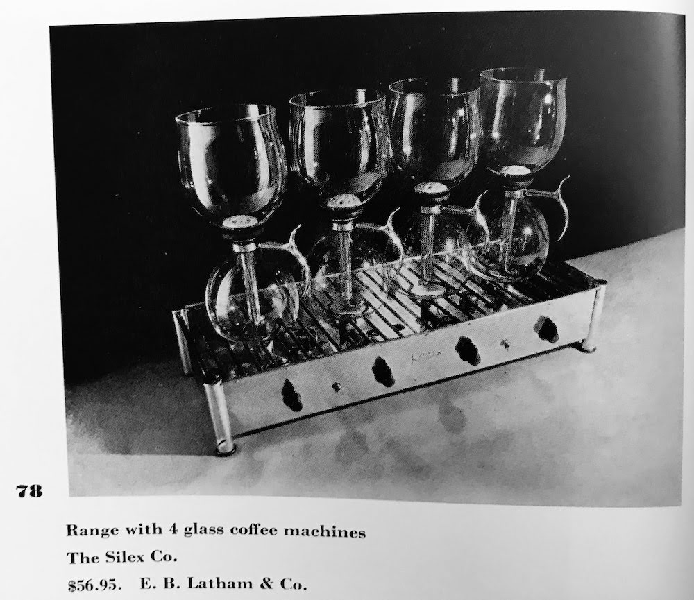
While the Precisionist show I’m comparing this to was a celebration of the best-of-the-best in retrospect, this catalog is far more… happy with chrome toasters of no special renown.
These functional design ideas have stood the test of time – these toasters were for sale in 1934, and models of the same appearance are available now – but aren’t something you’d necessarily buy a postcard of. (I buy some pretty weird postcards, just so you know.) They are plain enough to be shown as examples of a kind of functional purity (aside from the chrome, which is seen as functional rather than garish – I’m more pure than you, and I say this should be sheathed in plain concrete, bwa ha ha ha ha) , but are not glamorous. They definitely do avoid unnecessary decoration (again, I think the high polish IS decoration, but that’s me). The catch is that objects that look like this have become generic and somewhat invisible – which is either a great victory of function over the sentimentally decorative past, or… just the passage of time wearing the shine off these objects.
Summary: interesting catalog with essays of a zealous pro-machine/anti-handicraft bent, with objects which succeeded to such excess that the novelty and surprise of them sails past me. (Another thing ruined for me by architecture school and Bauhaus books & shows!)