I know I write often of comics, manga, and manhwa, but I wanted to make a fuss about how digital illustration has really changed how comics look now, and has made manhwa (comics from South Korea) in particular so attractive to me as a person who used to work in architecture.
I previously wrote about A Not So Fairy Tale by Hyobin on Webtoon. Look at this scene:
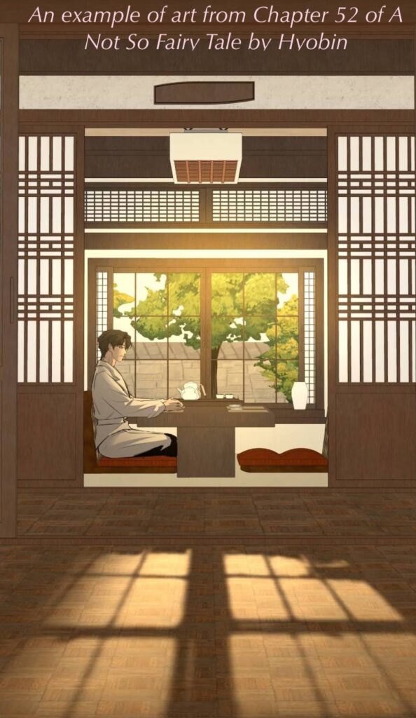
Look at the details. The textures. The shadows that the evening sun makes on the floor (which has a sort of wood parquet treatment). This level of effort in webtoons is VERY appealing to me. And is spoiling me a bit.
Even if/when the characters are highly stylized in unnatural ways, the rendering of the world they live in – backgrounds, the interior design, the furniture, the foliage – these have some remarkable details. Some appear to be produced by specialists who just create castles, modern cities, European rococo ballrooms, etc. Others appear to be photo-to-illustration conversions of some sort (but that works only for places based on real settings).
Drawings produced at this level when I was still in architecture would have been award-winning marvels of the profession: now they are the routine product of manhwa studio artists!
I admire the effort (and artifice) that goes into producing these scenes.
I have other favorite scenes to express my admiration for, but I haven’t reviewed those particular manga yet, so they’ll likely turn up in a few weeks.
