
The last time I made a small watercolor painting, it turned out badly. Like the normal, totally well-adjusted person I am, I decided it turned out badly because I am a terrible painter, no matter how many decent paintings I produced in the past, and so I avoided watercolor painting for several years.
Most of this was based on a misunderstanding.
Back when I was a starving architecture school student, I could only buy small amounts of paint at a time. A tube of transparent watercolor here, another tube there, a lot of skilled mixing, and I could get by. I experimented and made some decent paintings with my mismatched tiny tubes, and I was happy.
My first FULL boxed set of watercolors YEARS later was Holbein’s Iródori Antique Watercolors. I had been a regular user of Holbein’s regular watercolors (they released colors that matched the landscape of my trips to Japan SO PERFECTLY!). I liked colors in traditional paintings, so I thought this was the right choice for me. Yet, my paintings with these colors all… lacked something. I blamed myself, put them away, and moved onto other things (including watercolor pencils, and a travel set of a different brand of watercolors, which I worked more effectively with). Years passed, I brought the set out again, painted a rather muddy painting of a Japanese scene form one of my own photos, blamed myself, and put them away again. I was already so familiar with Holbein, I couldn’t figure out why I’d become so RUSTY.
YouTube sorted me out. An artist with a shop called Hino Art Materials in Vietnam reviewed Holbein’s new sets of Iródori GOUACHE. Yes, Holbein re-relased the colors as OPAQUE watercolors, to giddiness from YouTube. She recommended not mixing these paints (they are very saturated, and muddy easily) and showed off a lovely gouache painting on a dark blue background. She showed off that some colors have been reformulated, but not all of them. Perhaps my existing set, even before this re-release, could be used like opaque paints?
So today, a precious day off work, I broke out BLACK WATERCOLOR PAPER (a thing that wasn’t available when I first purchased these paints so long ago) and white watercolor paper, and tested the paint out.
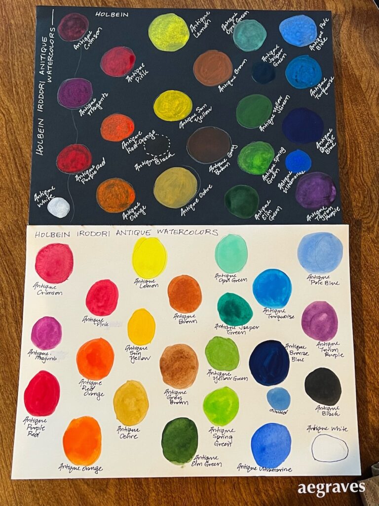
Oh, YES. So many of these colors are HIGHLY OPAQUE and look great on black paper. The great colors and saturation on white watercolor paper had fooled me! If only I’d had more experience with gouache when I purchased these, I could have put these to better use, and stuck to transparent colors for those other projects. Now that I understand their opacity, I can use them like gouache (and mix them with opaque white as needed when they need an opacity boost), and perhaps resist buying those French and German gouaches a bit longer… And actually get to enjoy these without fear of failure built in.
(Oh, that Antique Bronze Blue in particular is the color of the sky hours after sunset… I could USE that…)