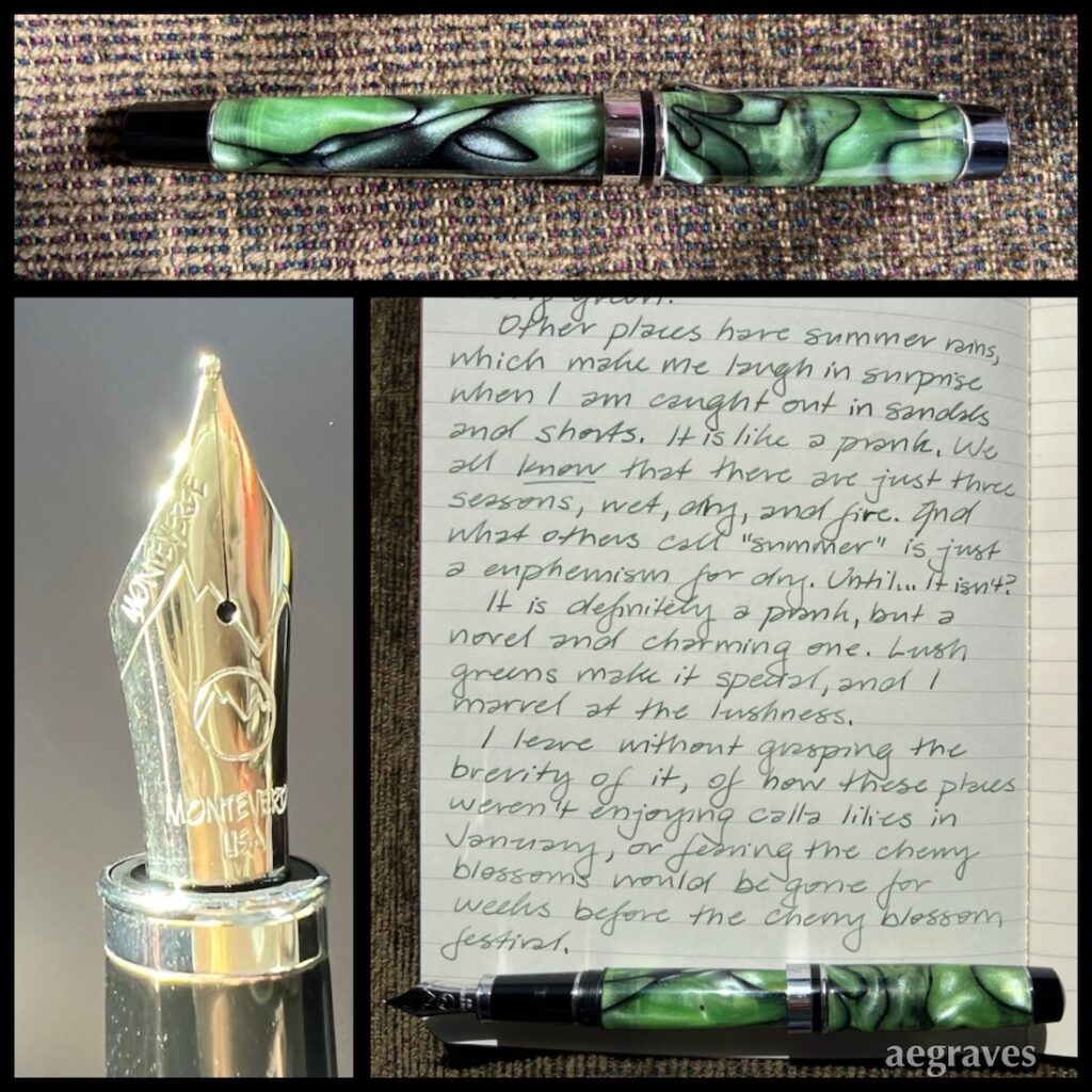
The view out my east facing dining room window is of the deep green of a holly tree, and the brighter green of a juniper, which inspired me to fill my greenest pen and write about the color.
This Monteverde Prima is one of my earliest fountain pen purchases. I initially thought it was stingy with ink, but just happened to be using a drier flowing ink. I tried others and improved my paper choices, which help me appreciate this pen’s smooth writing and pleasant proportions. It is comfortable to hold, is reliable (doesn’t clog or dry out), and the way it catches the light is attractive. The nib is firm, and I am amused that Monteverde is so proud of it that they engraved their long name on it TWICE.
The ink is Herbin’s ‘Vert Empire,’ the color of a dusty green velvet, or leafy desert plants that must protect themselves from the sun by being a bit gray. The pen isn’t an exact match for any of my five or so shades of green ink, though it comes quite close to Herbin’s ‘Lierre Sauvage‘ (which the Herbin website associates with anarchy. Ah, leafy green anarchy…). A medium bright green with silver sparkle could also come close, though that might be difficult to read if too shiny. (If you are a fan of Herbin’s “Vert Atlantide,” you probably beat me to this.)
Yes, my personal true color of California in summer is the yellow-gold of sun-dried grass on our rolling hills, but our extensive agricultural regions offer many shades of green, from the yellow-greens of grape leaves through the pale, silver-greens of artichoke leaves.
